
How Gaming Thumbnails Shape Viewer Behavior

Ever paused mid-scroll on YouTube because one gaming thumbnail jumped out? That little image is doing serious heavy lifting. In a sea of content, a gaming thumbnail is your digital billboard, an adrenaline shot promising action. According to marketing studies, 90% of top videos use custom thumbnails. Why? It’s simple: your brain makes the click decision in a fraction of a second.
Before you even read a title, your eyes latch onto bold colors, contrast and expressive faces. For example, if a thumbnail fails to “register as visually distinct” within 150 milliseconds, viewers often never notice it. In other words, an eye-catching gaming thumbnail can be the deciding factor between a click and a scroll-by.
Think about it: your brain is hardwired for visuals. When you browse a feed crowded with game screenshots and text, your visual cortex flags the brightest, highest-contrast elements first. Imagine a night scene from a horror game with only dark greys, then next to it a fiery boss battle shot with neon fire—your eyes flick instantly to the fiery one. That’s pre-attentive processing at work.
It’s why thumbnails with high contrast and a pop of bright red or yellow break through YouTube’s interface. Faces work similarly. The human fusiform face area lights up faster than anything else, so thumbnails showing a gamer’s reaction or an expressive in-game character immediately grab attention.
Imagine scrolling through hundreds of videos. Your finger is hovering, but only a few thumbnails have already earned that conscious look. If a thumbnail isn’t visible on the periphery, it doesn’t get clicked. It’s the digital version of “first impressions matter”: the momentary image of Mario leaping or a startled streamer’s face can lock in a viewer. Put simply, a great gaming thumbnail stops the scroll and signals, “Hey, this one’s worth your time.”
Even if you’re not a designer, these principles are good to know. If crafting thumbnails feels overwhelming, consider reaching out to expert YouTube thumbnail creators who live and breathe this craft. But even DIY thumbnails should follow the same science-backed playbook (we’ll cover that below).
How Thumbnails Hack Your Brain
Game thumbnails follow some sneaky psychological rules. Here are the core tricks that make you click:
- Color & Contrast: Your eyes are magnetized by bright, contrasting colors. Red backgrounds or vibrant highlights against a dark environment pop immediately. (Not for nothing, analytic data shows red thumbnails get ~23% more clicks than blue ones.) In practice, that might mean using a flaming orange or bright green outline to separate characters from a blue sky.
- Faces & Emotions: We instinctively notice faces. A screaming or surprised gamer face or even an animated character’s open-mouthed shock works like a magnet. Emotional contagion kicks in – seeing a look of awe makes you curious. The most click-driving expressions are surprise or excitement, since they create a mini-story: “What was that?”. (Just don’t overdo clickbait: if the promise fails to match the game content, viewers will bounce.)
- The Curiosity Gap: Great thumbnails tease information without giving it all away. Think of a “before vs. after” scene with one half blurred, or a huge pile of loot with nothing in context. That tiny unknown makes you want the answer. According to information-gap theory, your brain feels an itch when something is half-shown. Clicking “closes” that itch. For instance, a thumbnail might show a character looking stunned at something off-screen. You click to see what caused that reaction, satisfying your curiosity.
- Clarity > Complexity: A thumbnail’s job isn’t to tell the whole story, it’s to promise it. YouTube itself warns against clutter. If a thumbnail has too many tiny details or text, your eyes don’t know where to focus. Good design means one focal point: one big character, one bold text, one explosive moment. For gaming thumbnails, that often translates to a single hero, villain or loot chest dominating the frame, not five different sprites fighting multiple monsters. This reduces cognitive load and makes the click decision effortless.
- Text Sparingly: Think of thumbnail text as a headline, not a script. Data show that thumbnails with 0–2 words have about 6.8% CTR vs only 4.3% when you cram in 6+ words. In other words, shorter text scores better. Keep it to a few impact words – like “EPIC LOOT” or “NINJA KILLS!” – big and legible. Too much text is simply unreadable on a phone screen (and 70% of YouTube traffic is on mobile!). YouTube advises: if it’s not legible on a 320px screen, it’s worthless.
The Gaming Thumbnail Playbook
So what do top gaming channels actually do? In gaming content, thumbnails have some signature moves:
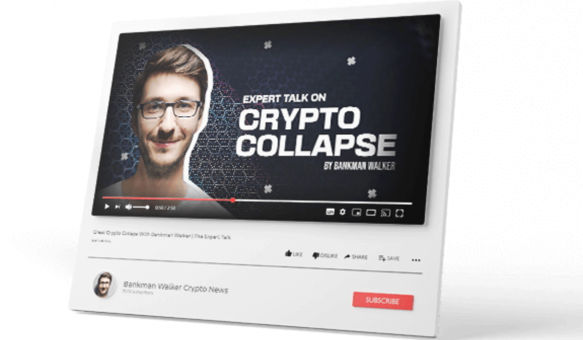
- Focus on Iconic Characters or Scenes: A high-performing gaming thumbnail usually features a big, familiar face – a hero, a villain, or a custom avatar. Legends of gaming like Fortnite or Minecraft thumbnails commonly show the player character wearing colorful gear. By contrast, bland scenery gets ignored. Viewers recognize beloved franchises at a glance, so slotting a game character or streamer’s face front-and-center immediately tells a gamer, “This is about [Game X]”.
- Dramatic Moments & Reactions: The best gaming thumbnails capture an adrenaline moment. For example, a battle scene with bullets flying, or the second before a character gets ambushed. Often a player’s exaggerated reaction is included for effect. Ampifire’s analysis found that modern gaming thumbnails “emphasize dramatic moments and emotional reactions” instead of generic gameplay. Think of it as a mini trailer still: it hints at action or surprise.
- Colorful, High-Contrast Art: Games often have their own vibrant palettes – highlight those. A racing game thumbnail might crank up the reds and blues, while a fantasy RPG thumbnail might glow with golds and greens. Thumbnail design experts show that high-contrast combos (like yellow/black or red/white) command attention. In practice, many gaming thumbnails have a neon-tinted background, bold outlines around text, or a glowing aura effect around the main subject. This kind of color clash ensures the thumbnail pops no matter if your viewer is on a TV or a small phone screen.
- Minimal, Bold Text Overlays: As mentioned, less is more. Gaming thumbnails often stick to 1–3 emphatic words or numbers (e.g. “7 KILLS!” or “New Secret!”). The text is usually a thick sans-serif font with a border or shadow to read at a glance. You might see phrases like “INSANE BOSS” or “LEVEL UP!” that tease the content without explaining it all. If used wisely, these punchy captions signal genre and energy (for example, white text with a red outline on a dark night-vision scene).
- Single Focal Subject: Remember to avoid clutter. A star player on camera will only have you use a single face, a clear action shot, or a shining collectible as the hero of the frame. One chart showing upgrade stats or one in-game enemy popping out is more powerful than showing five random items. This “one clear story rule” makes it effortless for your eyes to settle on the main subject and interpret what to expect.
- Brand Consistency: If you have a YouTube channel, pick one or two brand elements (like a logo, color scheme, or font style) and weave it into every thumbnail. This subtle cue helps your regular viewers recognize your videos instantly among others. For example, some streamers always use a particular color border or angle. Over time, consistent styling can give you a 15-20% CTR boost from loyal subscribers. However, don’t let “branding rigidity” hurt contrast: if your channel color is a dull grey, add a second accent color for pop.
- Relevant Authenticity: Crucially, make sure the thumbnail honestly reflects the video. Misleading clickbait might give a short-term click bump, but viewers will quickly churn away once they realize the content doesn’t match. YouTube’s algorithm favors watch time over raw clicks, so a thumbnail that accurately sells the story will outperform one that tricks users into a disappointment.
Data-Driven Design: What the Numbers Say
Design best practices sound great, but let’s back them up with data and examples:
- Gaming Channels See High CTR: In 2025 analyses of hundreds of thousands of videos, gaming thumbnails averaged about 8.5% CTR, beating tech, education, and most other niches. In other words, gamers do tend to click when attracted. (MrBeast-style thumbnails top out even higher, but gaming leads general CTR charts.)
- Faces vs No Faces: A large study found no overall advantage for faces across all content. In gaming, it’s common to combine faces and game scenes, but the data says context matters more than the face alone. On big channels (100k+ subs) a human face can give a slight lift, but on smaller channels it sometimes does not. So if you use your face, use varied expressions each time – repeated static poses can even be flagged as spammy by YouTube.
- Text and Words: As one study of 847 thumbnails confirmed, the sweet spot is 2–3 words. About 73% of top-performing thumbnails stick to that range. Longer titles on images see a massive CTR drop. Consider this:
|
Overlay Text Words |
Avg. CTR |
|---|---|
|
0–2 words |
6.8% |
|
3–5 words |
5.9% |
|
6+ words |
4.3% |
Figure: Fewer words drive clicks. Chart based on 2025 data shows that thumbnails with just 2–3 big words (or none) see far higher CTR.
- Contrast Crunch: The same analysis showed high-contrast thumbnails get 154% more clicks than low-contrast or monochrome ones. In practice, that means avoiding bland blue or greys that fade into YouTube’s dark mode background. Bright yellow text on a red background, or a glowing orange character on black, grabs eyes.
- Colors That Click: Neuroscience shows red and yellow cut through our visual field fastest. That’s why many gaming thumbnails use fiery reds or radioactive greens. Thumbnailr.io notes that red + white is a winning combo for gaming and action – it “conveys excitement”. Blue (trust, tech) works for tutorials but is less eye-popping. The key takeaway: match your color to the emotional tone. A bloody horror screenshot with dull gray fog will underperform; one with a bright red glow around the vampire will stop thumbs.
- Mobile Matters: If it looks good on a huge monitor but unreadable on a phone, it’s not a winner. Remember, most YouTube views come from mobile. Experts advise always checking your thumbnail at tiny sizes: if text or detail vanishes, simplify. Tools like YouTube’s thumbnail test & compare can help: try two variations on small screens to see which nets more clicks.
Overall, the message from creators and data teams is clear: make it bold, clear, and contextually interesting. For more guidance, TubeAnalytics’ in-depth thumbnail psychology guide emphasizes that a thumbnail should “help the viewer understand the promise instantly” and that clarity beats complexity. In other words, even in gaming, don’t sacrifice coherence for flash.
Testing and Fine-Tuning
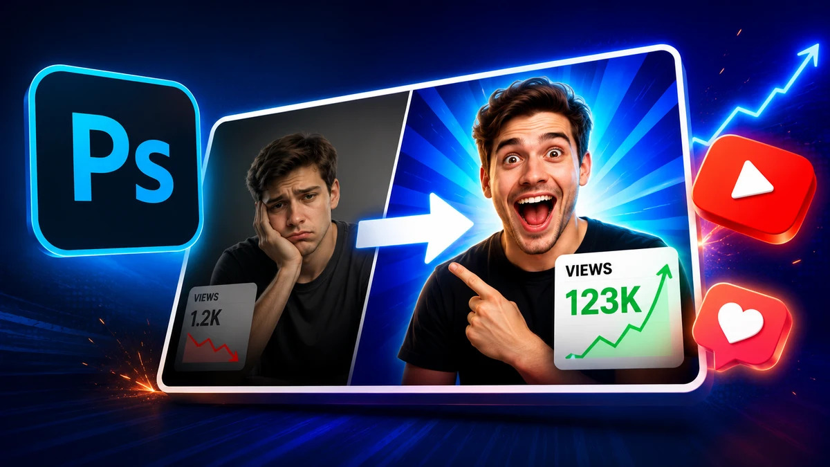
Remember that nothing beats real-world testing. A YouTuber we know went from 2.3% CTR to 7.8% CTR simply by applying these tips – brightening colors, cutting text to two words, and featuring a clear subject. Every game and audience is different, so always compare your new thumbnail against your channel’s average. YouTube’s analytics break down CTR by traffic source, so judge success in context (for example, home-page vs. recommended videos). If a new thumbnail underperforms, swap it within 24–48 hours. Over time, these small lifts compound into huge audience gains.
The takeaway? A gaming thumbnail is gameplay for the eyes. It sets expectations and invites action. Follow the data: use vibrant contrast, human emotion, and a tight visual story. Keep it aligned with your content promise, and you’ll steer viewers toward watching rather than scrolling past.
Conclusion
In the competitive world of gaming content, thumbnail design is not an afterthought – it’s strategy. By leveraging color psychology, visual hierarchy, and storytelling in that tiny 1280×720 image, you can significantly boost clicks and shape how viewers behave. The right gaming thumbnail acts like a magnet for your ideal audience, increasing not just initial views, but overall engagement and channel growth.
Next time you fire up Photoshop or an AI thumbnail tool, remember these principles. Test different styles, keep it clear and compelling, and never underestimate the power of a killer thumbnail. Now, it’s your turn: What thumbnail strategies have worked for you? Try experimenting with one of the tips above on your next video, and see if you can feel the difference in your CTR and viewer retention. Happy designing!
FAQs
Use a clear focal point like a character or action scene, high contrast colors (reds/oranges work well) and minimal text. If you include a face (yours or a character’s), aim for a big, expressive emotion (surprise, excitement). Keep text to a few strong words. Above all, be honest: the thumbnail should match the video’s content to maintain trust and retention.
Yes. Data shows that faces don’t automatically guarantee clicks – it depends on context. For some niches (like gaming), flashy scenes may matter more than your face. Too much text is almost always bad. If your graphic is cluttered or your caption tiny, viewers won’t click. The key is balance: include faces/text only if they add immediate clarity or intrigue.
It’s a good practice to revisit older thumbnails. YouTube itself suggests trying new thumbnails on older videos to attract fresh viewers. If you notice a video’s CTR is lagging, retesting a thumb could boost it. Regularly check analytics: if some videos have much lower CTR or retention, consider refreshing the thumbnail with a clearer, more exciting design.
There are many expert resources. For example, TubeAnalytics’ detailed guide covers the psychology of thumbnails and offers tips on clarity vs. clutter. YouTube Creator Academy and analytics blogs also share case studies on what works. In practice, trying A/B tests on your own thumbnails is invaluable – it’s the best way to see what resonates with your audience.
Comments
Update Comment