

How Consistent Stationery Design Builds Stronger Brand Recognition
Have you ever thought about how that crisp new business card in your pocket or the letterhead on your desk reflects a brand? In today’s digital deluge, a tangible piece of paper is like a surprise handshake.
The right stationery design can speak for your brand before you even say a word. When each printed touchpoint – business cards, letterheads, envelopes – follows a unified style, it imprints your identity on clients’ minds.
A consumer opening a letter or skimming a brochure should immediately recognize your brand’s signature look, even before reading any text. In other words, consistent stationery design is a silent ambassador for your brand, reinforcing recognition and trust with every encounter.
Why Stationery Design Still Matters
Stationery isn’t just old-school memorabilia – it’s a strategic asset. The tangible nature of print matters. In a world of emails and pixels, premium print “communicates something that no digital message can”: credibility, attention to detail, and brand pride.
Your stationery is more than paper and ink – it’s a direct reflection of your business identity. A well-designed business card or letterhead tells prospects who you are before you even speak. Conversely, a mismatched or cheap-looking piece quietly undermines your message.
As one designer notes, each stationery moment “either reinforces a single coherent identity or quietly undermines it with mismatched fonts”. In short, consistency in stationery design tells clients you’re organized and professional – you take your own brand seriously, so they can trust you’ll take theirs seriously too.
When it comes to achieving that consistency, consider expert help. For example, Appealing Stationery Design Services specialize in unifying all your brand materials. They can craft a complete stationery suite – from business cards to envelopes – so every piece aligns with your identity.
This kind of professional approach ensures that your stationery is eye-catching and unmistakably “you,” making clients recall your brand more easily when they see any of your materials.
How Consistency Builds Recognition
Consistent design builds familiarity, and familiarity breeds recognition. When all your stationery pieces share the same logo placement, color palette, typography, and style elements, each encounter reinforces the last.
As Liquid Bubble Studio explains, “a consistent look across all materials helps reinforce brand recognition, making it memorable to clients”. Even simple choices have powerful effects. Studies show that something as basic as a single signature color can increase brand recognition by 80%.
Think Coca‑Cola’s red or Tiffany’s blue – even if you don’t drink the cola or buy the jewelry, you instantly know the brand by its color. Repeated exposures to that color (on your business card, letterhead, envelope, etc.) quickly make your brand feel familiar. Over time, each stationery item becomes a tiny ad on someone’s desk, imprinting your identity through repetition.
Branding experts agree: repeated impressions cement memory. One source notes that it often takes 5–7 exposures for a logo or design to become familiar in a person’s mind. Every time a client pulls your branded folder from their office stack or reaches for a notepad with your logo, it’s another chance to lock in that familiarity.
In the end, each consistent piece of stationery compounds recognition – you’re essentially doing repetitive branding every time you send a letter or hand out a card. It’s a subtle, ongoing conversation where the “words” are your design elements.
Building a Cohesive Stationery Suite
In practical terms, what does a cohesive stationery suite include? Key items are your brand’s business cards, letterhead, envelopes, presentation folders, notepads, invoices/forms, and other office collateral. The goal is that every element feels like it comes from the same family.
NetMen Corp puts it well: “a stationery system is the printed face of your brand… When a client receives a proposal in a branded folder, opens a letterhead inside, and later gets an invoice in the mail, each touchpoint should feel like it came from the same place”.
For example, your business card might carry the same blue hues and typeface that appear on your letterhead and envelope. Even details like envelope flap color or folder graphics should echo the rest of the suite.
- Business Cards: These pocket-sized ambassadors often serve as your first handshake. Keep the design uncluttered, with a logo, name, title, and contact info. The card is your brand’s mini billboard – make it count.
- Letterhead: This is your formal voice. Use a clean layout with the logo and company details in the header (or footer), and ample white space. A well-designed letterhead makes any proposal or memo look official and polished.
- Envelopes: Branded envelopes make an impression even before they’re opened. Include your logo and return address so the moment someone sees the envelope, they know it’s from you.
- Folders & Inserts: When you gather documents for meetings or pitches, a custom folder ties everything together. Embossed logos or spot-UV finishes add a professional touch that clients will remember.
- Notepads & Forms: These workhorses see daily use. Even if internal, having your logo and colors on notepads, order forms, or invoices reinforces the brand both internally and externally.
Ensuring these pieces match visually is crucial. A stationery set where the business card’s blue and the letterhead’s blue look different actually confuses your identity. Invest in a unified brand style guide so every designer or printer follows the same rules. When done right, a stationery suite says: “Everything we send you is part of one strong, organized brand.”
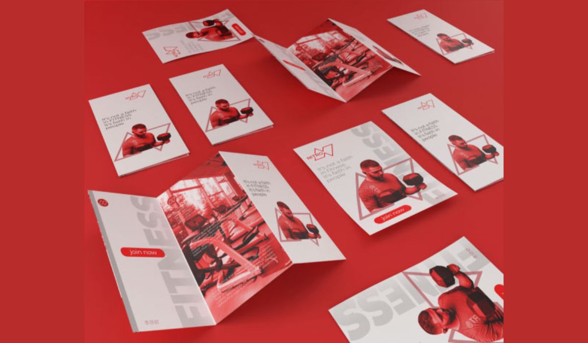
Take a look at the example above: you immediately see the consistent theme. To achieve this in your own materials, focus on a few design fundamentals:
- Color Consistency: Always use your official brand palette. If your logo is navy blue and gold, every stationery piece should carry exactly those shades. As noted earlier, consistency in color builds both trust and recognition.
- Typography: Use the same fonts (or a defined font pairing) for headings, body text, and accents. If your brand uses a modern sans-serif for titles and a classic serif for body copy, stick to those across cards, letterheads, and documents.
- Logo Placement: Choose a spot for your logo (e.g., top-left corner or centered in header) and use it every time. Random placement can look sloppy; uniform placement creates an immediate visual cue that it’s the same brand.
- Graphics & Layout: Any graphic elements, patterns, or photo styles should align. If you favor clean minimalist lines, keep them. If your brand aesthetic is bold and colorful, carry that style through. Margins, spacing, and formatting should follow a cohesive grid so every page “reads” like part of one book.
- Material Quality: Even paper quality and finish can play a role. Using the same type of paper stock or printing finish (matte, gloss, textured) for all items ensures a consistent feel. For example, a thick smooth business card and a flimsy folder look mismatched.
By treating stationery as a comprehensive design system, you remove guesswork. Designers or printers can simply follow the playbook. The result is that every client touchpoint – be it a crisp letterhead or a reminder invoice – reinforces your brand identity seamlessly.
The Data Speaks: Recognition and Consistency
It’s not just design snobbery – there’s real data behind the power of consistency. Research finds that standardized branding has a measurable impact. For instance, DesignRush cites studies showing a signature color boost recognition by about 80%.
In practice, this means if your stationery always uses that one bold hue, people are far more likely to remember your brand. Another study notes it can take 5–7 exposures to a logo or design before a consumer truly recognizes it. Each stationery item you hand out or mail provides one more exposure. Cumulatively, your brand becomes familiar rather than forgettable.
Consider loyalty too: consistent branding helps build trust. Print and marketing pros note that when people recognize your branding easily, they feel more comfortable buying from you. (In fact, companies report that consistent branding can boost revenue growth by 10–20%, since customers stick with brands they recognize.)
Every consistent stationery piece – the matching business card, the branded invoice, the uniform contract envelope – subtly tells the story that you’re reliable and professional. It’s why even in our screen-saturated age, we value the tactile connection of high-quality stationery.
To put it in perspective, here’s a quick comparison of what consistency does versus what a haphazard approach risks:
|
Aspect |
Consistent Stationery |
Inconsistent Stationery |
|---|---|---|
|
Brand Recognition |
Reinforces identity with every use (customers remember you). |
Confuses customers; each piece looks unrelated to the last (message gets lost). |
|
Credibility & Trust |
Signals professionalism and care. Clients think “they value quality.” |
Suggests carelessness. Mismatched design can make you look disorganized. |
|
First Impression |
Creates a polished, memorable impact. People feel impressed from the start. |
Risks a poor first impression. A cheap-looking letter can hurt your reputation before you speak. |
|
Brand Recall |
Builds familiarity through repetition. Repeat exposures stick. |
Missed opportunities. Without reinforcement, your brand forgets to stick in minds. |
Conclusion
In the end, stationery design isn’t decoration – it’s branding in action. A consistent stationery suite is like a chorus of brand voice across all your paper communications. It tells a unified story, turning routine documents into trust signals and marketing tools. From the moment your logo appears on a business card or envelope, consistency starts working: clients recognize you faster, trust you more, and remember you longer.
So take a fresh look at your own materials: Are your business cards and letterheads singing the same tune, or each on a different page? Investing a bit of effort (or professional design help) now means your stationery will work harder for your brand in the long run. When all your pieces click together, your brand becomes that familiar face people know – and keep coming back to.
Frequently Asked Questions
A: Consistency builds familiarity. Each time someone touches your stationery, it’s a subtle reminder of your identity. As experts note, consistent use of design elements (like color and logo) boosts recognition and trust. Over time, these repeated exposures make your brand feel familiar. It’s like hearing a catchy song – you remember it after a few listens. Likewise, uniform stationery turns each handout into brand reinforcement.
A: At minimum, cover the essentials: business cards, letterheads, and envelopes. These are your “face-to-face” materials. Also include presentation folders or brochures and any office forms or notepads you use. Essentially, any paper that leaves your office (or sits on your desk) should carry your visual identity. When every piece – down to invoices and thank-you cards – uses the same style, your whole communication system feels unified.
A: Templates can be a quick fix, but they often lack true cohesion. A professional designer (or dedicated service) will ensure your stationery truly fits your brand vision. They’ll customize fonts, colors, and layouts so everything works together. The benefit is you get unique designs that match your brand style guide – not a generic template that looks like everyone else’s.
A: The biggest mistake is inconsistency. Avoid using slightly different blues on your card versus your letterhead, or random placement of your logo. Another misstep is clutter: cram too much info or design flair and you dilute impact. Instead, prioritize simplicity and consistency. Stick to your brand colors, use easy-to-read fonts, and give elements room to breathe. This way, your stationery looks intentional and polished – never messy or confusing.
A: You shouldn’t need to revamp it often. Consistency means stability, so frequent changes can actually harm recognition. Update only when your brand undergoes a major change (new logo or palette). Otherwise, keep handing out the same trusted design. If anything feels dated or worn (say, paper stock is shabby), simply reprint in the same style. This way, your branding remains strong and continuous.
.png)


Comments
Update Comment