
Instagram Grid Planning: Design Tips for Better Branding
Instagram is the world’s visual town square. With over 2 billion monthly users, your profile is a global storefront. Research shows 62.3% of people use Instagram to follow or research brands.
In other words, your feed is part of your sales pitch. One glance at your grid tells visitors a story: polished and on-brand, or random and confusing. So let’s make that first impression count.
What Is an Instagram Grid?
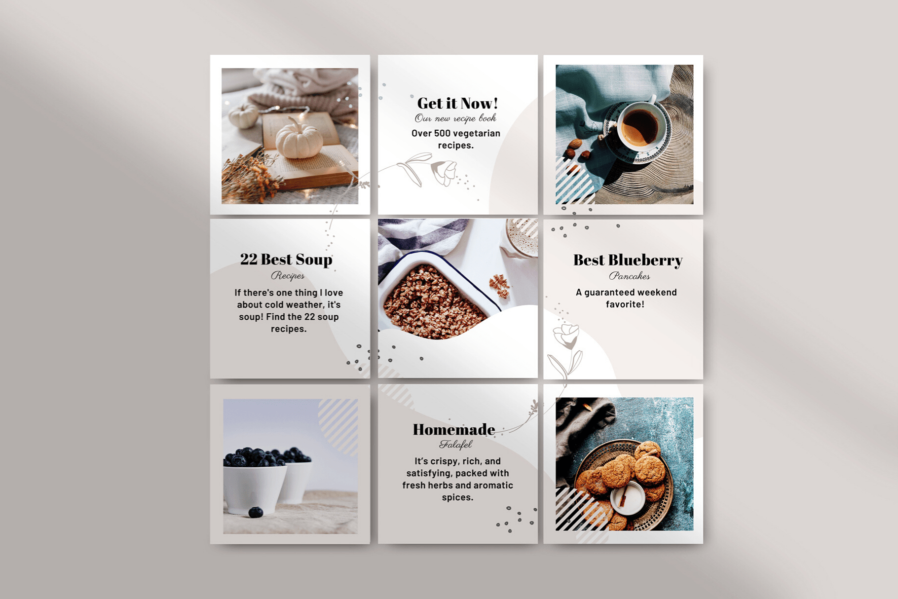
Your Instagram grid is the gallery of posts on your profile, arranged in rows. For brands, it acts like a silent sales page. Every image contributes to a bigger picture of your brand identity.
For example, some designers can create eye-catching Instagram post designs tailored to your theme. This ensures each photo fits your overall vibe. Think of the grid as the cover of a magazine: each square is a pixel in your brand’s portrait.
The grid preview is where consistency really shines. Visitors subconsciously assemble a story by scanning your top nine posts. Are the colors unified? Do the styles match? A cohesive grid immediately signals professionalism. Planoly even touts “we invented grid planning” to emphasize this point. When your feed looks intentional, people trust you more.
Why Instagram Grid Planning Matters
A planned grid is like a branded welcome mat: it guides visitors instantly. Without a plan, one off-color or awkward post can break the whole aesthetic. In contrast, a well-curated grid tells viewers who you are before they read a single caption.
Since so many users discover brands on Instagram, this visual first impression can be make-or-break. Even beyond branding, planning helps your engagement: when you slot in high-performing formats (like educational carousels or quotes) strategically, every piece of content works harder.
Popular Grid Layouts
Choosing a layout gives your feed a clear pattern. Here are some popular styles (pick one that fits your brand and stick with it):
- Monochrome/Color Theme: Pick a signature color (or filter) and use it in every photo. This creates an instant flow. For example, a beach shop might use sandy beiges so the feed looks like a matching set. (Planoly even boasts “we invented grid planning” for feeds like this.)
- Checkerboard: Alternate between two post types (e.g. photo and text graphic) to create a chessboard effect. Many brands do this by alternating bright photos with dark quote slides. It’s a playful yet structured look. For more inspiration, check out this Instagram grid layout guide.
- Rows or Columns: Assign each row (or column) a theme. For instance, Row 1 could be product photos, Row 2 behind-the-scenes, Row 3 quotes, then repeat. This makes your feed feel like a chaptered story. Some brands even dedicate whole columns to certain content (e.g., a tutorial column, a testimonial column, etc.).
- Branded Covers (Carousel Headers): Especially for multi-image posts or Reels, use consistent cover graphics (same fonts/colors) so each carousel starts with a branded slide. Many coaches and agencies do this: each tip or quote begins with a cover image, so the grid has a repeating visual motif.
You can also experiment with color gradients or puzzle-style feeds, but those are advanced. The simplest path is to pick one clear system and execute it consistently.
How to Plan Your Grid
Planning beats random posting. Here’s a concise approach:
- Clarify Your Message: Define who you serve, what you offer, and why it’s unique. Write a short “brand snapshot” (like an elevator pitch): “We help [audience] achieve [result] with [solution].” When someone glances at your grid, they should instantly “get” this message.
- Set Content Pillars: Choose 3–5 recurring themes (e.g. tips, products, community, FAQs). Rotate these pillars in your posts so your grid feels varied but focused.
- Pick a Layout: Refer to the patterns above and decide how your posts will appear in sequence. Sketch a 3×3 mockup or use a planning tool. Decide which post goes in each slot so your theme emerges in rows (or columns).
- Design Consistency: Lock down your color palette, filters, and fonts. For example, always use the same header font on graphics and one filter on photos. Keep key elements (faces, text) centered to avoid the crop edges. Consistent editing makes the grid look unified.
- Preview & Schedule: Always preview your feed before posting. I often map out and preview an entire week of posts in Planoly, catching any clashes before anything goes live. Then schedule your batch of posts so they land in the right order.
By following these steps, you ensure every new image slots into place, rather than throwing off your look.
Tools for Planning
Use apps to test your grid:
|
Tool |
Preview |
Schedule |
Specialty |
|---|---|---|---|
|
Planoly |
Yes |
Yes |
Drag-and-drop visual planner. Free tier available. (“Invented grid planning.”) |
|
Later |
Yes |
Yes |
Visual planner with analytics; multi-platform scheduling. |
|
Preview App |
Yes |
Yes |
Aesthetic-focused with built-in filters. Great free plan. |
Each lets you rearrange upcoming posts in a 3×3 mockup to see how your feed will look. Planoly’s site even says you can “preview how your Instagram feed will look and rearrange until it’s perfect”. Many offer free trials, so try one and make grid-previews a habit.
Common Mistakes
- Inconsistency: Posting images in wildly different styles or colors. Even one rogue photo can throw off your entire vibe.
- Straying from Brand: Chasing every trend or random filter that doesn’t fit your identity. Stick to your palette and style.
- Neglecting Reels/Covers: Forgetting to set a thumbnail for Reels (resulting in a black box in your grid). Always customize video covers so posts blend in.
- Low-Quality Images: Grainy or poorly lit photos. Use basic editing (filters, brightness fixes) so all images look cohesive and professional.
Conclusion
Your Instagram grid is a powerful branding canvas. By planning each post’s place, color, and content, you turn randomness into a coherent, professional-looking profile. Every time someone visits, your grid should quickly tell them who you are and why they should care.
Ready to level up? Start sketching your next posts today, and watch your grid transform into a stunning portfolio of your brand.
FAQ
A: A planned grid is like a strong storefront window. It immediately conveys your brand story and professionalism. Since many users judge a brand by first impression, a cohesive grid can make visitors trust you and hit Follow faster.
A: Consistency comes from sticking to shared elements. Use a fixed color palette and similar editing filters for all photos. Employ the same fonts and layouts on graphics. Always preview your feed in an app before posting—Hootsuite notes that even “one off-beat photo in the wrong color… can throw your whole look out of whack”, so catch those before they go live.
A: Feed-planning apps like Planoly, Later, and Preview let you drag-and-drop posts in a 3×3 mockup and schedule them. Many also offer analytics and hashtag tools. Planoly, for example, has a free trial and an intuitive preview feature. Using these tools makes it easy to maintain a polished grid without guessing.

Comments
Update Comment