
How to Design an Email Signature That Gets More Clicks
In our hyper-digital world, your email signature is like a tiny billboard in everyone’s inbox – often ignored, but always visible. With an estimated 4.6 billion people using email by 2025, every message is a chance to make an impression. Think of your signature as your digital handshake: it should look polished and memorable.
Done right, it can even build trust (about one-third of people see a sharp signature as a key trust signal) and gently guide recipients to click on your links to learn more about what you offer.
Email signatures are not just afterthoughts – they’re powerful mini-marketing tools. As one guide puts it, your email footer is “more than just your company name and title”, essentially a digital business card.
It should contain your full name, title, company, and key contacts – plus clickable links to your website and social profiles – and ideally one clear call-to-action (CTA) like “Book a Meeting” or “See My Latest Offer”.
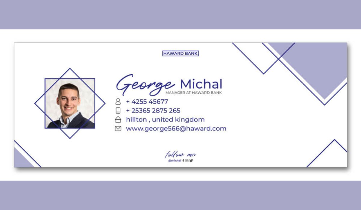
Keep the look clean and on-brand: use only 2–3 colors and 1–2 fonts to avoid visual clutter. For balance, consider placing your crisp logo or headshot on one side and your contact details on the other.
For those who prefer to skip the DIY struggle, investing in professional email signature design can give your sign-off a polished, on-brand look.
What Makes a Clickable Email Signature?
A high-CTR email signature combines clear info with a tempting next step. Key elements include:
- Clarity of Information: Organize content by importance. Make your name and title bold or larger, then list contact details, then any links. A good rule of thumb is name > title > phone > email > website/social. Experts recommend limiting each line to about 72 characters to prevent overwhelming readers.
- Professional Branding: A touch of personality goes a long way. A high-quality headshot (with a neutral background) or your company logo on one side makes the signature more engaging. It humanizes the email – yes, it matters.
- One Compelling CTA: Include exactly one clear call-to-action. For example: “Schedule a Demo,” “Download Free Guide,” or “Visit Our Blog.” Turn it into a button or banner for extra oomph. In fact, adding a call-to-action (CTA) to your email signature can boost clicks by around 371% – it’s basically putting a neon sign in your sig. That single button can quadruple the clicks you get (I can confirm – adding a green “Book a Call” button to my own emails made a noticeable difference).
- Social Media Links: Add a few small social icons linking to your professional profiles (LinkedIn, Twitter, etc.). Most businesses do this now – roughly 80% include social links in their email signatures – but limit to 3–4 icons so the sig stays tidy.
- Visual Hierarchy: Use emphasis and spacing to guide the eye. Put your name in bold first. Use a horizontal divider or extra spacing to separate sections (contact info vs. CTA). This natural flow helps ensure the reader’s eye hits your name, then scans the details, and finally lands on the CTA.
Each design above uses a clear two-column layout: the sender’s logo or photo on the left and text + button on the right. Notice how each signature highlights the name and CTA, making it easy for recipients to know where to click. This balance keeps the signature clean and engaging.
Crafting an Email Signature for Engagement
Surveys confirm the importance of a well-designed sign-off: 52% of people consider a “solid email signature” essential for effective communication. Your signature should invite action without feeling pushy. Here are some savvy tips to boost engagement:
- Use a Button or Banner: Buttons get clicks. Converting your CTA into a colored button or small banner graphic can drastically increase response. Research shows banner CTAs in signatures hit ~7% CTR, and any CTA can shoot clicks up by 371%. In other words, adding that button is like a neon sign – it quadruples engagement. Make the button text direct and benefit-oriented (“Book Time with Me,” “Read Case Study”).
- Write as You Talk: Keep the tone friendly and clear. If you serve different audiences (e.g. B2B vs. B2C), tailor the CTA accordingly. A sales email might say “Let’s connect” vs. a customer newsletter using “Check our latest webinar”.
- Highlight Availability: If you work across time zones, mention your hours or timezone in small text. It’s a small courtesy that builds trust (e.g. “PST” or “Mon–Fri, 9–5 GMT”). This way, people know when to reach out, and it can encourage them to click your scheduling link.
- Optimize for Mobile: Over 55% of emails are opened on phones, so design for a small screen. Keep it single-column, use larger tap targets, and test by sending yourself an email on your phone. Make sure text isn’t too small and buttons have enough padding. Don’t let your sig become unreadable on the go.
- A/B Test It: Try two signature versions on small scales. For example, test “Get Started” vs. “Learn More” as the CTA wording, or a blue button vs. green. Track which gets more clicks. WiseStamp marketing team saw a 22% lift in clicks after optimizing their signature campaign. Let data guide you to the best phrasing and design.
Visual and Technical Best Practices
- Less Is More: Resist the urge to over-design your email signature. A minimalist, clean layout feels modern and professional. Use just 2–3 brand colors and 1 font (or font family). Too many clashing colors or fonts looks messy or even “childish”.
- Readable Contrast: Ensure text is legible. Use dark-on-light text or vice versa. Test in a dark-mode email client – sometimes logos with white backgrounds look awful in night mode. Using a transparent PNG logo and off-white (#F2F2F2) instead of pure white can save you from ugly results in a dark-theme inbox.
- Test Across Devices: Emails render differently in Gmail, Outlook, Apple Mail, etc. Preview your signature by emailing yourself across clients (Outlook → Gmail and vice versa). Check that no lines wrap oddly and all links work. This catches glitches so your signature looks great everywhere.
- Avoid Info Overload: Keep content snappy. No one needs your life story in an email signature. Each line should be concise (remember that ~72-character guideline). If you find yourself writing paragraphs, pare it down.
- Limit Social Icons: More than 3–4 icons starts clutter. Only include channels you use regularly. (If your company has 10 social channels, just pick the top 3 relevant ones.)
- Use High-Quality Images: Any photo or logo in your signature should be crisp. Use clean, high-res headshots or logos sized for screens. If you skip this, recipients on Retina displays will see a blurry mess. Aim for 50–100px height for headshots/logos and compress images to keep load time fast.
- Keep It Compact: Aim for around 600px wide or less. Also keep the file size under ~50KB. Large signatures might be clipped by email clients or slow to load. A lean signature gets delivered more reliably.
Checklist for a Perfect Signature
- Essential Info: Full name, job title, and company (if applicable). At least one contact method (email or phone).
- Brand Element: Company logo or professional photo on one side (aligned with your brand).
- Clickable Links: Website URL and up to 3–4 social icons (LinkedIn/Twitter, etc.).
- Single CTA: One clear action (e.g. “Schedule a Call” button or linked text).
- Simple Design: Stick to 2–3 colors and 1–2 fonts. Text should be legible (around 10–12pt).
- Mobile-Friendly: Single-column layout, tap-friendly spacing, tested on phone.
- Legal/Disclaimer (if needed): Add any required confidentiality notice in fine print at the bottom.
By following these best practices and keeping your design streamlined, your email signature will stop being an afterthought and start pulling in clicks – think of it as your next mini marketing campaign!
Frequently Asked Questions
Keep it concise. Aim for about 3–5 lines of text plus any icons. Include the essentials (name, title, contact) and maybe one line for a CTA or website. If your signature needs an entire scroll, it’s too long.
A professional headshot can add personality if you often email clients. Just use a clear, cropped portrait (no group photos or casual selfies). For more formal or company-wide emails, a logo might be better. One or the other, not both.
It’s generally best to stick to one main CTA, so recipients aren’t overwhelmed. You can periodically switch that CTA (for example, summer promotion vs. holiday special), but in any given signature, keep it singular.
Update whenever your information changes (new phone, new title, new company logo). Also consider seasonal tweaks – like adding a subtle holiday banner or linking to a current promotion. Just remember to remove outdated info promptly.
Yes, many free and paid signature generators exist (from HubSpot, NewOldStamp, WiseStamp, etc.). These provide templates that follow good practices and ensure compatibility. Even with a tool, apply the tips above to refine your signature.
Track the links in your email signature using UTM parameters or URL shorteners. Check your analytics or email metrics. You should start seeing clicks or visits coming from your signature. Regularly A/B test changes (button vs. no button, different wording) and measure which version performs better.
.png)


Comments
Update Comment