

Why Vector Logos Are Essential for Packaging and Print Design
.png)
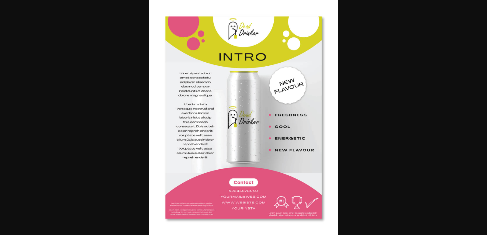
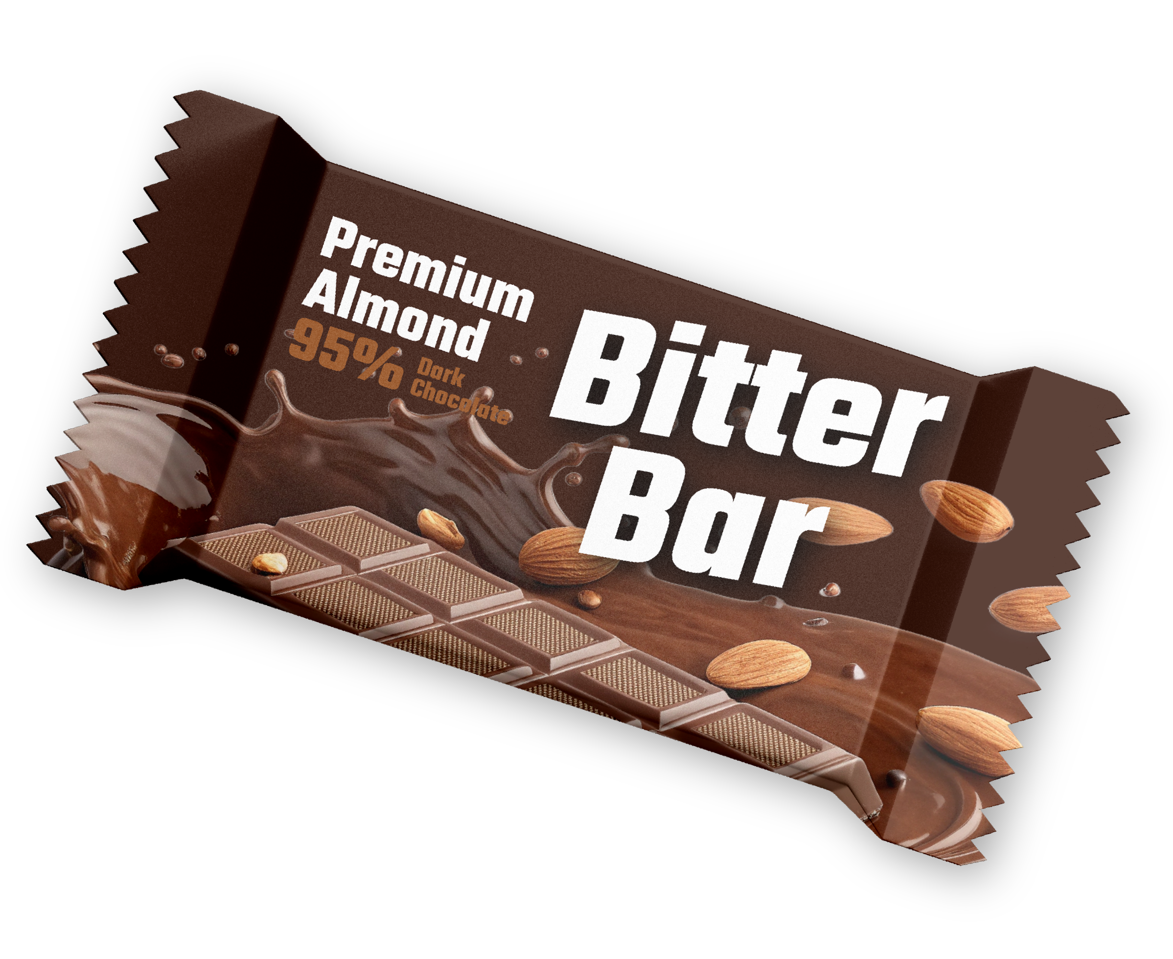
Picture this: you pick up a premium soda can or cereal box and admire the logo printed on it. The design is crisp – no blur, no pixilation – even if you squint or zoom in. That first impression isn’t luck; it’s the power of vector graphics in action. In packaging, your brand’s logo is literally the first handshake with a customer, and it needs to look flawless.
As one packaging expert notes, “if you’ve ever held a premium product box and noticed how impossibly crisp the logo looks… you’re seeing vector graphics at work”. In other words, packaging truly is a silent salesperson – and a vector logo is its clear, confident voice.
What Is a Vector Logo?
A vector logo isn’t an image of colored pixels, but a mathematical recipe of shapes and curves. In plain terms, it’s drawn with points, lines, and curves defined by math – think circles, rectangles and Bézier curves – rather than by a fixed grid of dots. That means a vector logo can be scaled anywhere: from a tiny label on a lipstick tube to a giant billboard, and it will always stay razor-sharp.
As creative professionals explain, “a vector logo is a graphic created using mathematical equations, making it infinitely scalable without losing quality”. In practice that means you can shrink your logo down for a business card or blow it up for a 50-foot banner and it will never blur or pixelate.
When I design logos, I always start in vector form. Working with a brand mark and logo design agency ensures this: they’ll craft your logo as a vector from the start so it stays crisp on any medium.
The benefits are huge. You can freely change colors, tweak shapes, or edit text without quality loss. You can save it as an SVG, AI, EPS or layered PDF and reuse it across marketing materials. This versatility is why vector art is the industry standard for branding: “a clean, sharp logo exudes professionalism,” boosting customer confidence no matter where it appears.
Vector vs Raster: Why Packaging Prefers Vectors
The difference between vector and raster (pixel) images is night-and-day in print. In simple terms:
- Scalability & Quality: Vector images (used for logos) are infinitely scalable. They “stay sharp at any size” because they’re calculated mathematically. Raster images (like JPEG or PNG photos) have fixed resolution and will pixelate or blur when scaled up. For packaging, that means a vector logo will look flawless on a 1.5-inch label or a 4-foot display alike, whereas a raster might turn fuzzy if you stretch it.
- Ideal Uses: Vectors excel at crisp graphics – think logos, text, icons, and dielines. They are the “go-to for branding components” on packages. Rasters excel at photo-like detail (product photos, textures, gradients) but aren’t used for logos. In packaging, that usually means use vector for your brand mark and design elements, and use high-resolution raster images only for photos or complex backgrounds.
- File Size & Editing: Vector files (AI, EPS, SVG) are often smaller and easier to edit because they store the image as formulas, not millions of pixels. You can change a vector logo’s color or shape instantly. Raster files need more pixels and can get very large at high quality. Editing a raster logo later risks quality loss.
- Print-Readiness: Printers generally require vector for logos. For example, any text or barcode on packaging must be vector-outlined to print correctly. Raster logos would force printers to rasterize them at high DPI (usually 300 dpi for packaging), but even then they could look “soft” or have banding under close inspection. In contrast, vectors ensure “every curve… communicates quality before the customer reads a single word”, no matter the print method or substrate.
|
Feature |
Vector Logos |
Raster Images |
|
Scalability |
Scales to any size without losing quality |
Can become blurry or pixelated when enlarged |
|
Best for |
Logos, text, icons, patterns, and dielines |
Photos, textures, and highly detailed images |
|
File size |
Often smaller because it stores shapes and paths |
Can be larger, especially at high resolutions |
|
Editing |
Easy to resize, recolor, and modify without quality loss |
Editing can be more restrictive and may affect image quality |
Why Vector Logos Matter in Packaging
In real-world packaging, vector logos are non-negotiable. Whether it’s a tiny label on a cosmetic bottle or the logo printed on a shipping box, vector ensures consistency. Modern packaging processes (offset, flexo, digital, etc.) demand precision.
For instance, an offset printing press can reproduce a vector logo with razor-sharp type and solid colors, but a raster version might look grainy or uneven. Packaging designers even have to deal with “dielines” – flat templates with folds and cuts – and only vector art can be reliably aligned to those exact edges.
Think of it this way: if your logo is pixel-based, it’s tied to one resolution. But vector logos “stay crisp on a small stick pack and a large stand-up pouch alike”. They hold fine detail (like tiny text or fine strokes) on even the smallest labels.
They remain editable up until the last minute if a client suddenly needs color or text changes. In short, vector logos offer future-proofing: as your product line grows or trends change, you’ll have a master artwork that adapts.
Consider also international packaging standards. Barcodes, nutrition tables and certification marks must be vector to meet regulations. Even organic or recycling logos come as official vector EPS files. Without vectors, you risk misprints or compliance issues.
In fact, one packaging guide bluntly states: “Always produce barcodes as vector EPS… Nutrition facts panels should be built in vector to ensure every rule and glyph prints at required weight and size”. In other words, not only branding but legal text often relies on vector graphics to meet specs.
Beyond clarity, vector logos simplify the production workflow. Printers can more easily separate colors (CMYK or spot inks) on vectors. If your logo uses a brand color (say Pantone red), a vector file can carry that exact spot color.
When it’s time to print, a vector-based PDF or AI file helps printers avoid surprises. Some creative teams even embed color swatches or use live effect layers on vectors to preview finishes (like embossing or foil) before the job goes to press.
In practice, designers and prepress teams demand vector logos for these reasons. As one authority on prepress summarizes: vector graphics “stay scalable across an expanding product line, remain editable and give prepress the control needed to reproduce your design accurately on press”. In everyday terms, that translates to fewer headaches, faster turnaround, and a product on the shelf that looks exactly as intended.
File Formats and Design Tips
To reap all these benefits, you’ll want to use the right file types. Common vector formats for logos are AI (Adobe Illustrator), EPS and SVG (especially for web and simple graphics). If you save your logo in a layered PDF (saved from vector software), that can also preserve the vectors for print. In contrast, formats like JPEG, PNG, or TIFF are raster-only and should be avoided for final logos on packaging.
When handing off artwork to a printer or packager, remember these tips:
- Outlining Text: Convert fonts to outlines so they become vector shapes. This prevents any substitution issues on the press. (Keep a copy of your original before you do this!)
- Include Color Info: Specify Pantone/spot colors in your vector file for brand-critical elements. Spot colors in vectors ensure consistent prints. Convert any raster images to CMYK and ensure they are ≥300 DPI.
- Bleeds and Safe Areas: Extend any background vectors slightly beyond the trim line (a bleed, usually 3 mm or more) so you won’t see white edges after cutting. Keep important logo elements inside safe zones away from folds or cuts.
- Bundled Files: If your logo references other graphics (like a pattern or clipping mask), either embed them or package the files so nothing is missing.
For a deeper technical dive, see the W3C’s Scalable Vector Graphics (SVG) specification or a design glossary. In practice, though, the golden rule is simple: supply your logo in vector form whenever print is involved. Your packaging designer will then be able to place it seamlessly at any size.
Conclusion
A vector logo gives your brand the flexibility and consistency it needs across packaging, print materials, signage, and digital platforms. Instead of worrying about blurry edges, poor scaling, or limited editing options, you have a clean master file that can adapt as your business grows.
If your current logo is only available as a JPG or PNG, now is a good time to upgrade it. Get your logo professionally created or converted into a vector format so your brand is ready for everything from product labels and boxes to brochures and large-format displays.
Ready to give your brand a sharper, more flexible identity? Get in touch today to discuss your logo design needs and create artwork that is built to work across every size and format.
FAQs
Q: Why can’t I just use a high-res PNG or JPG logo for my labels?
A: Even a high-resolution raster can only go so far. If you scale it up, it will eventually blur or show pixels. In contrast, a vector logo will always be sharp. Printers usually require vector logos for critical elements like barcodes and brand names. If you tried to send only a PNG to a label printer, they’d likely ask you for a vector or a 300+ DPI image at the final size, otherwise your logo might print fuzzy.
Q: How do I know if a file is vector or raster?
A: Check the file extension and behavior. Common vector files are .ai, .eps, .svg, and sometimes PDF or PDF/X files created from Illustrator. If you zoom in on the artwork and it stays crisp, it’s likely vector. Zoom in on a raster (JPEG/PNG) and you’ll see pixels. You can also open the file in Adobe Illustrator: a vector file will show editable anchor points and paths, whereas a raster will look like a flat image.
Q: Can an illustrator convert my old logo to vector?
A: Yes. Designers often trace or use software to convert a logo into vector form. Straight-line and solid-color logos are easier to convert. Detailed photographs are not fully convertable; those stay raster. But any logo — even if originally a JPG — can be manually redrawn as a vector for crisp printing.
Q: What are typical vector formats I should provide?
A: The safest formats are .ai (Adobe Illustrator) and .eps. Also save a layered PDF from Illustrator, which many printers accept (often called PDF/X-1a or PDF/X-4). SVG is great for web and digital uses. Deliver these as your master files so your printer and marketing team have full-quality sources.
Q: Do I need special software to work with vector logos?
A: Yes – programs like Adobe Illustrator or free tools like Inkscape. These allow you to create and edit vectors. However, once created, you can export your logo to common formats (PDF, SVG) that anyone can view. You don’t need a special “vector printer” – regular printers just need the vector file to produce the crisp result.
Q: Why does my logo need to be in CMYK or have Pantone colors?
A: Vector logos often include brand spot colors. In print, packaging must use CMYK or spot inks. If your logo is vector, printers can see the color values and match them. For branding consistency, many designers use Pantone (spot) colors for logos in vector files – these get precisely mixed during printing. Without vector, color conversions can shift and yield off-brand results.
.png)

Comments
Update Comment