

Product Brochure Design: From Product Brief to Final Artwork
In today’s fast-paced market, a product brochure design still packs a punch. Imagine walking past a trade show booth: an eye-catching trifold brochure catches your eye and slides into your hand. That tactile moment can beat an inbox notification.
In the USA, print still cuts through the noise – as neuroscience research shows, physical mail triggers stronger engagement and memory than digital ads. A well-crafted brochure feels personal and lasting.
It gives customers a tangible story of your product that they can revisit – far beyond a fleeting click. In short, a great brochure isn’t outdated; it’s a powerful piece in the buyer’s journey.
Why Product Brochures Matter
A product brochure goes deeper than a flyer. It’s a multi-panel, printed pamphlet that provides detailed information – from features and benefits to imagery – in an easy-to-digest format. According to design experts, brochures “provide more information about a company, its products and its services, at a deeper level than a flyer can”.
This makes them ideal once a prospect has basic awareness and is evaluating products. In practice, trade shows, showrooms, and direct mail campaigns still rely on brochures to seal the deal. They allow your brand to present a coherent story: a bold cover that pulls customers in, followed by panels of value-packed content, and a clear call-to-action to take the next step.
Modern design tools and tips reinforce this: for example, Canva notes that “great brochures include high-resolution images, attention-grabbing sentences… consistent, on-brand color schemes… bullet points… and a compelling call-to-action”. In other words, the format is familiar, but the content must be fresh and on-brand to stand out.
Starting with a Product Brief
Every standout brochure begins with a solid brief. Think of this as your design roadmap. First, define your audience and goal: are you targeting tech-savvy millennials or corporate buyers? What action do you want them to take? Next, gather product details and messaging: list the key features, specifications, and benefits you need to highlight.
Ask: What problem does this product solve? What makes it unique? Include any branding guidelines (logos, fonts, color codes) and tone-of-voice cues from your marketing team.
A professional brochure design agency for your products will often conduct stakeholder interviews or workshops at this stage, ensuring the brochure’s concept aligns with your brand story.
Finally, collect visual assets: product photos, infographics, or charts that illustrate performance. All this information – concise product descriptions, high-quality images, brand colors and logos – forms the foundation of your design.
Laying Out the Brochure
With a brief in hand, decide on the brochure format and size. Common U.S. brochure sizes include 8.5″×11″ (letter) and 5.5″×8.5″ (statement), typically folded. Two popular folds are:
- Bi-fold: Folded once (like a booklet), creating 4 panels. Great for simple presentations or menus.
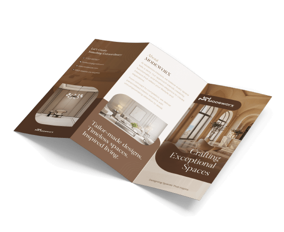
- Tri-fold (letter fold): Folded into thirds, yielding 6 panels. The classic marketing piece, with a cover, back panel, and four interior panels for details.
Other specialized folds include Z-folds, gatefolds, accordion folds, etc., each giving a different reveal or structure (see Wikipedia on brochure folds). The fold you choose depends on how much content you have and how you want the reader to open it. For example, Smartpress notes that a gate fold (panels that open like a gate) “is great to showcase photography or large illustrations” for a “splashy” reveal.
Once you pick a format, sketch a layout: decide what goes on each panel. Many designers use wireframes to block out header, image, and text regions.
Pay attention to flow: typically a brochure’s front panel headlines the offer or product name, with brief text or tagline; interior panels expand on features or benefits in concise sections; the last panel calls out contact info and calls-to-action.
A handy tip from brochure experts is to keep each section self-contained: use descriptive headings, bullet points, and one key image per section so readers can scan easily.
Crafting Images, Color and Copy
With your structure set, focus on visual style. Choose a color palette that reinforces your brand. Limit your scheme to 2–3 main colors to avoid visual clutter.
For product brochures, many U.S. designers follow current trends like bold accent colors, plenty of white space, and high-quality lifestyle images that show the product in use. (Think of an Esquire magazine aesthetic: clean typography with a touch of flair in headlines, and vivid photos.)
Sources like Pixabay or Unsplash are great for placeholder images, but ideally use professional photos of your actual product. Avoid cheesy clip-art or overly stocky looks.
Typography matters too: pick clear, legible fonts. Use one font family for headings (perhaps a sturdy sans-serif) and a complementary one for body text. Consistency is key – match the brochure’s fonts and colors to your other materials (website, packaging, etc.).
Smartpress advises balancing visuals with text “for the biggest impact,” using design tools like Adobe InDesign for layout or drag-and-drop platforms like Canva if you’re DIYing. Whatever you use, be sure to place text within margins and safe areas. Leave plenty of white space (empty areas) around images and copy so the design feels open and readable.
Copywriting should follow these design cues. Keep language clear, benefits-focused, and as concise as possible. A proven approach is one main message per panel: give each page or section a bold header and 2–3 bullet points or short paragraphs.
Canva’s style guide suggests bullets, short paragraphs, and “attention-grabbing sentences” to break up text. Use a friendly, second-person tone (“you”) where appropriate: for example, “Discover how your life changes with X” instead of generic talk.
Always include a strong call-to-action (CTA) like “Call now for a free demo” or “Visit our website to order.” In fact, checking brochure copy is part of every design checklist: we double-check all text for typos or clarity before moving on.
Final Artwork and Printing Specifications
Once design and copy are set, shift to print preparations. First, convert all colors to CMYK mode, since brochures are commonly printed in full color using a four-color (CMYK) process on coated paper. Ensure all images are high-resolution (at least 300 DPI) so they won’t pixelate.
Include a bleed of about 0.125″ (3 mm) on all sides if artwork goes to the edge, so no white borders appear after trimming. Use print-ready file formats like PDF/X-1a or PDF/X-4 and embed fonts or outline them.
Paper choice is also crucial. For tri-fold brochures, many U.S. companies pick a 70–100 lb coated stock (270–300 GSM) for a premium feel. Gloss coating makes colors pop, while matte feels more elegant and easy to read under indoor light.
If you’re mailing brochures, consider heavier stock (170–250 GSM) for durability, as one guide suggests. Decide finish (gloss, matte, or uncoated) based on content: use gloss if you have lots of photos, or matte if it’s text-heavy.
Before printing, use a final proofing checklist:
- Verify every fact, price and phone number. Proofread for grammar or typos.
- Check all images are correctly placed and sharp.
- Make sure brand colors match your standards (compare a print swatch if needed).
- Confirm the brochure’s dimensions and fold align with what the printer expects (tri-fold vs bi-fold, etc.).
- Ensure important content doesn’t fall into the fold or bleed areas.
Ask your print vendor for a physical proof. Hold it, open it, and read it as a user would. Often, you’ll catch something you missed on screen. This step is non-negotiable: smart designers check “fonts, image resolution, borders, and grammar” on a proof before final printing. Only once everyone signs off does the file go to press.
Distributing Your Brochure
With the final artwork approved, think about how and where to use the brochure. Brochures shine in face-to-face settings: trade show give-aways, in-office stacks, or mail-outs targeted to local neighborhoods.
Even digital-savvy audiences appreciate a physical leave-behind. The strategy is to meet customers where they are – at an open house event, in a waiting room, or inserted in a direct-mail campaign.
According to marketing guides, combining digital and print is ideal: print materials can even include QR codes linking to your website or videos, blending channels.
In terms of distribution tips, Venngage suggests leaving brochures in high-traffic spots (shops, cafes, co-working spaces) and using them in sales meetings as a tangible takeaway. Train your staff to hand them out proactively. And don’t forget to recycle or shred old versions – print materials can be updated each season or with new product launches.
For inspiration and templates, tools like Canva’s brochure hub offer thousands of free designs to spark ideas. They reinforce key points: use crisp visuals, branded colors, and clear CTAs for maximum impact. By following these steps – from a clear brief through diligent proofreading – you’ll end up with a product brochure that not only looks great but drives results.
By covering your product brief in detail, following design best practices, and carefully finalizing your files, you’ll have a brochure that looks professional and resonates with readers. Ready to create your next brochure? Roll up your sleeves and start sketching or partner with a design expert and watch your product story come to life in print!
FAQs about Product Brochure Design
What is the ideal brochure size?
The most common US brochure is 8.5″×11″ (tri-fold, yielding six panels). A 5.5″×8.5″ (half-sheet bi-fold) is also popular. Choose based on content volume and distribution (e.g. mailers vs. handouts).
How do I start designing a brochure?
Begin with your product brief: define your audience and core message. Sketch a layout or template, and gather brand assets. Use software like Adobe InDesign for full control, or a platform like Canva for templates. Focus on a single message per section, supported by quality images and bullet-pointed text.
What should my brochure include?
A great brochure typically has: an attention-grabbing cover, concise product benefits inside, high-resolution photos or graphics, consistent branding (colors/fonts) throughout, and clear contact details or CTA on the back. Think of it as a mini-sales pitch: it should entice readers and make them want to learn more.
How do I finalize artwork for print?
Follow prepress standards: convert to CMYK, ensure 300 DPI resolution, set 0.125″ bleed, and export as a high-quality PDF. Paper choice matters too – a coated 100 lb stock with gloss or matte finish is common. Always proof physically to catch any last errors before mass printing.
What is the difference between a brochure and a pamphlet?
A brochure is usually a folded, multi-panel product or service marketing piece, whereas a pamphlet is often a single folded sheet focused on information. Brochures are designed with advertising in mind and typically last longer in circulation.
.png)
.png)
Comments
Update Comment