

What Makes a Bespoke Logo Feel Premium Instead of Generic?

Ever notice how some logos just pop while others leave you yawning? Think of the swoosh on your favorite running shoes or the simple outline of an apple – even without color or words, you recognize them instantly.
These are examples of bespoke logos – custom, one-of-a-kind brand marks crafted just for a company. In contrast, a generic logo might feel flat, as if it came from a clip-art library. In today’s crowded marketplace, that first glimpse of your logo makes or breaks a first impression.
After all, people form an opinion about your brand in about 0.05 seconds. A premium logo can spark trust at a glance, whereas a generic one might just trigger “meh” and move on.
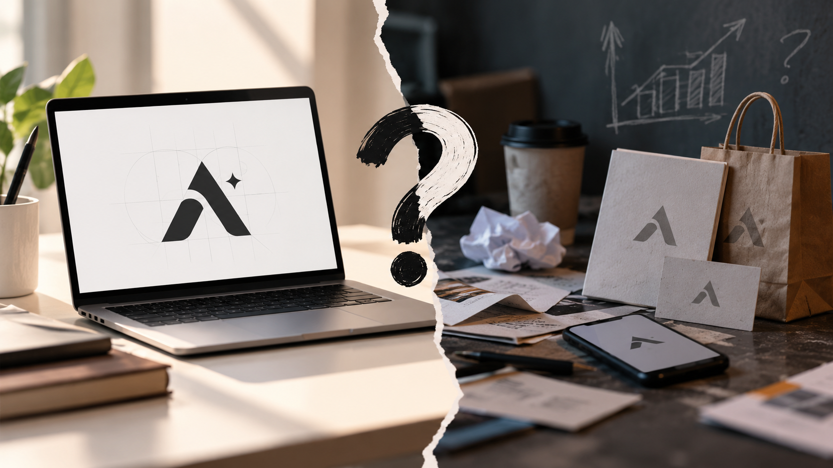
Briefly: a bespoke logo is hand-built to reflect your brand’s unique story, values, and audience – no templates, no shortcuts. It’s like a tailor-made suit versus off-the-rack clothing. Meanwhile, a generic logo often leans on overused symbols (think globes, swooshes, checkmarks) that thousands of other businesses use too.
When your logo looks “been-there-done-that,” it signals a lack of originality – and customers can feel that. The stakes are high, because first impressions last. If your logo feels amateur or uninspired, people might subconsciously think your product or service is too.
Why First Impressions Matter
Your logo isn’t decoration – it’s the face of your brand. In the blink of an eye, customers decide whether you’re worth their time and trust. Research shows a whopping 65% of consumers say their first impression of a brand is based on its logo, and 93% say visual appearance is key in a purchase decision. That means if your logo looks DIY or dated, people assume your business is too.
One marketing expert tells of a shop whose sales jumped after a rebrand: the old logo “looked like it was made in Microsoft Word,” he says. A polished, custom logo signals that you’ve invested thought (and money) into your brand, so people instinctively believe you’re credible.
In contrast, a generic logo sends the opposite message. It’s like showing up to a first date wearing last season’s fashion – not exactly confidence-inspiring. VistaPrint’s guide on logos notes that seeing a logo “you’ve seen before” makes customers think the brand itself is unoriginal.
Why pick a company that looks like everyone else? A truly bespoke logo avoids clichés. It’s designed to make you stand out and say “we’re different” without even uttering a word.
Bespoke vs Generic Logos: What’s the Difference?
A bespoke logo is built from the ground up for your brand. That means custom sketches, exclusive color palettes, and typography crafted to match your identity. Your designer will research your industry, audience, and competitors so the logo tells the right story.
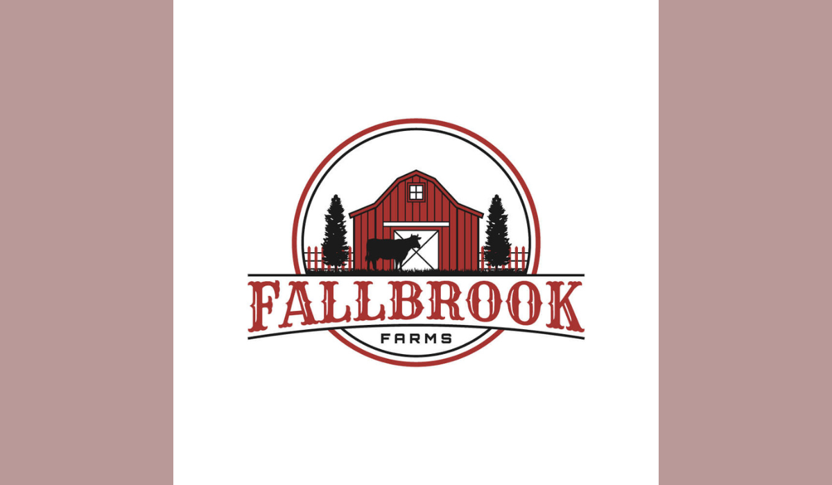
On the other hand, a generic logo often comes from a template or library of clip art – quick and cheap, but everyone’s using the same pieces. Zen Agency sums it up: using a generic template is like trying to fit your business’s unique story into a pre-made box. Those “been-there, done-that” icons and default fonts make your brand blend in, not stand out.
Why does that matter? Because unique logos build legal and emotional value. A bespoke logo is 100% unique (usually trademarkable), while a template design might not even be legally protected.
More importantly, a custom logo carries meaning only you share. Every curve or color reflects something real about your company. Contrast that with a generic globe or swoosh – those say nothing personal about your story.
For example, think about working with a professional bespoke logo design service. Such a team will craft original concepts tailored to your brand essence, rather than recycling a stock image. The result? A logo that feels intentional and premium, rather than one more drop in the ocean of clip-art clichés.
In practice, this means no cheesy clip-art figures, no off-the-shelf icons, and no accidental similarity to another business. Instead, you get an emblem that’s all yours, whispering (or shouting) your brand’s vision.
Key Elements of a Premium Logo
Premium logos often look deceptively simple – but that simplicity is anything but accidental. High-end brands trust that doing less with precision is stronger than cluttering their mark. Here are some hallmarks of a logo that feels luxe:
- Intentional Simplicity: Every line, shape, and space is deliberate. A premium logo doesn’t rely on fancy effects or trendy doodads. Think of Chanel’s double-C or Nike’s swoosh – minimal, yet unmistakable. Clean, minimalist designs signal confidence and self-assurance.
- Elegant Typography: Custom lettering or refined fonts give exclusivity. Premium logos often feature bespoke typefaces or carefully chosen fonts with strong contrast (thick vs thin strokes) and ample letter spacing. Because those unique letterforms can’t be found in a clip-art set, they immediately feel high-end.
- Timeless Color Palette: Forget neon or trend-driven colors. Luxury logos stick to classic tones – black, white, deep navy, forest green, or metallics like gold and silver. These colors evoke sophistication and stability. They “age well” without screaming “2026 hot pink” and needing an update next year.
- Ample Negative Space: White (or transparent) space is a premium brand’s secret ingredient. By giving the logo room to breathe, you create balance and focus. A lot of empty space tells the eye this brand doesn’t need to shout – it’s secure and refined.
- Meaningful Symbolism: If there’s an icon, it’s usually stripped-down and symbolic, not a literal illustration. Think famous luxury logos like Louis Vuitton’s interlocking L and V or Gucci’s double G: they’re memorable yet abstract. Those marks work on everything from hangtags to storefronts without losing impact.
- Precision and Balance: A premium logo feels “just right.” Lines have consistent thickness, curves are smooth, and the whole mark is either symmetrical or thoughtfully asymmetrical. There’s no wobble or random flair – every tiny detail is considered, reflecting craftsmanship.
Good logos can even tell a story. Often, behind a luxury brand’s mark is a bit of history or meaning. For instance, an upscale fashion brand might subtly reference its founder’s initials or an iconic symbol from its heritage. When customers sense that a logo has a hidden nod or rationale, it feels more intentional and enduring. In short, premium logos have both style and substance.
The Story Behind Your Logo
A logo isn’t just decoration – it’s a story starter. The best bespoke logos have layers of meaning connected to your business. Maybe the icon honors where the company began, or the shapes hint at the industry in a clever way. These details resonate subconsciously. They say, “Someone thoughtful created this logo just for you.”
As one Forbes contributor notes, a good logo becomes the shorthand for everything your brand is and does. Kids can guess Disney or McDonald’s from black-and-white logos alone – that’s power. Ross Kimbarovsky (founder of Crowdspring) puts it bluntly: pre-made templates are a terrible idea long-term.
They can’t reflect your brand’s essence, and thousands of other companies will have near-identical logos. A bespoke logo, by contrast, is built on a solid brief: your values, mission, and personality come first. In practice, this means your logo can communicate instantly who you are – whether it’s playful, authoritative, innovative or classic.
Consider an example: a local bakery had a generic cartoon cupcake logo that anyone could mistake for another cake shop. When they worked with a designer to create a custom logo, the new design incorporated a stylized grain (a nod to their organic flour) and a warm serif font suggesting hominess.
Suddenly the logo spoke their values – something a stock cupcake icon never could. This story-meets-design approach is what makes a bespoke logo feel premium.
Boosting Your Brand with a Premium Design
Investing in a bespoke logo isn’t vanity – it’s smart branding that pays off. A custom, professional logo signals quality and immediately builds credibility. In fact, research shows that well-designed logos make brands seem two to four times more credible than ones that look homemade. A crisp, original logo tells customers “Yes, we’re legit.” Every marketing dollar you spend then works harder, because people aren’t distracted by a subpar logo first.
There are hard numbers to prove this. Well-crafted logos can boost brand recognition by up to 80% and increase consumer trust by 40%. In plain language: if you’re funneling ad traffic to a site whose logo screams “I didn’t invest in design,” you’re literally burning money. On the flip side, a premium logo plus a simple brand style guide lays a foundation that makes all your marketing more effective.
Generic logos also come with hidden costs. Forbes reports that ready-made logos are a “terrible idea” because they can’t convey uniqueness. Worse, if your logo looks cheap or unprofessional (pixelated, clip-arty, or cliché), people may subconsciously associate that with your product.
One trust expert puts it this way: your logo “signals professionalism” or lack thereof. If the signal is weak, you may lose customers before you even get to tell them how great you are.
In summary, a bespoke logo is built to earn trust and recognition. It’s an investment that lets you charge premium prices and stand out. The logo itself doesn’t do miracles, but it opens the door. Once you’ve piqued interest with a premium-looking logo, everything from your product to service quality must follow through to truly lock in loyalty.
How to Get a Custom Logo
If all this sounds good, how do you actually get a bespoke logo? The key is to work with creative professionals who follow a thoughtful process. Typically, that looks like:
- Discovery & Research: Your designer asks about your business, audience, and competitors. They dig into what makes you different so the logo can highlight that.
- Brainstorming & Sketching: Instead of firing up Illustrator first, designers sketch dozens of ideas on paper. This frees creativity and lets them explore shapes quickly.
- Digital Development: Top concepts get turned into vector designs in software. Here, geometry and spacing are fine-tuned for precision.
- Typography & Color: Designers choose or create a typeface that reflects your tone, and pick colors based on psychology (e.g., blue for trust, warm tones for friendliness).
- Refinement: You’ll review options and give feedback. A good process might involve multiple revisions until every detail feels right.
- Finalization: Once approved, you get all the logo files (vector, PNGs, color versions, etc.) plus guidance on how to use it consistently.
Having a premium bespoke logo design service at this stage ensures you’re not left with a generic, uninspired result. Their expertise means they know current trends (and when to avoid fleeting fads), can introduce creative ideas you’d never think of, and will deliver a logo that scales from your website down to your pens. They’ll also help you protect your logo legally and technically (vector files, multiple formats, color profiles, etc.).
It’s like hiring an architect versus buying a house plan from a brochure. The custom path costs a bit more, but you get a truly custom fit. And just like custom home builds, every small feature in your logo has meaning and contributes to a premium feel.
Conclusion
A premium, bespoke logo is far more than a pretty picture – it’s the essence of your brand in a graphic. By being unique, meaningful, and expertly crafted, a bespoke logo speaks quality and builds trust right away. In contrast, a generic logo feels impersonal and forgettable.
So when you’re building or refreshing a brand, remember: don’t skimp on the face of your business. Invest in a custom logo that captures your story. You (and your customers) will feel the difference every time your logo appears on a business card, billboard or website banner.
Ready to elevate your brand? Consider working with a professional bespoke logo design service to create a logo that’s uniquely you and undeniably premium.
Frequently Asked Questions
A: A bespoke logo is custom-made for your brand, while a generic logo uses templates or common graphics that lack originality.
A: Simplicity keeps every element intentional. Clean typography, balanced spacing, and fewer details can create a more refined, confident look.
A: A polished custom logo signals professionalism and shows that you’ve invested in creating a thoughtful, trustworthy brand identity.
A: It can. Template-based logos may look similar to competitors and make your brand feel less distinctive or professional.
A: Define your values, audience, and visual preferences, then collaborate with an experienced designer who can turn them into a distinctive logo.
A: Costs vary widely, from hundreds to several thousand dollars, depending on the designer, research, concepts, revisions, and final deliverables.
.png)
Comments
Update Comment