

How to Turn Your Company's History Into a Modern Heritage Logo
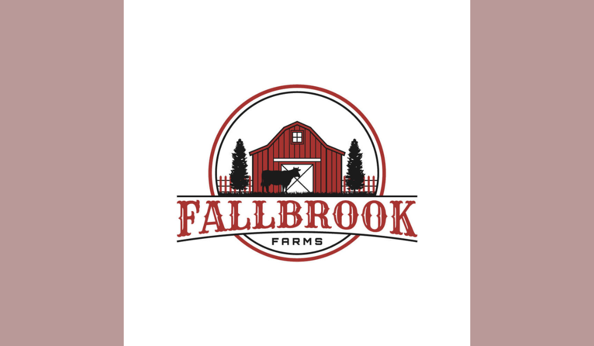
A company can collect decades of history and still end up with a logo that feels strangely anonymous. Maybe you have a founder’s signature, a storefront sign from 1958, a family crest, an old delivery truck, or packaging customers still remember. The opportunity is not to make those things look “retro.” It is to decide which pieces of the past deserve a role in the future.
Brand heritage goes deeper than nostalgia. Research published in the Journal of Brand Management defines it through a company’s track record, longevity, core values, meaningful symbols, and belief that its history matters. History gives you raw material; strategy decides which parts become identity.
If your archives contain strong visual clues but you are unsure how to translate them into something current, professional heritage logo design can turn those clues into a usable identity while preserving the story behind them. The linked service specifically focuses on communicating a brand’s background, values, expertise, and story through vintage and retro inspired identity work.
A modern heritage mark should create continuity, not costume drama. Consumer research into corporate heritage brands found that people judge authenticity through connections between a company’s past and present, along with symbols and communications that remain meaningful over time.
That distinction matters. A logo can look old without carrying genuine heritage, and a genuinely historic company can use a crisp, modern identity without abandoning its roots. Academic work treats brand heritage as something grounded in history, values, symbols, longevity, and track record, rather than simply an old fashioned visual treatment.
The process rewards a little detective work. Old invoices, labels, uniforms, storefront photos, ads, packaging, patents, founder correspondence, and employee memorabilia can reveal recurring shapes, phrases, colors, and symbols.
The Library of Congress notes that researching historical companies can require creativity and may involve company websites, state records, directories, news archives, and other sources.
Before you revive an old emblem or rebuild a forgotten wordmark, check whether it could create a legal conflict. The USPTO Trademark Search system lets you research federal marks, and the agency recommends checking similar trademarks and designs because similarity can involve appearance, sound, meaning, or overall commercial impression.
Start With the Story, Not the Sepia Filter
I think of the first stage as an identity dig. You are not hunting for the oldest object in the building. You are looking for evidence of what the company repeatedly stood for.
Start with three questions: What did the company become known for? Which values survived changes in leadership, products, or markets? Which visual cues would longtime customers recognize without a caption?
Those questions matter because research on brand heritage repeatedly points to track record, longevity, core values, symbols, and continuity as central ingredients. Consumer focused research also suggests that origins and signs repeated over time can contribute to perceptions of authenticity.
Then create a disciplined archive. Record the date, source, context, and story behind each artifact. Twenty pieces with clear provenance may give your designer more meaningful direction than hundreds of vaguely vintage Pinterest images.
And verify the stories.
If the founder really sketched the first mark on an invoice while waiting for a customer, fantastic. That detail has character. If nobody can confirm it, however, do not turn office folklore into a permanent brand claim. Authenticity works better when your visual story has evidence behind it, especially because heritage consumers may evaluate a brand through its links to real origins and continuity.
|
Historical clue |
Modern design opportunity |
What to avoid |
|
Founder’s signature |
Simplified signature wordmark |
Preserving every shaky stroke |
|
Old factory stamp |
Compact emblem or secondary badge |
Fake distressing everywhere |
|
Storefront lettering |
Custom letterform inspiration |
Blindly copying an old typeface |
|
Long used symbol |
Redrawn, simplified icon |
Replacing it just because it looks old |
|
Founding place or year |
Supporting seal or lockup |
Using claims you cannot verify |
A Heritage Logo becomes stronger when each element has a reason to exist. That reason might come from a product, place, founder, craft tradition, or symbol customers have seen for years. Decoration alone does not create heritage. The underlying history does.
Choose the Historical Signals Worth Keeping
Here comes the difficult part: subtraction.
Company history can hand you dates, buildings, initials, tools, founders, hometown references, slogans, crests, seals, and product illustrations. Put everything into one badge and you do not have a logo. You have a very tiny museum.
Instead, choose one or two memory anchors.
These are visual elements with genuine continuity or meaning, such as:
- a distinctive initial or wordmark shape
- a recognizable animal, tool or object
- an established color relationship
- a founder’s signature
- a geometric frame or emblem
- an important place or year
Consumer research into heritage brands found that signs can develop symbolic meaning through repetition over time. The same research stresses that people value continuity while still allowing brands to evolve.
There are excellent American examples hiding in plain sight.
The USPTO’s Trademark Trail shows how Morton has refreshed its famous umbrella carrying girl over the years instead of throwing the character away. IBM hired designer Paul Rand to reshape its visual identity and later streamline it into the striped version still associated with the company. Atari’s “Fuji” symbol has survived ownership changes and decades of technological change.
That does not mean your company should imitate any of them. Quite the opposite.
The lesson is that modernization does not always require visual amnesia.
A strong Heritage Logo keeps the element that carries recognition, then removes the clutter around it. Think tailored suit, not costume rental.
Modernize the Heritage Logo Without Erasing Its Character
Once you know what deserves to survive, simplify with a light hand.
Start with silhouette and proportion. Remove tiny details that vanish at small sizes. Clean awkward spacing. Simplify lines that add noise but no meaning.
Then ask a brutal little question: If I remove this element, does the brand lose part of its story?
If the answer is no, the element might simply be decoration.
Typography needs the same restraint. Historic storefront lettering often contains wonderful personality, but that does not mean you should download a distressed “Old Time Saloon No. 7” font and call the project finished.
Instead, borrow specific traits from the original lettering.
Maybe the capital R has an unusual leg. Perhaps the A has a wide stance. Maybe the founder’s script has a particular rhythm. A designer can preserve those recognizable details while creating cleaner letterforms that work on modern screens and print.
Color deserves careful treatment too. Consumer research on heritage authenticity has found that repeated visual signs, including colors, can acquire meaning through consistency over time. If one shade has followed your company for decades, consider whether it has earned recognition before casually replacing it with this year’s fashionable palette.
Most importantly, test the mark without all the vintage theater.
Remove the textured paper. Remove fake ink wear. Kill the shadows. Hide the sepia mockup.
Now look at the logo in solid black.
Does it still have character?
If yes, excellent. If not, the atmosphere may be doing more work than the actual design.
Build for Modern Brand Touchpoints
A century of company history may now need to fit inside a tiny social profile image.
Slightly absurd? Absolutely.
Still a real design challenge.
Do not force one complicated emblem into every space. Instead, build a flexible logo system.
Your primary logo might carry the complete wordmark. A compact symbol can handle profile images and smaller digital placements. A secondary seal might carry the location, founding year, or historic phrase for packaging, signage, merchandise, or anniversary campaigns.
That approach also suits the larger idea behind corporate heritage design. Scholars describe successful heritage brands as connecting the past, present, and future rather than freezing themselves in one historical moment.
Test your Heritage Logo in situations customers will actually see:
Phone screen → Website header → Business card → Product packaging → Storefront → Large signage
Then go small. Really small.
If the illustration turns into visual oatmeal at thumbnail size, simplify it.
Next, place the identity beside several competitors. A handsome heritage inspired mark that looks almost identical to ten other circular badges in your category has lost the very distinctiveness history was supposed to give you.
Finally, prepare clean vector artwork and rules for spacing, typography, color, logo variations, and appropriate usage. The vintage logo service referenced earlier likewise emphasizes source files, timeless concepts, and storytelling, reinforcing the practical value of treating a logo as part of a wider identity system rather than a one off graphic.
Keep the Heritage Honest
There is one creative shortcut I would avoid completely: inventing history because history looks premium.
Adding “Est. 1927” to a company founded in 2021 does not magically produce gravitas. Mostly, it produces questions.
Research draws an important distinction here. Brand heritage involves actual track record, longevity, values, symbols, and a relationship with organizational history. Consumer research also connects authenticity with credible origins and continuity between what a company represented before and what it represents now.
A Heritage Logo therefore works best when it edits real history rather than manufactures a costume.
That does not mean young companies cannot use classic visual language.
Of course they can.
A new coffee shop can use lettering inspired by traditional sign painting. A young clothing company can commission an engraving style illustration. A startup can use a monogram that nods to nineteenth century stationery.
Just describe the approach honestly.
Vintage inspired describes an aesthetic.
Heritage suggests a meaningful relationship with an organization’s real past. That distinction follows the academic concept of brand heritage, which ties heritage to history and enduring organizational characteristics rather than appearance alone.
You should also think about intellectual property before launching a redesigned mark. The USPTO defines a trademark as a word, phrase, symbol, design, or combination that identifies the source of goods or services, and it specifically provides tools for searching both word marks and design elements.
A designer can shape the identity. When legal risk matters, qualified U.S. trademark counsel can evaluate that risk.
Conclusion: Let the Past Earn Its Place in the Future
The best Heritage Logo does not look as though someone locked it in an attic for 80 years. It feels familiar for a reason, yet it works wherever a modern company needs to appear.
Start with evidence. Find the symbols, values, places, products, and stories that survived. Keep the few elements that carry genuine meaning. Simplify carefully, test the result across real applications, and resist decorative nostalgia that has nothing to do with your company.
That approach closely matches what heritage branding research emphasizes: continuity, meaningful symbols, authenticity, stewardship, and a connection between a brand’s past, present, and future.
Your company's past may contain better creative material than any trend board ever could.
The job is not to copy yesterday.
It is to decide what deserves tomorrow.
Ready to turn your company's history into a logo that feels timeless and works for today's audience? Contact us to create a heritage-inspired logo that honors your story and moves your brand forward.
FAQs About Modern Heritage Logo Design
What makes a logo a Heritage Logo?
A Heritage Logo draws meaningful cues from a company’s genuine history, origins, enduring values, track record, or long used symbols. Simply adding an old fashioned font or an “Est.” date does not automatically create heritage. Academic definitions place much greater emphasis on real history, longevity, core values, symbols, and organizational continuity.
Should a Heritage Logo include the company's founding year?
Only when the date is accurate and genuinely adds value. A founding year can reinforce a sense of provenance, and research into consumer perceptions of heritage brands has identified origins and founding information as potentially relevant authenticity cues. However, you do not need to squeeze the date into your primary logo. A secondary seal may handle it more elegantly.
Can I modernize an old logo without losing brand recognition?
Yes. The goal should often be evolution rather than unnecessary replacement. The USPTO documents how Morton periodically refreshed its historic character and how IBM streamlined its visual identity while maintaining recognizable continuity.
What is the difference between a vintage logo and a Heritage Logo?
A vintage logo uses visual references associated with an earlier period. A Heritage Logo ties those visual choices to the company’s actual history or enduring identity. The two styles can overlap, but genuine heritage needs more than an antique aesthetic.
Should I reuse my company's original logo?
Not automatically. Keep it when the core shape remains distinctive, legible, relevant, and practical. Consider redrawing or carefully simplifying it when tiny details, poor scalability, dated messaging, or technical limitations make it hard to use. Because logos can function as trademarks, also investigate relevant trademark issues before bringing a dormant identity back into active commercial use.
.png)
.png)
Comments
Update Comment