

7 Product Label Design Mistakes That Can Hurt Your Brand
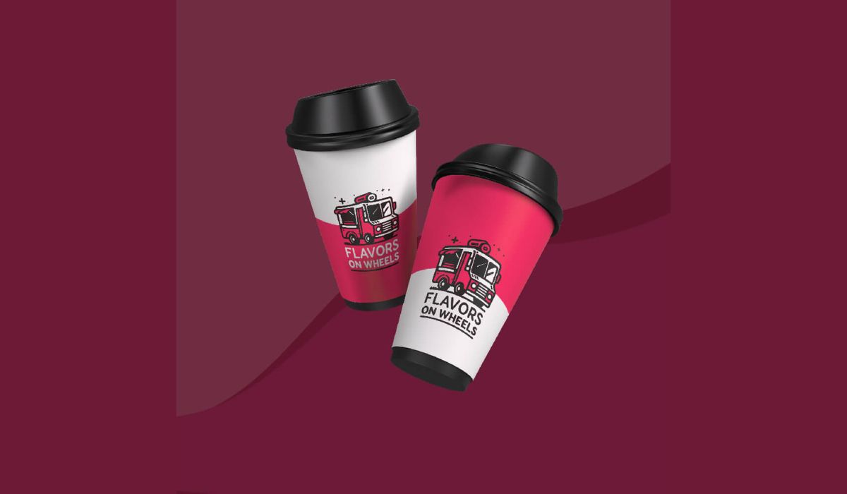
Imagine strolling down a store aisle, coffee in hand, scanning shelves for your favorite snack. You pick up one product and instantly feel a spark – the label’s vibrant color pops, the logo feels familiar, and the message is crystal clear. That emotional jolt is no accident.
In the USA’s hyper-competitive market, your product label design is a silent salesperson. It’s the first handshake between your brand and the customer. But all too often, brands trip up with avoidable missteps.
In this article, we’ll unpack seven common label design mistakes that sabotage your brand’s impact. Trust us: skipping these pitfalls can make your product fly off the shelf instead of fading into the background.
From tiny text that no one can read to forgetting legal fine-print, these blunders not only hurt sales but can erode trust. We’ll dive into each mistake, sprinkle in expert insights, and even share my own experiences with wacky label fails.
A quick fix can save you from fines or a flop. And if you ever feel out of your depth, remember that partnering with the Best Product Label Design Agency can help navigate these waters with style. So grab your sharpie (just kidding, don’t scribble on your expensive packaging!), and let’s explore these costly traps.
Mistake 1: Illegible Typography and Tiny Fonts
Ever seen a label where the brand name is bold but the ingredient list is scrawled in microscopic cursive? Yikes. One of the most brutal mistakes is using fonts that look great on-screen but vanish in print.
Designers often zoom in 200–400% on their monitors; a fancy font that’s easy to read at that size can become an indecipherable blur when printed at just 2–3 inches wide.
If you can’t read the product name or key details from arm’s length, a hurried shopper definitely won’t. In practice, that means testing your label at full size and real conditions before finalizing.
Pro Tip: Always proof your label by printing it out and holding it at “shopping distance.” Can you read it with your glasses on? If not, bump up the font. (Yes, I’m looking at you, tiny allergy warning text.)
Poor contrast can add to the problem. If your label background is busy or colors clash with your font, even larger text gets lost. For example, light green text on a pale yellow label – beautiful on Pinterest, but try reading that under fluorescent lights! High contrast and ample white space around text blocks ensure your message pops.
Remember: good typography isn’t just about aesthetics, it’s about communication. By choosing clean, bold fonts and avoiding overly decorative scripts for crucial info, you make sure customers absorb your message instantly.
- Never assume screen = real life. A font that looks sharp on a retina display might smear on paper.
- Use hierarchy. Your product/brand name should pop. Secondary info (like flavor or key benefit) comes next. Fine print (ingredients, disclaimers) goes last – but still, make it readable!
- Contrast is king. Dark text on a light background (or vice versa) is easiest to read. Avoid green-on-red or similar tricky combos.
Getting typography right is the foundation of legible labels. It’s also one of the easiest mistakes to fix early on. Do this, and you won’t accidentally send consumers squinting past your product to competitors’.
Mistake 2: Blending In – Ignoring Competitors and Your Brand Story
Your product’s label doesn’t float in isolation; it’s on a shelf right next to rival brands. A critical mistake is designing a label without considering the shelf context and brand identity. In a word: don’t blend in.
If your packaging looks just like everyone else’s, shoppers will skip right by. For example, if all similar products use cool blues and minimalist fonts, standing out might mean a bold accent color or a quirky illustration that tells your brand’s story.
Think of it this way: your label’s job is identification. When a loyal customer scans the shelves, they should spot your brand in a flash. If your design accidentally mimics a competitor or ignores your own brand vibe, you confuse buyers.
As one design expert puts it, shop owners should “buy or photograph every competing product” and test if their mockup stands out and fits the right category vibe. This also means knowing your audience. A fun, playful font and bright colors might thrill kids’ snack buyers, but those same elements could hurt a luxury wine bottle’s credibility.
- Stay on-brand. If your cosmetic line is about clean, organic beauty, a neon graffiti-style label will send mixed messages.
- Mind the competition. Place your label next to similar products while designing. Does it scream “PICK ME!” or whisper “who are you?”
- Leverage shelf presence. Unique shapes, textures, or even packaging form factors (like a hexagonal box) can help your product leap out at first glance.
Ignoring these factors is like painting your billboard in stealth camouflage – pretty to you, invisible to customers. Avoid this by putting yourself in the shopper’s shoes: would this label catch your eye? If not, it might be time for a redesign or bold accent.
Mistake 3: Choosing the Wrong Material or Finish
Imagine a gorgeous label printed on plain paper stuck on a bottle that lives in the refrigerator or gets tumbled in a gym bag. Not ideal. A common pitfall is selecting inappropriate materials and finishes for the product’s real-world use.
The wrong choice says to customers: “We didn’t test this in real life.” For example, paper labels on a sweaty beer bottle will wrinkle and peel. A gorgeous lamé gold finish on a kids’ juice bottle might scratch off under sticky fingers. Each mismatch tells customers you cut corners on quality.
Consider where and how the product will be used. Will it sit in humidity, be exposed to sunlight, or need to withstand shipping rubs? Here are some frequent misfires:
- Laminating vs. Matte. A matte finish can look elegant, but it’s prone to scuffs. Gloss or satin finishes protect against handling abrasion.
- Adhesives and environments. Standard adhesive might fail on cold glass. Waterproof or freezer-grade labels prevent peeling on chilled or frozen goods.
- Ink type. On clear or metallic packaging, adding a layer of white ink under color (a “white flood”) prevents colors from looking translucent or washed out.
In short, material is functional, not just aesthetic. The packaging experts at Model Graphics stress that the wrong choice “can lead to smudging, peeling, fading, or water damage,” which directly hurts brand image. One of my own clients once used uncoated paper for a soap label (to look “rustic”), but customers complained it bled in the shower.
We switched to a synthetic waterproof label—suddenly the labels stayed gorgeous, and the brand felt more premium. Bottom line: test samples. If you’re labeling a beauty serum, try it on a prototype glass bottle before the big run.
If it’s a snack pack, take a few prints and leave them in a hot car or the freezer. Investing in the right material up front means never having to apologize for a ruined label later.
Mistake 4: Information Overload and Cluttered Design
In label design, less is often more. Yet brands frequently cram the entire company origin story, ingredient details, usage tips, social media QR codes, and more onto the front panel. The result? A visual train wreck.
New brands especially want to shout everything at once, but the front label’s only job is to make someone grab the product. Everything else should live on a back panel or a website.
This mistake shows up as: tiny text, dozens of fonts, dozens of colors, or a collage of graphics competing for attention. It forces the eye nowhere, confusing potential buyers.
The remedy is restraint. Prioritize your main message – typically your brand name, product name, and one strong visual element (like a logo or key image). Make that the hero; let everything else step back. White space isn’t wasted space – it’s a breath of fresh air for the eyes.
- Keep the front panel focused. Aim for one big “story beat.” For example: the brand logo + product name + one enticing image or benefit claim.
- Move the rest. Nutritional facts, ingredient lists, allergen statements, etc., belong on side/back labels or secondary panels. QR codes (for full stories or promos) can even let people discover more online without cluttering the label.
- Consistent alignment. A tidy grid or flow helps readability. For instance, align all text to one side and leave 20–30% of the label blank for visual breathing room.
Remember the Golden Rule: A confused mind says “no.” If a customer has to work hard to decode your label, they’ll pick something easier. As one design pro puts it, cramming a label with “social media handles, origin story, usage instructions” and everything else just creates “visual noise that communicates nothing effectively”. Simplify, focus, and trust that beauty (and clarity) will do the selling for you.
Mistake 5: Low-Quality Images and Graphics
You wouldn’t buy a print with blurry photography, so why do it on a label? Using pixelated images or amateur graphics is a major design faux pas. Many entrepreneurs pull images from a web gallery at screen resolution (often 72 DPI) and slap them onto packaging. The result: sharp graphics on screen but blurry, jagged prints at the required 300 DPI print resolution. This poor quality screams “cheap,” instantly undermining brand trust.
Always use high-resolution, print-ready artwork. Logos and line art should be vector files (AI, EPS, SVG) so they scale cleanly to any size. Photos and textures should be at least 300 DPI at the final label size.
Before sending to press, zoom in on every element: if any image turns blocky, source a better one. Think of it this way: a crisp, detailed image on your label is a badge of quality. A pixelated mess is like a cracked screen—it looks broken.
In fact, Pixelation and amateur graphics “connote low quality” and damage brand identity. They advise using premium images (often through stock libraries or custom shoots) and careful font pairing.
In practice, that meant one artisan jam maker I know insisted on a high-res raspberry photo taken in a studio (not a blurry smartphone shot). When the jars hit shelves, shoppers could see the luscious berries on the label – boosting sales and underscoring the jam’s artisanal vibe.
- Check your DPI. An easy trick: print a small thumbnail of each image at full size. If you spot fuzziness, get a better image.
- Stay original. Avoid cheesy clip art or widely-used stock images unless they perfectly align with your brand. Original illustrations or custom photography set you apart.
- Quality control. Many label vendors (or agencies) will automatically check your files. But you should request a proof or mock-up first – just to catch any hidden low-res elements.
Ever heard the phrase “your label is the face of your product”? You wouldn’t put a blurred face on a billboards, so don’t do it on your labels. Sharp imagery and clean graphics signal professionalism and build brand trust.
Mistake 6: Overlooking Regulatory and Legal Requirements
This one’s a biggie, especially for US brands. Every category (food, cosmetics, chemicals, supplements, etc.) has hard rules about what a label must include. Forgetting these is like leaving money on the table – it can cost fines, recalls, or worse.
Common slip-ups include omitting allergens, leaving out a nutrition panel, or misprinting units (ounces vs. grams). In fact, experts note that among “common packaging compliance mistakes” are mislabeled allergens, incorrect net quantity statements, and Nutrition Facts formatting errors. These aren’t trivial typos; they can be considered misbranding under FDA laws.
Key label elements (USA) you must absolutely get right:
- Product name. Use the standard/common name, not a fanciful brand-only term.
- Ingredient list. Descending by weight, with major allergens clearly identified. (E.g., spell out “Peanuts,” not just “Nuts.”)
- Net quantity. Display both U.S. customary and metric units (e.g. “16 oz (454 g)”) prominently.
- Manufacturer info. Name and address of the maker or packer (or “Distributed by…” if it’s a distributor).
- Country of origin. “Made in USA” or equivalent if imported.
- Safety/warnings. Any required cautionary statements (like “choking hazard” or chemical hazards with GHS symbols) and in proper font size.
And for foods/beverages: a Nutrition Facts panel is mandatory (even if your product is just water or spices, it still needs a mini table!). Cosmetics and drugs have their own FDA layouts (often called Drug Facts or Cosmetic Facts) that must be formatted exactly.
You can’t design around these elements. Failing to allocate space from the start forces last-minute hacks that ruin your look. As one design specialist warns, “regulatory text is not optional,” so build it in early.
➤ Quick checklist: If you’re unsure, do a quick audit (or hire one). Regulatory bodies like the FDA don’t want you to fail – they want compliance. Model Graphics emphasizes partnering with someone who understands FDA rules to avoid the “missing allergens or ingredient” trap. Because at the end of the day, a compliant label isn’t just legal safe – it’s a signal to customers that your brand is trustworthy and transparent.
Mistake 7: Skipping the Physical Proofing Stage
Finally, never treat a digital design file like the final product. A glowing monitor and an offset press are very different beasts. Skipping a physical proof (or even a prototype sample) is a recipe for disaster.
What looks good in RGB might dull in CMYK ink. A label’s fit on the package – how it wraps, where the cut line falls – only becomes clear when you hold it in your hand.
Always order a test print or sample run before mass production. Experienced label suppliers will offer a printed proof or even a few packaged samples. Use them. Check everything: color accuracy, text legibility, alignment on the container, and yes, those pesky legal blocks.
In one case I know, a client’s label looked flawless on screen, but on the actual glass jar the seam split right through the logo! Catching that with a mock-up saved a lot of embarrassment (and reprinting costs).
Also consider market testing: share a label mock-up with a focus group or friendly consumers to see if it makes sense to them. Sometimes outsiders spot issues we designers miss. The motto here is simple: don’t assume perfection, verify it. A good rule is “measure twice, cut once” – except with labels, it’s print once, test ten times.
The few extra bucks spent on proofs will spare you from wholesale reprints. In contrast, neglecting proofing has caused many brands to silently suffer from mismatched colors, hidden typos, or fatally small print that should have been caught.
Conclusion
Your product label is more than just a wrapper – it’s a window into your brand’s soul. Avoiding these seven mistakes means your labels will not only look stunning, but also communicate clearly and comply fully.
Remember: legibility, clear hierarchy, bold branding, proper materials, high-quality imagery, regulatory compliance, and rigorous testing are the pillars of great label design. Nail these, and you transform your packaging from “just another bottle on the shelf” into a magnetic brand statement.
Think of your label as a brief conversation with the consumer. Make it bold, easy to understand, and genuine. When in doubt, put yourself in your customer’s shoes: What information or feeling would make you pick up this product? By doing that, and by even consulting professionals when needed, you’ll dodge costly errors and elevate your brand reputation.
As trends like eco-friendly materials and interactive packaging (QR codes leading to videos) gain steam, staying on top of design best practices is more important than ever. So, take these lessons to heart, maybe grab a sketchbook, and start reimagining your label. Your brand (and future customers) will thank you for it. Ready to give your label a glow-up? The world is waiting.
Frequently Asked Questions
Any product label must have certain info by law. At minimum, include the product’s common name, ingredient list (with allergens spelled out), net weight (in both US and metric units), manufacturer/distributor contact, and country of origin. Food and drink labels also require a Nutrition Facts panel with calories and nutrients. Of course, your brand name/logo and a clear product image are key for marketing, but not at the expense of these legal essentials.
Readability affects first impressions. Shoppers often “browse” shelves quickly. If they can’t instantly grasp what your product is or see its key benefit due to tiny or confusing text, they’ll keep walking. Clear fonts and good contrast ensure the message is absorbed at a glance. Plus, accessibility matters: easy-to-read labels help everyone, including older customers or people with low vision.
Prioritize ruthlessly. Put only the core promise or unique selling point on the front (brand name, product type, key graphic). Move auxiliary details—full ingredient lists, warnings, stories—to the back or sides. Use bullet lists or icons for complex info, and consider a QR code if you have a lot to say. Clean, minimalist designs often outperform cluttered ones in catching eyes.
Absolutely. Packaging and label design agencies focus on creating labels that look great and sell. They can guide you through font choices, color theory, printing materials, and even the legal must-haves. Hiring experts can save time and money by catching mistakes early and ensuring your packaging reflects your brand identity.
Non-compliance can be costly. For food or cosmetics, the FDA or FTC might issue a warning letter, fines, or force a product recall if key info is wrong or missing. Beyond legal trouble, it erodes trust—customers notice errors. It’s worth double-checking regulations (food-allergen laws, Prop 65 in California, etc.) and possibly consulting a compliance expert.
Always get a physical proof. Order a small batch or sample mock-up and examine it on the actual container. Check color accuracy, text size, and how the label wraps. Show it around to a few people (e.g., colleagues, potential customers) to ensure clarity. This real-world test often reveals issues that no screen preview can catch.

.png)
Comments
Update Comment