

Brochure Design for Contractors: What Homeowners Want to Know
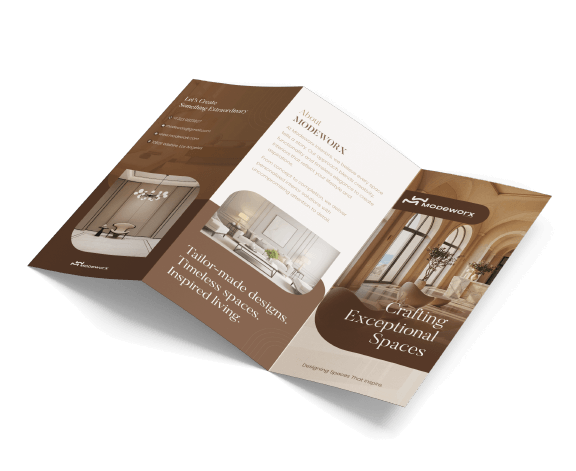
Brochures aren’t relics – they’re your printed handshake with a potential client. In today’s market, a contractor’s brochure is more than paper: it’s a first impression maker. Homeowners often judge reliability within seconds, so a well-crafted brochure can instantly build trust and interest.
Imagine a homeowner leafing through a brochure with crisp photos of your past projects and clear, friendly language; that tangible quality sticks in their mind, even in a digital age. A great brochure feels familiar and trustworthy – like getting a personal note in the mail – and that tactile experience still wins hearts.
Designing a brochure is a blend of art and strategy. You want clear headlines, relatable photos, and an inviting layout. Every choice – from colors to fonts – should make a homeowner feel confident in your skills.
For example, a professionally designed brochure builds confidence and lets you show off real projects. By guiding eyes through images and bullet points, a brochure answers questions before they’re asked.
Why Brochures Matter for Contractors
Contractors live on reputation. A brochure is a concise portfolio: it says, “I’m professional, reliable, and proud of my work.” Homeowners use brochures to vet contractors. A polished tri-fold or booklet can boost credibility and leave something in their hands when you walk away.
Brochures remain a top tool in a contractor’s arsenal: they build trust with clients, showcase completed jobs, and clearly explain your services. In practice, that means your brochure might include checklists of services, photos of recently finished decks or kitchens, and quick testimonials. These elements reassure homeowners: “Yes, they’ve done this kind of work, and they do it well.”
- Builds Trust and Credibility: A high-quality brochure tells a homeowner “we’re serious about our craft”.
- Showcases Real Work: Photos of your latest renovations or roofings let readers see your craftsmanship.
- Clear Communication: Use bullet points to explain your process (permits, timelines) and qualifications, so homeowners aren’t left guessing.
By carefully structuring the content (strong headline, clear sections), the brochure becomes a mini sales pitch. Every section answers a homeowner’s silent questions: “What can you do for me?” “Have you done projects like mine?” “Can I trust you?” Good brochure design ensures those answers jump right off the page, not hiding behind jargon.
What Homeowners Look For in a Contractor’s Brochure
From a homeowner’s viewpoint, the brochure should feel helpful and respectful. They don’t want filler – they want clarity and reassurance. First, simplicity: clear language and straightforward info matter. Use short sentences and a friendly tone.
Homeowners also love visual proof: include real, high-res images of past projects (no stock photos!). Research shows that clear proof and real photos of your actual work build trust. In other words, your brochure should avoid generic marketing fluff and speak directly to homeowner concerns.
Second, brand consistency: the colors, logo, and style in your brochure should match your website and other materials. According to design experts, visual consistency “influences trust, recognition, and perceived credibility”. If your flyer looks like it was made in 1995, homeowners will wonder if you’re cut-rate. Use a consistent color palette and fonts to look professional.
Third, accessibility: make sure text is legible and well-spaced. Large headings and bullet lists help skimmers find what they need. Avoid tiny print – home improvement happens on site or on a clipboard, not in perfect lighting. A smart layout will guide the eye naturally from one section to the next.
Finally, every brochure should point to one clear next step. Maybe that’s “Call for a free estimate” or “Visit our website for testimonials.” An obvious call-to-action (CTA) prevents a homeowner from flicking away without knowing what to do.
Good brochures have a prominent CTA in the place a reader naturally ends – for example, the back page or bottom of the last panel. This turns interest into action: you’ve shown them why you’re great, now tell them exactly how to hire you.
Key Elements of Effective Brochure Design
Designing an effective brochure is about purpose and clarity. Start with your core message. What do you want the homeowner to take away? Maybe it’s “We make home remodeling easy” or “Your local trusted contractor.” That headline should be immediately obvious.
The rest of the brochure should never contradict that main point. Think of it like guiding the reader: context first (who you are), then your offer (what you do), ending with next steps (how to contact you).
Visual hierarchy is crucial. Use headlines and subheads that explain sections – not just catchphrases. They should guide understanding, not just be pretty. High-quality imagery and consistent branding bring it to life. Avoid clip art. Instead, use story-driven images (e.g. a homeowner smiling next to their new deck) that reinforce your message.
Remember: color matters! Studies show 85% of consumers judge a purchase by color alone, and 80% of brand recognition comes from color. For trust, contractors often use blues (calming, professional) and whites (clean, modern). Pick a palette that makes you feel reliable, not loud or confusing.
Formatting choices also affect how information is absorbed. Brochures come in many folds: tri-folds and bi-folds are classic for simple service lists and photos. A tri-fold is great for summarizing key points (it unfolds sequentially), while a bi-fold offers a clean, brochure-like booklet feel. For large portfolios, consider a multi-page booklet. We’ve summarized the main types below:
|
Brochure Format |
Best Use Case |
Benefits |
|---|---|---|
|
Tri-fold |
Basic service overview with images |
Compact, budget-friendly, easy-to-scan panels |
|
Bi-fold |
Detailed story or large image spread |
Modern look, spacious layout for big pictures |
|
Multi-page (Booklet) |
Extensive portfolio or detailed catalog |
Best for telling a detailed story or showing many projects |
|
Digital (PDF/Interactive) |
Online sharing, email campaigns |
Easily updated, interactive links, eco-friendly |
Stand-up tri-fold brochures (left) are great for concise info; bi-folds/booklets (right) showcase bigger visuals. When it comes to print vs. digital, neither is one-size-fits-all. Print brochures work wonders at job sites, home shows, or community meetings – tangible pieces that homeowners can hold onto.
But don’t ignore digital: a PDF brochure or slide can be emailed or downloaded from your website for convenience. Ideally, have both. A print piece gives that personal feel, while a digital one reaches wider audiences and can be easily updated as services change.
Conclusion
In the end, a homeowner wants confidence. They want a brochure that speaks plainly, shows real results, and feels reliable. An effective contractor brochure uses clean design and clear information to answer homeowners’ questions before they ask.
Remember: your brochure is often their first takeaway – make it count. Summing up, keep it clear, on-brand, and actionable. When done right, a brochure isn’t just marketing collateral; it’s a conversation starter. So the next time you hand a homeowner that glossy pamphlet, you’ll know you’ve got everything they wanted to see.
Ready to level up your contractor marketing? Start crafting a brochure that wows and watch those leads roll in.
FAQs
Homeowners look for who you are and what you do. Include a brief intro to your company, bullet points of services, standout project photos, and clear contact details. Testimonials or certifications (licensed, insured) also boost confidence. Keep text simple and headings clear so readers can scan for what matters to them.
By showing proof and clarity. Use real, before-and-after images of your work. Highlight any awards, years of experience, and client quotes. Explain your process step-by-step so homeowners know what to expect. A consistent, professional design signals reliability – it says you care about quality in every detail.
Both have value. Print brochures are great at open houses, trade shows, or when you meet clients in person – the tactile feel makes a lasting impression. Digital brochures (PDFs or web flipbooks) can be emailed or posted online, letting homeowners review them on their own time. Many contractors send both: a printed version by mail and a digital link by email. Choose whichever fits how your clients engage, or offer both for maximum reach.
Stick to colors that convey trust and clarity. Blues often feel professional and dependable; greens suggest growth and eco-friendly sensibility; whites/neutral backgrounds keep the look clean. Use one or two accent colors from your brand palette – consistency with your logo helps recognition. The key is readability: dark text on light background is safest, and a splash of a bold accent (like orange or green) can guide attention to calls-to-action.
.png)
.png)
Comments
Update Comment