
Brochure Design That Builds Trust and Drives Revenue
I once snagged a brochure off a hotel lobby table in Tokyo because the cover looked like it belonged in a fashion magazine: clean, calm, and quietly expensive. I didn’t even need what they were selling. I still read it. That’s the point.
That’s the sneaky power of Brochure Design. Done right, it feels like a firm handshake and a good haircut at the same time. Done wrong, it feels like a desperate flyer screaming from a lamp post.
If you’re trying to win attention in a world that scrolls faster than it thinks, investing in a professional brochure design service can keep you out of “DIY regret” and help you look instantly credible.
Here’s the truth nobody puts on the cover: people don’t separate trust and sales. Trust is the runway; revenue is the takeoff. And because a brochure often lands in someone’s hands before they meet you, Brochure Design becomes your first conversation, sometimes your only one.
The trust formula behind Brochure Design
Trust doesn’t float around like incense. People trust you when your brochure reduces risk. Strong Brochure Design helps readers answer three questions quickly: Who are you? Can you deliver? What happens next? Credibility research in the digital world backs up the “looks matter” reality: in a Stanford study where 2,684 people evaluated real websites, the “design look” showed up in 46.1% of credibility comments.
And yes, first impressions really can happen fast. In research on visual appeal, people formed stable judgments after extremely brief exposure times (the famous “tens of milliseconds” territory). Your brochure cover and first spread work the same way: the brain decides “professional” or “sketchy” before it reads a full sentence.
Now for the unglamorous part that quietly makes or breaks deals: print quality. Adobe calls 300 pixels per inch the industry standard for high-quality prints viewed up close. If you want the practical, no-drama explanation for Brochure Design images, save this: Adobe’s print resolution guide.
Once you lock in quality, build trust with structure. Nielsen Norman Group defines visual hierarchy as “guiding the eye on the page” so people notice elements in the order that matters, and they recommend using a small set of type sizes to signal importance.
This is Brochure Design’s version of good manners: you don’t make people guess where to look.
A quick trust checklist you can use today
- Make yourself easy to verify. Add real contact details, a physical address when appropriate, and clear “who we are” context. Stanford’s credibility guidelines emphasize making it easy to contact you and showing there’s a real organization behind the message.
- Write like a human, not a legal printer. Digital.gov explains that plain language helps people understand your call to action and can build trust because readers “get it” the first time.
- Respect legibility. WCAG guidance explains why low contrast text becomes unreadable for many people. Even in print, faint gray body copy can feel like you’re hiding something.
Brochure Design essentials that convert
Brochure Design isn’t “making it pretty.” It’s building a guided tour for a busy brain. You lead. The reader follows. If you do it well, they take the next step.
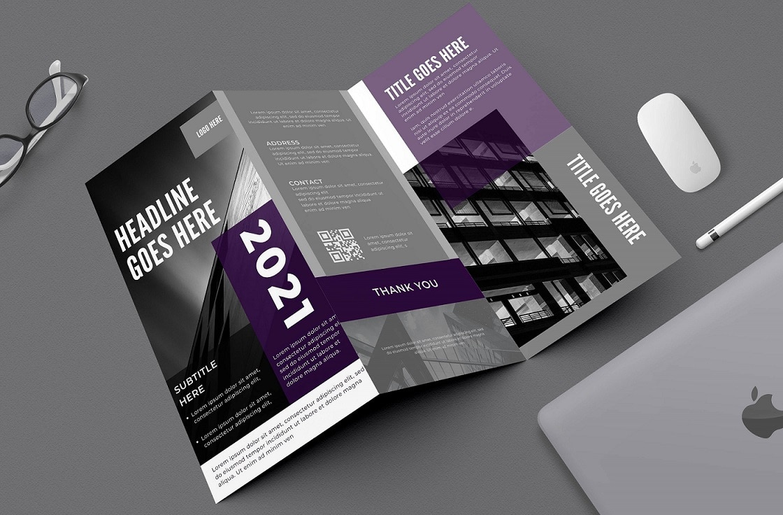
Pick a format that matches the decision
A tri fold brochure works when you need fast scanning. A bi fold gives you more breathing room. A short booklet signals depth. Don’t pick a format because it’s common; pick it because it supports the action.
|
Format |
Best for |
Trust advantage |
Typical face-plant |
|---|---|---|---|
|
Tri fold brochure |
Events, service menus, quick overviews |
Familiar, easy to skim |
Cramming every panel with text |
|
Bi fold brochure |
Premium services, offers with a story |
Creates a “reveal” as people open |
A weak cover that wastes the first impression |
|
Booklet (8–24 pages) |
Proposals, catalogs, “why us” narratives |
Signals stability and substance |
No navigation, so readers get lost |
|
One page sell sheet |
Sales teams, one product, one action |
Fast proof + fast decision |
Big claims with zero proof |
Build a simple trust stack on every spread
Think of trust like a layer cake. You don’t need twenty layers. You need three good ones.
Clarity comes first. Put your strongest promise in plain language near the top. [6] Proof comes next: a number, a testimonial, a short case snapshot, a credential that matters. Humanity comes last: a real team photo or a founder note that sounds like an actual person.
Use typography like a tour guide
Nielsen Norman Group recommends using hierarchy and a limited set of type sizes to show importance. In Brochure Design terms, you keep body text comfortable, avoid tiny gray copy, and let headlines breathe. If your brochure looks like it’s whispering, it won’t close deals.
Design for real life, not your monitor
People read brochures in motion: at trade show booths, in waiting rooms, in airport lounges, and on the ride home. You can help them by:
- Making the Brochure Design cover readable from arm’s length
- Repeating the call to action 2–3 times without begging
- Keeping contact info obvious on more than one panel
Print, digital, and measurement
This is where Brochure Design stops being “art” and starts acting like a revenue tool: you connect it to measurable next steps.
Print details that signal professionalism
Use bleed when you print to the edge. Adobe explains that you extend artwork into a bleed area so trimming doesn’t leave awkward white edges.
Choose sizes that match where you sell. ISO explains that ISO 216 specifies trimmed paper sizes for writing paper and certain classes of printed matter, which is why A-series sizes (like A4) dominate globally outside North America.
If sustainability matters to your buyers (and to you), choose responsible paper and say so. FSC notes that certification helps businesses demonstrate responsible choices in paper and packaging, and FSC promotional licensing supports logo use in promotion.
Why the physical brochure still hits different
Digital ads vanish. Physical pieces linger. In a USPS OIG neuromarketing study with Temple University, researchers found physical ads beat digital ones for leaving a lasting impression across age groups and performed better on measures like ad recognition and brand recall. If you aim at young professionals, that matters: they live online, so a great brochure feels refreshingly “real.”
A simple trust-to-revenue flow you can build around
Trust → Interest → Action → Revenue
(If you skip trust, you force your reader to do emotional gymnastics.)
To track results without making it weird, connect Brochure Design to one measurable next step:
- Use a unique QR code per campaign (event vs. in-store vs. partner drop)
- Send people to a landing page that matches the brochure headline
- Add a short promo code so you can attribute sales
- Give sales teams a one-sentence “what to say when you hand it over” script
Conclusion
The best Brochure Design doesn’t beg for attention. It earns it. It respects your reader’s time, tells a clear story, and backs up every promise with proof.
So here’s my challenge: pick up your current brochure, read it like a skeptical stranger, and ask, “Would I trust this? Would I buy from this?” If the answer feels like a hesitant shrug, it’s time to rethink your Brochure Design.
If you’ve got a brochure horror story (we all do), drop it in the comments. I’ll bring sympathy. You bring the receipts.

Comments
Update Comment