
7 Instagram Post Design Mistakes Brands Should Avoid

Your Instagram feed is basically your brand’s outfit. Before anyone reads your caption, checks your link, or decides to trust you, they see the visual. And yes, people judge. Quickly. Brutally. Sometimes before their coffee even kicks in.
Good Instagram Post Design does more than look pretty. It tells your audience, “We know who we are, we understand what you like, and we’re worth your attention.” Bad design does the opposite. It whispers, “We made this in a rush, please don’t zoom in.”
If you want your brand to look sharp, modern, and memorable, working with a custom Instagram post design Specialist can help you create posts that feel polished, strategic, and scroll-stopping without looking overdone.
The problem is that many brands make the same design mistakes again and again. They use too many fonts, ignore mobile readability, copy every trend, and forget that Instagram is not just a gallery. It is a fast-moving visual conversation.
I’ve seen brands with great products lose attention because their posts looked confusing. I’ve also seen small brands punch above their weight because their feed felt clean, intentional, and instantly recognizable. Design can do that. It can make a brand look bigger, smarter, and more trustworthy.
So, let’s walk through the 7 Instagram Post Design mistakes brands should avoid if they want stronger engagement, better branding, and posts that don’t disappear into the digital fog.
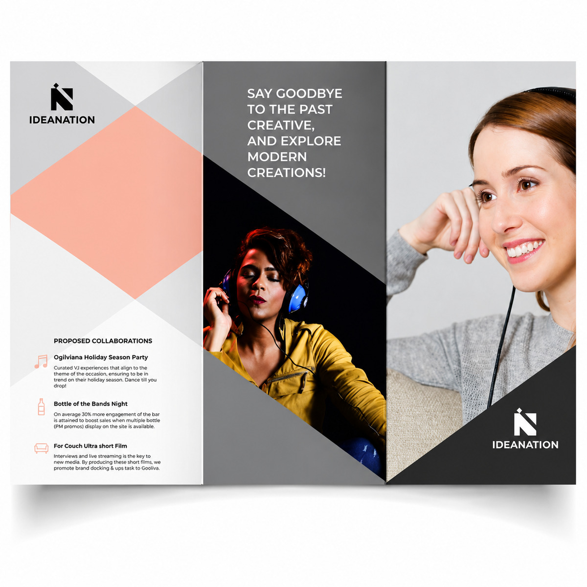
1. Using Too Many Fonts in One Post
Fonts are like cologne. A little adds personality. Too much clears the room.
One of the most common Instagram Post Design mistakes is using three, four, or even five fonts in a single graphic. It usually happens because the brand wants the post to feel “creative.” But instead of creative, it often feels messy.
Your audience should not need a map to read your post.
A strong Instagram design usually needs:
- One font for the main headline
- One font for supporting text
- Optional accent styling for emphasis
That’s it.
When you use too many fonts, your visual hierarchy breaks. People don’t know where to look first. The headline competes with the body copy. The call-to-action gets lost. Suddenly, your post looks like a college project made at 2 a.m. with six tabs open and no plan.
Better approach: Build a small font system. Choose one bold, clean font for headlines and one simple font for body text. Keep it consistent across your feed.
Font Mistake vs Better Design Choice
|
Design Mistake |
Why It Hurts |
Better Choice |
|
Using 4+ fonts |
Looks cluttered and unprofessional |
Use 1–2 brand fonts |
|
Tiny decorative fonts |
Hard to read on mobile |
Use clear, bold fonts |
|
Random font styles |
Weakens brand identity |
Create a fixed font style guide |
|
No headline emphasis |
Post lacks direction |
Use size and weight contrast |
Your font should guide the eye, not start a shouting contest.
2. Ignoring Mobile Readability
Most people view Instagram on their phones. Not on a giant monitor. Not on a designer’s 27-inch screen. A phone.
That means your Instagram Post Design must pass the thumb test. Can someone understand the post while scrolling with one hand, half-distracted, possibly standing in line for coffee? If not, the design needs work.
Tiny text is a silent engagement killer. It may look elegant while designing, but once posted, it becomes unreadable.
Avoid:
- Long paragraphs inside graphics
- Thin fonts with low contrast
- Text placed too close to the edges
- Overloaded carousel slides
- Small captions embedded in busy images
Instead, use short punchy lines. Give your text breathing room. Make the main idea visible within one second.
A good rule: if your post needs pinching and zooming, it needs redesigning.
Instagram Post Design should feel easy. The viewer should not work hard to understand your message. People already have jobs, bills, and 47 unread emails. Don’t make your post another task.
3. Overcrowding the Design
Some brands treat one Instagram post like a suitcase before vacation. They try to fit everything in.
Headline? Yes. Subheadline? Yes. Logo? Yes. Offer? Yes. Product image? Yes. Five icons? Why not. Random shape in the corner? Of course.
The result? Visual traffic jam.
A crowded post weakens attention because every element fights for the spotlight. Strong design needs focus. One post should usually communicate one main idea.
Before creating any Instagram Post Design, ask yourself:
- What is the main message?
- What should the viewer feel?
- What action should they take?
- What can I remove?
That last question matters most. Great design often comes from removing, not adding.
Think of your post like a stylish magazine cover. It needs drama, space, and confidence. It does not need every detail from your marketing meeting.
4. Copying Trends Without Brand Fit
Trends are fun. They are also dangerous when used blindly.
Every few weeks, Instagram gets a new visual obsession. Neon gradients. Retro stickers. AI-style portraits. Scrapbook layouts. Bold meme fonts. Chrome text. Grainy Y2K edits. Some look fantastic. Some age faster than milk in July.
The mistake is not using trends. The mistake is using trends that don’t match your brand.
A luxury skincare brand does not need to jump on every chaotic meme format. A serious finance brand probably should not use cartoon flames and bubble letters unless there is a very smart reason behind it.
Good Instagram Post Design balances trend awareness with brand identity. You can borrow the mood of a trend without copying it completely.
For example:
- Use trendy colors, but keep your brand fonts.
- Try carousel storytelling, but keep your tone professional.
- Use playful layouts, but protect your visual consistency.
- Test bold hooks, but don’t sound like a brand having an identity crisis.
Trends should support your brand, not kidnap it.
5. Weak Color Contrast
Color can make your post feel premium, energetic, calm, playful, bold, or trustworthy. But poor contrast can ruin everything.
If your text blends into the background, the design fails. It doesn’t matter how beautiful the color palette is. If people cannot read it, they will scroll.
This happens often with:
- White text on pale backgrounds
- Dark text on busy photos
- Low-contrast pastel combinations
- Text placed over product images
- Brand colors used without accessibility checks
Aesthetic matters, but clarity wins.
Imagine wearing a perfectly tailored black suit at midnight in an unlit alley. Stylish? Sure. Visible? Not really.
Your Instagram Post Design needs contrast between text and background. Use overlays, solid text boxes, or darker image areas to make copy easier to read.
Quick Color Contrast Guide
|
Design Goal |
Use This |
Avoid This |
|
Strong readability |
Dark text on light background |
Pale text on pale background |
|
Premium look |
Neutral base with one accent color |
Too many loud colors |
|
Product focus |
Clean background |
Busy photo behind text |
|
Brand consistency |
Fixed color palette |
Random colors every post |
|
Better mobile viewing |
High contrast text |
Thin low-contrast fonts |
A beautiful post that nobody can read is just expensive wallpaper.
6. Forgetting Visual Hierarchy
Visual hierarchy is the order in which people notice things. In simple words, it tells the eye where to go first, second, and third.
Without hierarchy, your post feels flat. Everything looks equally important, which means nothing feels important.
A strong Instagram Post Design usually has:
- A bold hook or headline
- Supporting text
- A visual element
- A call-to-action
- Branding
The headline should grab attention first. The supporting text should explain the idea. The CTA should guide the next step.
Many brands make the logo too large, the headline too small, or the CTA invisible. That’s like inviting someone to dinner and hiding the address in tiny text at the bottom of the invite.
Use size, spacing, color, and placement to create a clear path. Your post should feel like a well-dressed host guiding guests through the room.
For extra guidance, Instagram also shares official tips on creating engaging content, including how to use insights, visuals, and audience behavior more effectively. You can explore Instagram’s own creator advice here: (Instagram Creators)
7. Designing Without a Clear Call-to-Action
A post without a call-to-action is like a great conversation that ends with awkward silence.
Your audience may like the design, but what should they do next? Save it? Comment? Visit your website? Share it with a friend? DM you? Buy something?
Many brands create attractive posts but forget the purpose. That’s a missed opportunity.
Every Instagram Post Design should have a goal. Not every post needs to sell, but every post should guide.
Examples of simple CTAs:
- “Save this for later”
- “Share this with your team”
- “Comment your favorite”
- “DM us for details”
- “Tap the link in bio”
- “Swipe to see the checklist”
- “Follow for more design tips”
The CTA should match the post type. Educational posts often work well with “save this.” Opinion posts can invite comments. Product posts can guide users to shop or inquire.
Don’t shout at people. Just point them in the right direction.
Bonus Mistake: Inconsistent Branding Across Posts
This one deserves a seat at the table because it quietly damages brand recall.
If every post looks like it belongs to a different business, your audience won’t remember you. Consistency builds recognition. Recognition builds trust. Trust builds clicks, inquiries, and sales.
Your Instagram feed should feel connected, even when the content changes.
Keep these elements consistent:
- Colors
- Fonts
- Logo placement
- Image style
- Tone of voice
- Layout patterns
- Icon style
- CTA format
This does not mean every post should look identical. That gets boring. Think of it like a wardrobe. You can wear different outfits, but your personal style should still show.
Good Instagram Post Design creates a visual rhythm. When someone sees your post, they should recognize your brand before reading the username.
That’s the sweet spot.
What Good Instagram Post Design Actually Looks Like
Strong design is not about stuffing every trendy element into one square. It is about making the message feel clear, attractive, and worth stopping for.
A good Instagram post usually has:
- A sharp hook
- Clean spacing
- Strong contrast
- Branded colors
- Easy-to-read text
- One clear message
- A natural CTA
- Visual personality
The best posts feel simple, but not lazy. Stylish, but not stiff. Trend-aware, but not desperate.
They make people pause for a second and think, “Okay, this brand gets it.”
That pause is everything.
Simple Instagram Post Design Checklist
Before you publish your next post, run it through this quick checklist.
|
Question |
Yes/No |
|
Is the main message clear in 1 second? |
|
|
Is the text readable on mobile? |
|
|
Did I use only 1–2 fonts? |
|
|
Does the design match my brand style? |
|
|
Is there enough white space? |
|
|
Does the color contrast work? |
|
|
Is the CTA clear? |
|
|
Would I stop scrolling for this? |
That last question is the honest one. If you wouldn’t stop for your own post, your audience probably won’t either.
Conclusion
Great Instagram Post Design is not about being flashy. It is about being clear, stylish, and intentional. Your posts should help people understand your brand faster, trust you sooner, and remember you longer.
Avoid the big mistakes: too many fonts, tiny text, crowded layouts, random trends, weak contrast, poor hierarchy, and unclear CTAs. Once you clean those up, your Instagram presence starts to feel sharper almost immediately.
Think of every post as a tiny brand moment. Make it useful. Make it beautiful. Make it easy to understand.
And most importantly, make it worth the scroll-stop.
FAQs
Instagram Post Design is the process of creating visual content for Instagram using images, text, colors, fonts, layouts, and branding. It helps businesses communicate clearly, attract attention, and build a consistent visual identity.
It matters because Instagram is highly visual. A strong design can make your brand look more professional, improve engagement, support brand recognition, and help your message stand out in a crowded feed.
A good design has a clear message, readable text, strong contrast, clean spacing, brand colors, and a simple call-to-action. It should look attractive while still being easy to understand quickly.
Use one or two fonts. Too many fonts make your design look messy and confusing. A simple font system keeps your posts clean and professional.
Portrait posts often work well because they take up more screen space on mobile. A common size is 1080 x 1350 pixels for feed posts. Square posts at 1080 x 1080 pixels also work, especially for simple visuals.
Yes, most posts should include some form of call-to-action. It does not always have to sell. You can ask users to save, comment, share, swipe, follow, or visit your profile.
Use consistent fonts, brand colors, high-quality images, strong spacing, readable text, and clear layouts. Avoid clutter and design every post with one main goal.
You do not need to redesign your style every month. Review your visual branding every 6 to 12 months, or when your business positioning, audience, or content strategy changes.


Comments
Update Comment