
How Cosmetic Packaging Design Builds Brand Identity
Imagine you are walking through a busy beauty shop in Manhattan. You're scanning shelves packed with bottles and tubes when, suddenly, one jumps out at you. It’s a frosted-white jar with these subtle rose-gold touches. You haven't even picked it up or read the label, but you already have a vibe: it feels expensive, clean, and modern. That split-second reaction? It’s not an accident. That is cosmetic packaging design doing its job.
Ask any industry pro, and they'll tell you: before a customer touches the cream, they touch the box. It is the first handshake between you and the brand. It’s not just a wrapper to keep the product safe; it’s a storyteller you can hold. Through the colors, the texture, and the shape, that package is quietly whispering (or shouting) what the brand is all about, pushing us toward a decision before we even realize it.
Get the design right, and you signal quality immediately. You spark a connection. You might even make something "Instagrammable," getting people to do your marketing for you by sharing photos online. Basically, great design hooks you and builds an identity before you ever try the product inside.
Why Packaging Matters for Brand Identity
When a brand is sitting on a shelf surrounded by competitors, the packaging has to do the selling. There is research suggesting that around 73% of purchase decisions happen right there in the store. That means the design often wins the argument.
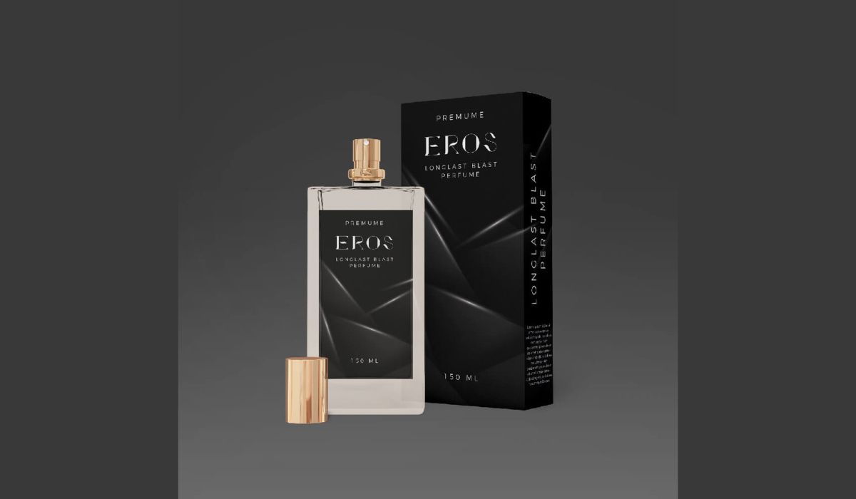
Good packaging is what separates a brand from the noise. Think about the difference between a heavy, minimalist glass bottle and a flimsy plastic one with a loud label. One whispers "luxury" and the other screams "cheap." We judge books by their covers and creams by their jars. It’s a gut check—we assume the outside matches the inside.
Take sleek black-and-gold styling—it immediately feels authoritative and high-end. Swap that for matte paper and a bamboo cap, and the vibe shifts to "natural" and "earth-friendly." A lot of shoppers lean toward those earthy tones because they want that mix of elegance and sustainability.
Your packaging is the first thing people see, so it needs to be clear about who you are. Effective packaging builds an emotional bridge to the customer. It’s a direct line to your brand’s story.
Visual Design Elements
The mix of logos, graphics, and colors acts like a flag for the brand's character. Neon colors usually mean fun and energy, while soft pastels feel gentle and romantic (like Glossier’s pink). Since color is such a huge factor in buying decisions, smart brands use it intentionally to lock in their identity.
Material & Finish
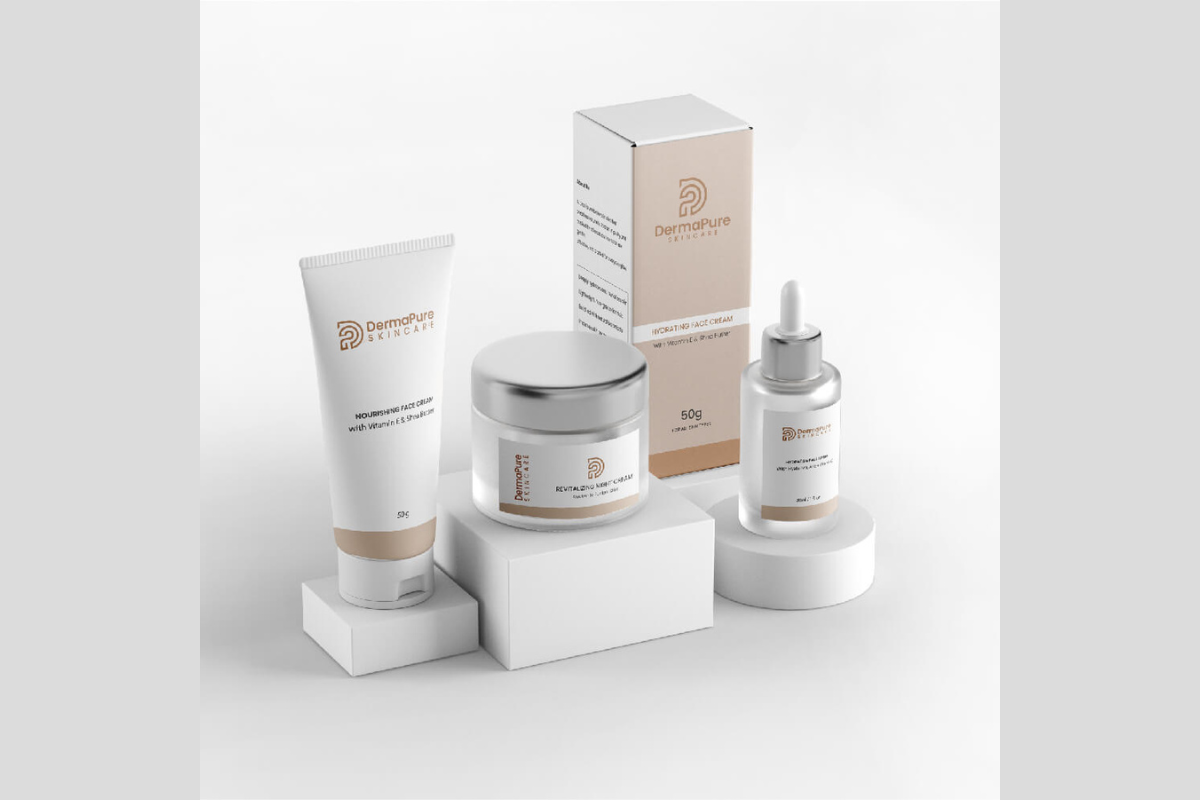
How it feels in your hand matters just as much as how it looks. Glass and metal have a "heft" that feels premium. Plastic is lighter and feels more casual. Materials like kraft paper or bamboo scream "eco-friendly." The finish plays a role too—glossy can feel high-tech, while matte often feels modern and understated.
Function & Form
The shape and how it works tell a story, too. A big case with lots of compartments says "pro kit," while a slim tube designed for one hand says "easy to use." Things like airless pumps (to keep serums fresh) or dropper tops add a functional "premium" feel that customers love.
Consumer Perception
Packaging is the brand experience before the unboxing happens. A brand’s reputation hangs on these touchpoints. If a box feels flimsy, we doubt the quality of the product. If it feels sturdy and thoughtful, we trust it.
It has to be portable and easy to use, fitting into our messy, busy lives. At the end of the day, packaging is a silent salesman. It needs to make the brand recognizable instantly and trigger that "I need this" impulse.
Working with Experts to Nail Your Brand Look
Making packaging that stands out is tough—it’s a mix of art and engineering. You might think anyone can slap a logo on a jar, but weaving a whole identity into the details takes real skill. That’s why so many companies partner with a specialized Cosmetic Packaging Design Agency to create packaging that captures attention and elevates their brand.
These experts know how to pick the exact shade, font, and material to hit the right note with a specific audience. A wellness brand might go for sage green and wood to look natural, while a fashion makeup line might use bold geometric patterns and metal to look edgy.
When a designer really gets the brand, the packaging makes sense. It speaks a clear language, whether that’s "ultra-modern tech skincare" or "vintage apothecary perfume."
Working with pros helps avoid mixed messages. They make sure the design matches the voice of the brand and fits industry standards. (Big icons like Chanel didn't get there by luck; their packaging was planned down to the millimeter). A design partner also handles the boring but important stuff making sure labels are readable and lids actually close properly. When it’s done right, everyone who touches the package gets the message.
The Psychology of Color and Shape
We touched on this, but color is basically a secret code in packaging. Here’s how it usually breaks down:
- Black: This is the heavy hitter for authority and elegance. Luxury brands love it because it signals strength and exclusivity. A matte black lipstick case just feels expensive.
- White: The go-to for simplicity. It suggests purity and clarity. Apple set the standard here, and clean-beauty brands adopted it to say "pure ingredients, no filler." It cuts out the noise and makes logos pop.
- Pink & Pastels: These evoke playfulness and care. Soft pinks and peaches are huge in beauty because they feel sweet and nurturing. It’s why brands like Glossier use them—to feel approachable, not intimidating.
- Blue: The color of trust. It suggests reliability, which is why you see it in men’s grooming or "clinical" skincare lines. Dark navy feels serious; sky blue feels fresh.
- Green & Natural Tones: pretty self-explanatory—these scream health, organic, and eco-friendly.
- Bright Hues (Orange, Yellow): These radiate energy. Fruit colors grab your attention. A bright orange jar says "fresh" and "awake."
Shapes and fonts matter, too. Sharp edges feel cutting-edge; round edges feel friendly. Embossed logos or the satisfying "click" of a magnetic lid add a tactile luxury that sticks in your memory. Every little detail plants the brand’s personality in the consumer’s mind.
Materials, Functionality & Sustainability
The material you pick sends a loud message. A heavy glass jar feels substantial and fancy, even if it costs more to ship. Plastic is practical and great for travel. Metal feels sleek and high-end. Natural stuff like bamboo or recycled cardboard shows you care about the planet.
For instance, wood textures or paper finishes give off an "artisanal" vibe, like the product was made in small batches in nature. A wood cap on a jar tells customers the brand values craftsmanship.
Sustainability isn't just a buzzword anymore; it's part of the identity. Shoppers look for recyclable or refillable stuff as a baseline. The demand for green packaging is huge. Brands are offering refill systems or using plastics made from post-consumer waste to show they aren't just talking the talk—they’re walking the walk.
Functionality is key, too. It shouldn't just look good; it has to work. Elegant pumps that keep air out or tubes that don't leak add value. A solid container that protects the product tells the customer you care about their experience. If the package breaks, the trust breaks.
Comparing Common Materials
To make it clear, here is how the usual materials stack up for branding:
|
Material |
Brand Image Cues |
Sustainability/Notes |
|
Glass |
Premium, high-end, clean |
100% recyclable, very sturdy but heavy (ideal for luxury lines). |
|
Plastic |
Modern, casual, affordable |
Versatile and light, but you need to use recycled types (PCR) to avoid looking cheap. |
|
Metal (Aluminum) |
Sleek, modern, durable |
Recyclable and looks elegant. Used by trendy or eco brands. Heavier than plastic. |
|
Paper/Board |
Eco-friendly, craft/organic vibe |
Biodegradable. Great for natural brands. You can dress it up with foil or embossing. |
|
Wood/Bamboo |
Artisan, natural luxury |
Suggests eco-conscious craft. Each piece looks unique. Usually used for caps or accents. |
Current Trends: Personalization, Minimalism, and Tech
Trends change, but they always come back to what the customer wants right now. Here is what we are seeing lately:
- Minimalist “Quiet Luxury”: The stripped-back look is in. Brands are using muted colors like sand or sage and simple fonts. It makes the product feel calm and trustworthy. Frosted glass looks modern and shows off the product inside, which works great for wellness lines where transparency is the whole point.
- Playful & Artistic: On the other end of the spectrum, some brands treat the box like a canvas. Bright colors and quirky drawings make products eye-catching. It’s "Packaging as Art." Bold graphics grab attention and encourage people to share photos on social media.
- Customization: Brands are getting personal. We’re seeing everything from engraved initials to seasonal color drops. Small-batch printing lets brands make unique packages that feel exclusive. It makes the customer feel special, like the product was made just for them.
- Functional Innovation: If it works better, it sells better. One-handed closures or multi-use compacts show innovation. For science-based brands, high-tech packaging reinforces the idea that the product inside is advanced, too.
- Tech-Integration: Physical and digital are merging. You might see QR codes that link to demo videos or labels that work with AR filters on your phone. It’s not just a gimmick; it builds trust. Imagine scanning a bottle to see exactly where the ingredients came from.
Whether it’s minimalism or high-tech, the goal is to deepen the connection. The key is to let the brand values lead. If you are elegant, go minimal. If you are bold, go colorful. Consistency is what keeps the experience clear.
Conclusion
Cosmetic packaging is chapter one of your brand’s story. It is a statement, not just a container. A smart design turns heads, promises quality, and echoes your mission. We’ve seen how color, material, and style weave together to create an identity people trust.
When it’s done right, packaging creates a little bit of magic—like the excitement of unwrapping a gift. That emotional bond is gold for loyalty.
Ready to take action? Look at your own packaging. Does it tell your story immediately? If not, maybe it’s time to experiment—try a new material or tweak a color. Don't be afraid to bring in design pros to help. Whether you share your favorite designs or just think about your own purchases, remember: packaging is a silent ambassador. Make sure yours is speaking clearly.
FAQs
It’s usually the first impression you make. Design conveys quality and style without words, grabbing attention in a crowded store. In a market where a lot of products feel similar, unique packaging helps you stand out. It is basically your brand’s face.
It’s visual branding. You use specific colors, logos, and fonts to tell a story. A natural brand uses earthy tones and recycled paper; a glam brand uses metallics and bold fonts. Every choice should line up with the personality you are trying to project.
Sustainability is massive—people want refills and recyclable stuff. "Quiet luxury" minimalism is also big, using calm colors to look sophisticated. On the fun side, custom or limited-edition packaging engages customers. And don't forget tech, QR codes and interactive unboxing experiences are trending.
There’s no rule for this. Some do it seasonally, others only when the design looks old. Small tweaks can keep things fresh, while major overhauls are worth it if your brand direction changes. Just make sure you keep the core elements (like your logo) so people still know it’s you.


Comments
Update Comment