
What Makes Food Packaging Design Look Premium?
Have you ever picked up a sleek chocolate bar or admired a chic tea tin and instantly thought, “This must be expensive”? That’s the magic of great design. Packaging design isn’t just about practicality—it’s your brand’s first impression and a chance to tell your story to consumers.
Even I’ve found myself grabbing a snack in an artisanal jar over a cheaper brand, just because the packaging felt special. In today’s market, your product’s “outfit” on the shelf can be as important as the product inside.
In fact, packaging deeply influences buying choices. Approximately 73% of shoppers say they rely on packaging to shape their decisions, and 52% of consumers will make repeat purchases if their products arrive in good-quality, fitting packaging. These stats show that making your food packaging look premium pays off.
It convinces the brain that the contents are worth more. But what exactly gives that upscale vibe? Let’s unwrap the key ingredients – from heavy materials to bold simplicity – that transform food packaging design into a premium experience.
Whether you’re a local coffee roaster or a national snack brand, achieving that polished look often means calling in the pros. A specialized food packaging design company can act as a style consultant for your product.
They blend branding and design know-how to make your package feel custom-made: perfect dielines, thoughtful textures, and typography that whispers “quality.” Basically, they turn a plain box into an eye-catching ambassador for your brand.
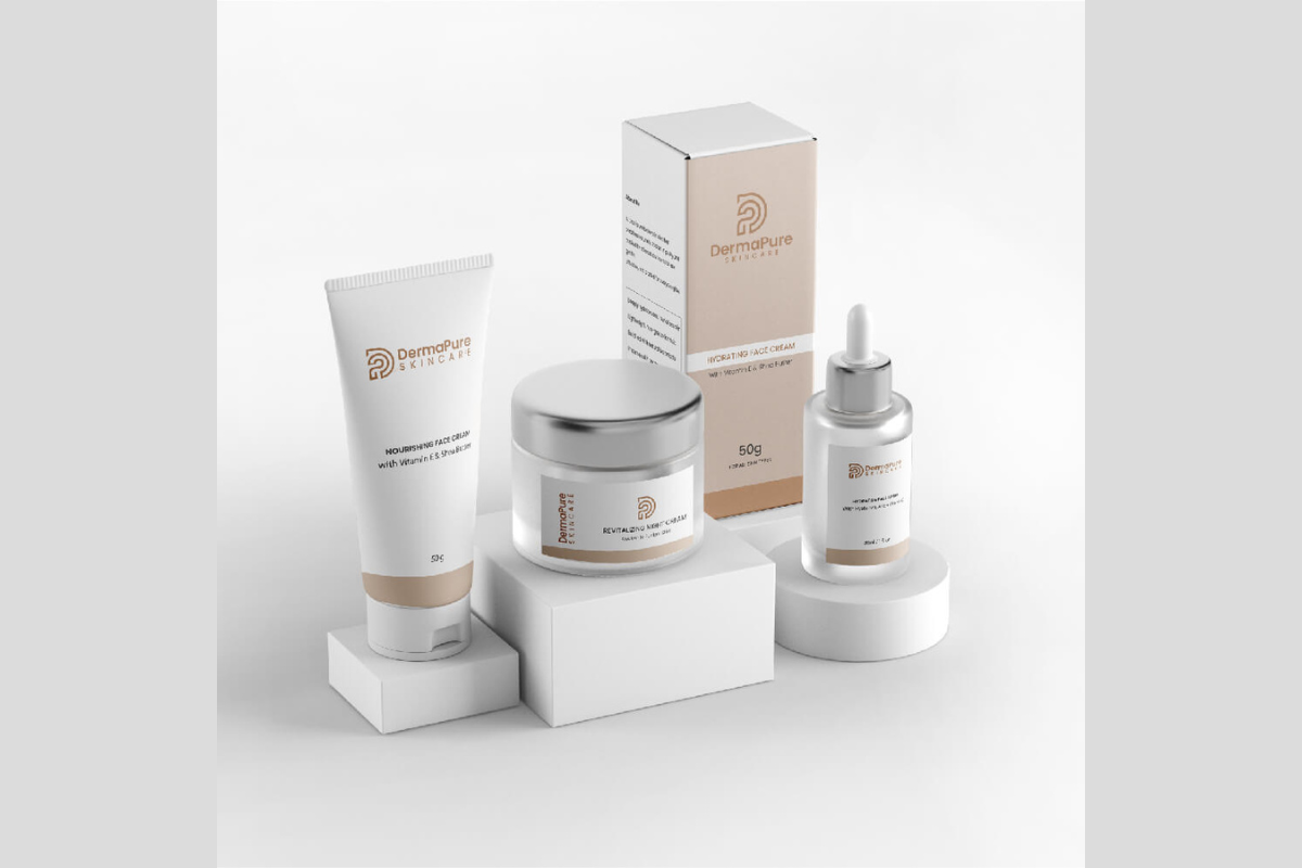
Materials & Tactile Cues
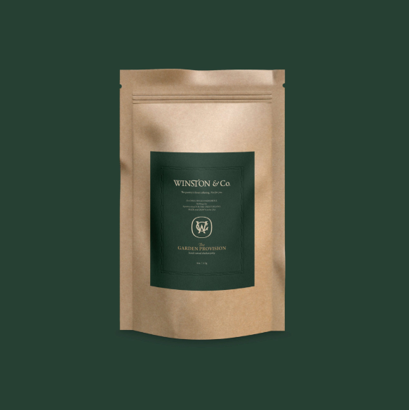
Figure: A hefty kraft pouch with an embossed label feels substantial and natural, immediately signaling artisanal, premium quality.
First impressions start at the fingertips. Premium packaging often feels heavy and textured. As design experts note, “weight signals care; texture signals intention; resistance signals quality”.
In plain terms, a thick box or glass jar immediately suggests something valuable inside. High-end food packages use materials like rigid paperboard, embossed kraft, or coated stock instead of thin plastic.
They incorporate luxe finishes – soft-touch matte coatings, raised embossing you notice with your fingers before your eyes, or one intentional swath of gold foil. These sensory details “quiet the brain,” telling customers this product is worth more before they even read the label.
Minimalist Design & Finishes
Clutter is the enemy of luxury. Premium brands usually follow the “less is more” rule. As one packaging strategist points out, “anyone can add more; very few know when to stop. Restraint means leaving space, using fewer colours”.
Elegant food packaging often embraces white (or negative) space, streamlined fonts, and a clean layout. It might use just one or two accent colors – think a matte navy box with a single gold seal, or a white label with a bold red ribbon. The result is a design that feels calm and confident, not busy or contradictory.
- Sparse Typography: Only the key details appear on the front. Long ingredients lists or stories go on the back. The front looks uncluttered and intentional.
- Selective Colors: A carefully chosen palette (for example, just gold foil or a pop of deep burgundy) stands out. Too many bright colors or fonts can cheapen the vibe.
- Single Finish: Instead of a gaudy mix of decorations, premium packaging often features one standout finish done beautifully (like a spot-foil logo or emboss).
These tactics ensure the package feels sophisticated, like a fine restaurant’s menu – purposeful, with no fluff.
Color & Imagery
Color choice plays a huge role. Bold or classic hues can communicate confidence. For example, vibrant reds or greens signal fresh, flavorful food, while deep blues or blacks often read as upscale.
Packaging experts note that “red is an appetite stimulant… perfect for dessert or candy,” whereas calming blues or pastels might be used for health-oriented products. Premium brands pick palettes that suit their story and category. They might use jewel tones, earth hues, or even a metallic accent (like copper or champagne) to catch the eye.
Strong visuals – say, a hand-drawn illustration of ingredients or a moody photograph – can also elevate perceived value. The key is consistency: the design should feel deliberate. As one expert puts it, premium packaging “feels anchored in something – a place, a point of view”. Avoid loud “sale” graphics or cartoonish art – premium shoppers want mood, not noise.
Packaging Psychology & Stats
In case you need more convincing, the numbers speak for themselves. A MeteorSpace packaging report found that 45% of consumers are more likely to buy products when their packaging looks premium. Other research backs this up: - 73% of consumers say packaging design influences their buying decision.
- 52% will reorder a product if it arrives in high-quality, fit-for-purpose packaging.
These figures highlight the simple truth: great packaging sells. It’s proof that investing in design pays off in customer trust and loyalty.
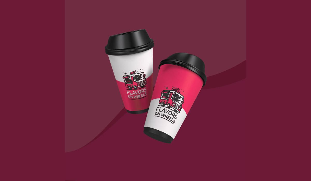
Unboxing & Giftability
Figure: A well-designed takeout box or custom pouch makes opening your food feel special.
Even functional items like a sturdy box or a neat zipper convey care and quality.
Premium packaging often doubles as an experience. Think of the modern “unboxing” trend: customers delight in packages that feel like gifts.
As one branding strategist sums up, if packaging feels like part of the product, customers stop questioning the price. That’s why you’ll see features like reusable tins, rigid boxes with magnetic closures, or eco-friendly cloth wraps – extras that feel like bonuses. These details create that “wow” factor and justify a higher price tag.
Just remember: luxury shouldn’t sacrifice function. Flaps should open smoothly, closures should work perfectly, and the contents must be well-protected. Even premium brands sweat the details: a crisp fold here, a clever tear-strip there, or a snug fit that pops open cleanly. Those little touches show the same care as a sleek design.
Sustainability as a Premium Factor
Nowadays, eco-friendly can also mean upscale. Many consumers associate natural or recycled packaging with authenticity and quality. Premium food brands often use sustainable materials—unbleached kraft paper, glass jars, bamboo, etc.—that look organic and high-end.
The key is choosing well-executed sustainable options. Studies show 55% of shoppers expect companies to use sustainable packaging, though 42% only care if it doesn’t hike costs. So pick recyclable or biodegradable materials that still feel sturdy.
A matte-finish box made from 100% recycled board, for example, can feel just as premium as virgin paper if it’s thick and beautifully printed. Done right, green choices can reinforce your brand values and appeal to discerning customers.
Conclusion
Food packaging design is like dressing your product for success. Every detail should say quality: sturdy materials, thoughtful finishes, and an uncluttered look. This investment doesn’t just catch eyes; it tells your customers that your brand cares about the experience.
So next time you’re sketching a label or choosing a box, put yourself in the shopper’s shoes. Would this inspire confidence or just blend in on the shelf? By focusing on premium cues (or teaming up with design pros), you can give your product a first-class look that stands out globally.
We’d love to hear from you: What’s one piece of packaging you bought just because it looked amazing? Share your thoughts below or on social media – let’s chat about making your brand shine through design.
Frequently Asked Questions
Premium food packaging design feels intentional and refined. It uses quality materials like thick paperboard, glass, or metal, paired with clean layouts, balanced spacing, and minimal text. Subtle finishes such as matte coatings, embossing, or foil accents add depth without clutter, helping the product feel carefully crafted and high-value.
Focus on restraint rather than excess. A single premium detail—like embossing, spot foil, or a thicker label stock—can elevate the entire look. Clean typography, fewer colors, and sharp printing often matter more than expensive materials. Small, well-executed choices usually outperform flashy designs.
Heavier and tactile materials instantly raise perceived quality. Rigid cardboard, textured paper, glass jars, metal tins, and even fabric or wood elements signal durability and care. These materials hold their shape, feel substantial in the hand, and visually communicate craftsmanship.
Yes, and in many cases it enhances the premium feel. Recycled kraft paper, bamboo, or compostable materials can look upscale when paired with thoughtful design and solid construction. A clean matte finish and simple branding help sustainable packaging feel intentional rather than basic.
Color sets the mood instantly. Deep, muted tones often feel sophisticated, while bright colors communicate energy and flavor. Premium designs usually limit the palette to one or two main colors, sometimes paired with a metallic or neutral accent, to maintain visual balance and elegance.
Premium packaging focuses on quality, clarity, and craftsmanship, making everyday products feel elevated. Luxury packaging leans more toward exclusivity and status, often using bold embellishments or limited-edition elements. Both look polished, but premium design feels more approachable and product-driven.


Comments
Update Comment