
7 Modern Feminine Logo Design Ideas for Elegant Brands
Modern Feminine Logo Design has moved way beyond the old formula of blush pink, swirly script, and a flower tossed in like garnish. Today’s elegant brands need something sharper: a logo that feels soft without looking sugary, premium without looking stiff and memorable whether it appears on packaging, a website header, or a tiny social icon.
That shift matters because people form first impressions in a flash, and visual design plays a real role in whether a brand feels credible and intentional.
What I keep seeing, over and over, is that the strongest feminine logos are not louder. They are more disciplined. Research on good visual design points to consistent typography, clear hierarchy, refined color palettes, grids, and thoughtful whitespace as the ingredients that make a visual system feel polished.
Current design trend signals also lean toward structured simplicity, tactile detail, and understated neutrals, which is perfect if you want elegance with a long shelf life.
If you’re building or refreshing a brand, the sweet spot is Feminine Logo Design that feels warm, clear, and flexible across print and digital touchpoints.
If you want expert help turning that vision into a usable identity, a Premium Feminine Logo Design Service can speed things up, but even if you’re still in mood board mode, the seven ideas below will help you choose a direction that actually fits your audience and your brand personality.
Modern feminine logo ideas
Before we jump in, one quick reality check: elegant Feminine Logo Design is not a costume. It is a system. Your logo should feel at home with your colors, typography, photography, packaging, and web design, and it should still hold up in one color, in black and white, and at small sizes.
Official guidance on branding and logo systems keeps returning to the same themes: clarity, cohesion, flexible color use, versatile type, and scalable formats.
Refined serif wordmark:
If your brand name is short, distinct, or just plain gorgeous on paper, start with a serif wordmark. This is one of the smartest Feminine Logo Design directions for elegant brands because it lets typography carry the mood.
A wordmark uses stylized text, without requiring a separate icon, to express brand identity in a straightforward and recognizable way. The trick is to keep it tailored: think elegant spacing, maybe a custom terminal or ligature, and just enough personality to feel editorial rather than generic. Done right, it looks expensive in the best way, like your logo drinks sparkling water out of real glass.
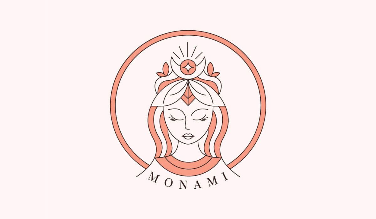
Soft monogram seal:
A monogram inside a circle or oval is a beautiful option when you want a boutique, timeless feel. Circular shapes are associated with harmony, continuity, emotional connection, and beauty, while more structured geometry still supports trust and professionalism.
That balance is exactly why this style works so well for elegant Feminine Logo Design. You get softness, but it is held together by order. Use one or two initials, plenty of breathing room, and a border or frame you can emboss, stamp, or shrink without losing clarity. It works especially well for jewelry, skincare, salons, interiors, and founder led businesses.
Minimal botanical line art:
Yes, floral elements can still look modern in Feminine Logo Design, but only if you edit with restraint. One leaf, one stem, one elegant contour is often enough. The goal is not “busy wedding invitation from 2014.” The goal is symbolism with air around it.
Simple, adaptable shapes tend to read as more sophisticated across digital platforms, and if you want a deeper primer on how shapes influence brand perception, this guide to logo shapes is a genuinely useful resource. Keep the icon thin but not fragile, balanced but not stiff, and simple enough to survive a mobile avatar.
This quick selector table makes those first three ideas easier to compare at a glance.
|
Logo idea |
Best fit |
Why it works |
Common mistake |
|---|---|---|---|
|
Refined serif wordmark |
Fashion, beauty, interiors, consulting |
Feels polished, editorial, premium |
Overdecorating the letters |
|
Soft monogram seal |
Jewelry, skincare, salons, personal brands |
Looks timeless, compact, stamp friendly |
Crowding the initials |
|
Minimal botanical line art |
Wellness, floral, clean beauty, boutique retail |
Adds softness and symbolism |
Using too many leaves or flourishes |
Negative space icon:
This is where Feminine Logo Design gets smart. A hidden symbol tucked inside a letterform or shape can make a logo feel more memorable without making it feel busy. Guidance on shape psychology specifically notes that negative space can add breathing room and a second layer of meaning while improving clarity and sophistication.
That makes it perfect for elegant brands that want a little intelligence in the room, not just prettiness. Think beauty tools, premium services, boutique wellness, or modern product brands that want a clever symbol people notice on the second look. The beauty here is subtlety. You are not shouting. You are leaving a good aftertaste.
Signature script with a clean sans:
If you love handwriting, wonderful. Just do not ask the script to carry the entire identity on its back like an overworked intern. One of the easiest ways to modernize Feminine Logo Design is to pair a graceful signature element with a grounded sans serif word or descriptor.
Typography guidance shows that spacing and letter interaction heavily influence tone, and branding guidance stresses that your logo type should stay cohesive with your wider brand system. So let the script be the accent, not the whole orchestra. That way your brand still feels personal and expressive, but it stays readable on a phone screen, a label, or a website menu.
Quick script sanity check:
- Keep the signature short.
- Use the sans serif for clarity.
- Avoid five dramatic swashes where one will do.
- Test the logo at icon size before you fall in love with it.
Quiet luxury monochrome with one muted accent:
One of my favorite modern moves in Feminine Logo Design is restraint in color. Elegant feminine branding does not need to default to pink just because the market expects it. Color guidance shows that color shapes emotional tone and brand perception, and brand color strategy works best when it reflects your goals, differentiates you from competitors, and stays consistent across touchpoints.
Current palette language also leans toward trans seasonal neutrals and understated combinations. So instead of going sugary, try warm black, espresso, stone, mushroom, sage, dusty plum, muted rose, or soft ivory, then add one considered accent if needed. In logo design, a palette that whispers often feels more luxurious than one that performs cartwheels.
Responsive logo family:
This is the idea too many elegant brands skip, and then regret the second they need a favicon, shipping sticker, embossed tag, website header, social avatar, and email footer. Great Feminine Logo Design is not one logo. It is a logo family. Responsive logo guidance recommends designing marks that adapt to changing technologies and usage patterns, and the SVG standard explains why vector graphics are so useful at different resolutions. In plain English, you want a primary logo, a secondary lockup, and a small icon or monogram. If your mark only looks good on a mood board, it is not finished. If it still looks beautiful at 24 pixels, now we’re talking.
One more reason this matters: consistent branding is not just aesthetically pleasing, it is commercially useful. Updated brand consistency guidance based on survey data from more than 400 respondents says people associated consistent branding with stronger trust and estimated 10 to 20 percent growth when a brand is maintained consistently. A logo alone will not perform miracles, of course, but it should act like the front door to a coherent brand system, not a lonely decorative sticker slapped on at the end.
A fast approval checklist before you sign off on your logo:
- Does it work in one color?
- Does it stay legible at tiny sizes?
- Can the icon live without the full wordmark?
- Do the colors still feel elegant when muted?
- Does it belong next to your packaging, photography, and website design?
Conclusion
The best Feminine Logo Design today feels intentional, grown up, and beautifully self aware. It uses typography with purpose, shape with psychology, color with restraint, and flexibility with real world common sense. That is why the strongest elegant logos do not merely look pretty. They identify, organize, and reinforce the entire brand experience.
If you are sketching ideas for your own brand, start simple. Pick two directions from this list, mock them up on packaging and a social profile, and see which one still feels right after the first rush of excitement fades. That little pause is where good taste usually wins. And when it does, your Feminine Logo Design will not just look elegant. It will feel inevitable.
Frequently asked questions
Modern Feminine Logo Design relies on restraint, not overload. The strongest marks use fewer decorative elements, better spacing, cleaner hierarchy, thoughtful shapes, and a refined palette. Current design guidance also leans toward structured simplicity, tactile character, and adaptable forms that work across digital platforms. In other words, modern femininity usually looks edited, intentional, and calm, not sugary or crowded.
The best colors for Feminine Logo Design depend on your brand personality, not a stereotype. Soft neutrals, warm blacks, sage, dusty plum, muted rose, and creamy off whites can all feel feminine and elegant when used consistently. Color works best when it supports how you want people to feel, helps differentiate you from competitors, and still allows the logo to remain recognizable in monochrome versions.
Yes, but with discipline. Script can add warmth, personality, and founder energy, especially for beauty, fashion, and personal brands. The catch is readability. Kerning and letter interaction change how a logo feels, and branding guidance recommends choosing a versatile type direction that still works across all your brand touchpoints. A script accent paired with a clean supporting font is usually the safer, more modern move.
Absolutely. Feminine Logo Design is about tone, not industry limitation. Soft curves and circular forms can signal beauty, care, and connection, while abstract, simplified shapes can still feel scalable and contemporary. Shape guidance also notes that clean, adaptable forms perform well across digital platforms, which is why feminine branding can work just as well for a premium skincare line as for a modern wellness app or a polished consulting brand.
Ask for SVG, PDF, transparent PNG versions, full color files, one color files, dark and light versions, a small icon, and a simple usage guide. SVG matters because it scales across display resolutions, and responsive logo guidance supports having multiple versions for different contexts. If you can only ask one extra favor, ask for a primary mark, a secondary lockup, and an icon. In the future you will be thrilled.


Comments
Update Comment