
7 LinkedIn Banner Design Tips That Attract High-Quality Clients
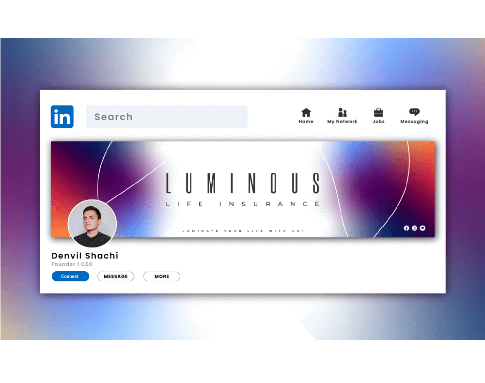
You can tell a lot about a person from their LinkedIn banner. It is the digital equivalent of walking into a meeting five minutes early, wearing something sharp, and actually knowing why you are there. Before anyone reads your headline, scans your experience, or judges your suspiciously enthusiastic use of “results-driven,” they see that banner.
And that tiny strip of visual real estate does a lot more than people think. A strong LinkedIn Banner Design can quietly signal authority, style, clarity, and confidence. A weak one can make even a smart professional look like they forgot the front door matters.
If you want your profile to feel polished, strategic, and client-ready, working with a LinkedIn Banner Design Specialist can help you turn that overlooked header into something that actually supports your personal brand instead of just sitting there like decorative wallpaper.
Here’s the part many people miss: high-quality clients are not usually impressed by noise. They are impressed by clarity. They want to know who you help, what you do, and whether you look like someone who understands positioning, not just Canva shortcuts and motivational gradients.
I’ve seen this play out again and again. Two professionals can offer nearly identical services, have similar experience, and even post similar content. Yet one profile feels instantly more premium. Why? Because the visual message is aligned. The banner supports the offer. The copy is intentional. The profile photo, headline, and background all feel like they belong in the same sentence.
That is what this guide is about. Not flashy design for the sake of looking busy. Not “hacks.” Not a banner crammed with every achievement since sophomore year. This is about smart visual branding that helps you attract the kind of clients who value quality, trust your expertise, and are less likely to ask for a “quick discount.”
According to LinkedIn’s official help guidance on profile cover images, your cover image should be high quality and is recommended at 1584 x 396 pixels, with important visual elements placed carefully because the display can shift across screens. In other words, design matters, but placement matters too. A beautiful banner that hides your message behind your profile photo is basically a nice suit with the price tag still attached.
Why LinkedIn Banner Design Matters More Than People Admit
Your banner helps answer three silent questions in a visitor’s mind:
- What do you do?
- Who do you help?
- Can I trust you?
That is why LinkedIn Banner Design is not just a decoration choice. It is a positioning choice.
For young professionals, consultants, creators, recruiters, founders, coaches, marketers, and service providers, the banner can shape first impressions in seconds. It can support your personal brand strategy, reinforce your niche, and create visual consistency across your profile.
A good banner says, “I know my market.”
A bad one says, “I picked this during lunch.”
What High-Quality Clients Actually Notice
Before we get into the seven tips, let’s be honest about something. High-quality clients are usually not sitting there rating your kerning or debating your font pairings. They are looking for signals.
They notice whether your profile feels:
|
Signal |
What Clients Infer |
|
Clear message |
You understand your value |
|
Strong visual hierarchy |
You communicate well |
|
Professional layout |
You care about details |
|
Consistent branding |
You are established |
|
Relevant imagery |
You know your audience |
|
Minimal clutter |
You are focused and confident |
That last one matters a lot. Clutter often reads like insecurity. It says, “Please notice all twelve of my services.” Confidence says, “I know exactly what I want to be known for.”
1. Lead With One Clear Promise
The best LinkedIn banners do not try to say everything. They say the right thing quickly.
If you help B2B founders grow the pipeline, say that. If you design conversion-focused websites for wellness brands, say that. If you are a recruiter placing engineering talent, make it obvious.
Your banner headline should communicate one core promise. Think of it as your visual elevator pitch.
Examples:
- Helping SaaS teams turn traffic into qualified leads
- Brand design for founders who are done looking generic
- Copywriting for coaches, consultants, and course creators
- Recruiting top product and engineering talent
Keep it short. Keep it specific. Keep it human.
Vague phrases like “empowering innovation” and “unlocking scalable transformation” sound impressive for about two seconds, then collapse under the weight of their own nonsense.
2. Design for Positioning, Not Decoration
This is where people get distracted. They start with colors, icons, abstract shapes, city skylines, laptop mockups, and dramatic smoke effects. Suddenly the banner looks like a tech conference flyer from 2018.
Instead, begin with positioning.
Ask yourself:
- What do I want to be known for?
- What kind of clients do I want more of?
- What feeling should my profile create?
- What visual style matches my market?
A premium consultant might use restrained colors, elegant typography, and a confident one-line message. A creative strategist might use bolder contrast and sharper visual personality. A corporate recruiter may lean toward clean, trustworthy, and understated.
Your banner should match your market. If you want premium clients, your design should feel premium. Not crowded. Not random. Not loud for sport.
3. Use Visual Hierarchy Like a Pro
Visual hierarchy is just a fancy way of saying: make the important stuff easy to notice first.
A strong LinkedIn Banner Design usually includes:
- Primary message
- Support line or niche detail
- Optional trust cue, such as industries served or a simple callout
That means your eye should land on the main promise first. Then the supporting detail. Then anything else.
Here is a simple structure that works well:
|
Banner Element |
Purpose |
|
Main headline |
States what you do |
|
Subheadline |
Clarifies audience or result |
|
Small trust cue |
Adds credibility without noise |
|
Visual background |
Supports the mood and brand |
Do not make everything the same size. That is not design. That is visual democracy, and frankly, it rarely works.
4. Respect the Safe Zones
This tip separates polished banners from banners that look great in a mockup and terrible in real life.
On LinkedIn, your profile photo and interface elements cover part of the banner. That means important text should not sit too close to the left edge or lower areas where it may get blocked.
A smart approach is to keep your key message toward the center-right area while maintaining enough breathing room around it.
Here is what to avoid:
- Text hidden behind your profile photo
- Logos pressed into the corners
- Tiny copy that disappears on mobile
- Important details placed too low
This is not the place for a design that only works on your 27-inch monitor. Your banner needs to survive laptops, tablets, and phones with its dignity intact.
5. Choose Images That Support Your Expertise
The background image in your banner should not feel like a stock-photo accident.
Use visuals that support your offer or brand personality:
- A subtle workspace scene
- A branded texture or abstract pattern
- Industry-relevant imagery
- A clean cityscape if it matches your niche
- A simple branded layout with no photo at all
What you choose depends on your market. But whatever you pick, it should feel intentional.
For example, if you are a LinkedIn coach, a clean personal-brand banner with confident typography often works better than a generic handshake photo. If you are a designer, a more visually expressive layout can help, but it still needs restraint. If you are in finance, legal, or executive consulting, simplicity usually wins.
A good rule: if the background is louder than your message, it is stealing the microphone.
6. Add Subtle Credibility Cues
You do not need to turn your banner into a trophy case, but a few credibility cues can help the right people trust you faster.
These can include:
- The type of clients you serve
- A niche market focus
- A brief result-based statement
- A simple descriptor like “For SaaS Founders” or “For E-commerce Brands”
This works especially well when you want to attract high-quality clients instead of general traffic. Specificity filters. And filtering is a gift. Not everyone needs to think your profile is for them.
For example, “Brand strategy for wellness founders” is stronger than “creative solutions for modern businesses.” One speaks to someone. The other sounds like it was written by a committee with matching water bottles.
7. Make It Cohesive With the Rest of Your Profile
Your banner should not feel like it belongs to a different person than your profile photo, headline, and About section.
This is where so many profiles lose momentum. The banner says one thing. The headline says another. The profile photo feels super corporate. The content is playful. The Featured section points in three directions. It is like arriving at a restaurant that serves sushi, tacos, and medieval stew.
High-quality LinkedIn profiles feel connected.
Make sure your:
- Banner tone matches your headline
- Colors align with your personal brand
- Message supports your service or niche
- Overall style feels consistent across the profile
That consistency creates trust. And trust creates clicks, inquiries, and better-fit conversations.
Common LinkedIn Banner Mistakes to Avoid
Let’s save you from the usual suspects.
Mistake 1: Saying Too Much
A banner is not a brochure. Do not cram in every service, credential, and life philosophy.
Mistake 2: Using Tiny Text
If someone needs to squint, you already lost.
Mistake 3: Picking Style Over Clarity
A sleek design that says nothing is still saying nothing.
Mistake 4: Ignoring Mobile View
Always preview your banner across devices.
Mistake 5: Using Generic Stock Visuals
Nothing says “forgettable” like a smiling business team pointing at an invisible chart.
Quick Checklist for a Client-Attracting LinkedIn Banner
Before you publish your next banner, run through this:
- Is your message clear in under five seconds?
- Does the design match your audience?
- Is the text easy to read on mobile?
- Are important elements placed in safe areas?
- Does the banner support your headline and offer?
- Does it feel polished enough for premium clients?
If the answer is yes across the board, you are in good shape.
Best Practices at a Glance
|
Tip |
Why It Works |
|
Use one clear promise |
Helps visitors understand your value fast |
|
Design for your niche |
Attracts better-fit clients |
|
Create visual hierarchy |
Makes the message easier to absorb |
|
Keep text in safe zones |
Prevents awkward cropping and overlap |
|
Use relevant imagery |
Reinforces authority and style |
|
Add light credibility cues |
Builds trust without clutter |
|
Stay consistent across profile |
Makes your brand feel established |
Conclusion
A great LinkedIn Banner Design does not scream for attention. It earns it.
It gives your profile shape, direction, and confidence. It tells high-quality clients that you understand your brand, care about presentation, and know how to communicate value before a single message is sent. That matters more than most people realize.
So if your current banner is blank, blurry, overcrowded, or built around a random blue gradient you chose in a hurry, this is your sign to fix it. Clean it up. Sharpen the message. Make the whole profile feel intentional.
Because on LinkedIn, first impressions are not just visual. They are commercial.
FAQs
LinkedIn recommends a cover image size of 1584 x 396 pixels for personal profiles. Using the right size helps your banner look sharp and reduces awkward cropping.
It is very important because it shapes first impressions fast. A strong banner helps communicate your niche, value, and professionalism before someone reads the rest of your profile.
Yes, but only if the text is clear, minimal, and strategically placed. Too much text makes the banner feel crowded and harder to read, especially on mobile.
Include a short message about what you do, who you help, and possibly a subtle credibility cue. Keep it focused on your audience, not just on you.
Absolutely. A well-crafted banner supports your visual identity, makes your profile more memorable, and creates consistency with your headline and content.
Not always, but professional help can make a big difference if you want a polished, strategic banner that aligns with your niche and attracts better clients.
Comments
Update Comment