
Is a Vintage Logo Right for Your Business?
Imagine strolling into a funky diner or hitting play on a classic vinyl record – you feel that warm nostalgia, right? Vintage logos work the same magic. They tap into our love of “old-school” charm to make brands feel familiar and genuine. In fact, a branding expert notes that “vintage logos have such a powerful hold… we love what feels familiar yet distant”.
Modern consumers often equate retro designs with authenticity. One design blog even quips that drawing a vintage logo on the beach would make “a hundred hipsters” rush out of the sea for craft coffee and adventure! So, is riding the nostalgia wave right for your brand? Let’s explore what vintage logos are, who they suit, and how to pull off the look.
What Is a Vintage Logo?
At its core, a vintage logo tells a story. It looks like it was plucked from a past era – think prohibition-era saloon signs or 1960s outdoor emblems. As one designer put it, “vintage logos are a nostalgic departure from the present to some faraway time and place… returning to your roots through visual elements that refer to an old pedigree, heritage, or tradition”. In practice, this means a vintage logo often includes:
- Classic Typography: A bold serif or cursive script (often in all caps) reminiscent of early trademarks.
- Ornate Frames & Badges: Ribbons, shields, or circular emblems that look like an old stamp or seal.
- Rustic Icons: Anchors, compasses, mountains, vintage bicycles, or other symbols of craft, adventure, and heritage.
- Distressed Textures: Faded inks, rough edges, or a grainy “weathered” appearance as if worn by time.
- Earthy Color Palette: Muted, nature-inspired tones – sepia browns, forest greens, mustard yellows, or simple black-and-white – instead of bright neon.
These elements combine to give logos an aged, handcrafted vibe. Rather than sleek minimalism, a vintage logo feels cozy, artisanal, and steeped in history. It’s the design equivalent of wearing grandma’s leather jacket – reliably cool and a bit story-filled.
Who Should Use a Vintage Logo?
Not every business will click with an old-school emblem. Vintage style shines for brands that have heritage, craftsmanship, or a clear story to tell. Think about it: a retro design works when you want to emphasize roots, authenticity, and trust.
For example, artisans and local businesses often benefit: craft breweries or distilleries (whiskey labels, craft beer), bakeries and coffee shops with a homey feel, tattoo parlors, barbershops, and interior designers often use vintage-inspired logos. Outdoor and adventure brands (think camping gear, mountain lodges) use retro badges to highlight ruggedness and nostalgia. Even fashion lines that trade on “heritage” – like workwear or denim brands – lean retro.
In short, if your brand’s vibe is artisanal, cozy, or time-honored, a vintage logo could be a perfect fit. It broadcasts, “We have roots and stories.” And if you’re convinced a retro look is your brand’s story, it might be worth bringing in a professional vintage logo design team. (Trust me, the difference between a DIY sticker and a pro design can be as big as a vinyl record playing on a hi-fi vs. a smartphone ringer!)
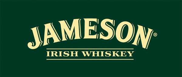
The Jameson Irish Whiskey logo is a classic vintage design. Its ornate script and crest evoke craftsmanship and timeless tradition.
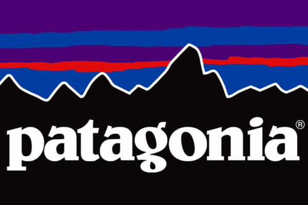
Patagonia’s logo with its retro mountain outline illustrates vintage style in the outdoors industry. It hints at the brand’s wilderness roots and love of timeless adventure.
Key Elements of Vintage Logo Design
When creating or evaluating a vintage logo, keep these features in mind:
- Typography: Use a font with character – perhaps a classic serif or hand-script style. All-caps text (like old trademarks often had) or cursive flourishes instantly look retro.
- Illustrative Details: Add embellishments like laurels, filigree, scrolls, or small hand-drawn illustrations. These nods to old engravings or letterpress give authenticity. Think the little stars, dots, or scrollwork on antique signage.
- Vintage Motifs: Include era-appropriate icons. For example, ropes and anchors for nautical vibes, mountains or trees for outdoorsy brands, or gears and cogs for an industrial feel.
- Texture & Distress: Apply slight grunge or fading to the graphic. A tiny amount of roughness (like a worn-out stamp) goes a long way in signaling age and warmth.
- Muted Palette: Stick to subdued colors. Earth tones, pastels (like powder blues or pinks from the ‘50s), or just black/white work well. The key is to avoid electric neons. This palette instantly makes viewers think “nostalgia”.
Altogether, these touches make a logo feel like a well-traveled badge or seal. Imagine the difference between a glossy app icon and a slightly scratched metal sign – that tangible, classic aura is the goal.
Pros and Cons of Vintage Logos
Here’s a quick look at the upside and downside of going retro:
|
Advantages |
Drawbacks |
|---|---|
|
Emotional Connection: Evokes nostalgia and warmth, forging instant trust. |
Not Always On-Brand: May look out of place for cutting-edge, high-tech, or ultra-modern companies. |
|
Authenticity & Heritage: Signals craftsmanship, tradition, and longevity. |
Potentially Outdated: If overdone or mismatched, can make your brand seem stuck in the past or clichéd. |
|
Differentiation: Stands out amid today’s flat minimalist logos. Feels handcrafted rather than generic. |
Design Complexity: These logos often have many elements, which can be hard to simplify or scale (e.g. very small uses). |
|
Timeless Appeal: If your story is genuine, a vintage logo can last for decades (just look at Jack Daniel’s or Levi’s). |
Trend Risk: Like any trend, it might feel too on-the-nose if every competitor does it. |
|
Warmth & Approachability: Often friendlier and more inviting – great for cafes, hotels, local businesses. |
Color & Format Limitations: Earthy tones and old-school fonts limit how “flashy” the logo can be, which might not fit brands needing sleek gloss. |
Any design style has trade-offs. A vintage logo’s nostalgia-rich vibe is potent, but make sure it aligns with your brand’s values and audience.
Designing a Vintage Logo (Tips & Best Practices)
If you decide a vintage logo is worth exploring, here are some pointers:
- Balance Detail with Clarity: Retro logos often have many flourishes. But ensure the logo remains legible at small sizes or from a distance. Designers advise: “strike the perfect balance between the details and readability”. In practice, avoid overly intricate patterns that blur together when scaled down.
- Combine Old with New: To prevent the design from feeling dated, try mixing vintage elements with a clean, modern layout. For example, use a retro font but give it plenty of white space, or pair hand-drawn icons with a minimalist frame. This helps the logo feel fresh, not antique.
- Color Psychology: Even with muted palettes, color choices matter. Warm browns and muted reds can feel cozy (good for cafes, breweries), while teal or olive might suggest organic or outdoorsy. Think about the emotion each hue conveys and test how it reads in both color and black/white.
- Tell Your Story: Let your brand’s story guide the design. If you have a founding date, an origin tale, or a signature product, consider how to hint at it. A small touch (like "Est. 1965") can add authenticity – but only if genuine. Forced “heritage” can ring hollow.
- Seek Feedback and Iteration: Show your early designs to actual customers or friends. Do they immediately get the vibe? If not, tweak the elements. For example, if they say “this looks too much like a beer label,” maybe simplify or change the icon.
- Consider Professional Help: As mentioned, a seasoned designer (or a professional vintage logo design service) knows how to blend aesthetics with strategy. We’re all too familiar with our own logos, so an external expert can spot if something feels off or outdated.
Remember: the feel of the logo is just as important as its look. A vintage badge isn’t just decoration – it’s a handshake with your customer. Does it say “I care about quality and tradition”? If so, you’re on the right track. If it confuses them (or looks noisy), refine it.
Bringing It All Together
So, is a vintage logo right for your business? If you want customers to feel a sense of nostalgia, trust, and authenticity, then an old-school design might be your secret weapon.
Research backs this up: a recent study found that seeing vintage-style typography can trigger an emotional “good old days” vibe, even making customers perceive products as safer and more desirable. In other words, the right retro logo can literally make people feel good and buy from you.
On the flip side, think twice if your brand is ultra-modern, tech-centric, or forward-thinking. A cyber-security firm or a futuristic app might look oddly out of place with a distressed, 1920s crest. As the research notes, vintage cues don’t work when they clash with the product’s nature.
Conclusion
In the end, it comes down to story. A logo is the first chapter of your brand’s narrative. If your narrative is about heritage, quality, or laid-back vibes, a vintage logo could make that story pop. If it’s about innovation or luxury, a sleeker design might fit better.
So grab your sketchpad (or laptop) and play around. Mix fonts, draw some frames, try sepia-toned color swatches – see if the “retro” button feels right. And hey, drop a comment with your favorite throwback brand logo or let us know if you’re considering going vintage.
Vintage or modern, make sure your logo earns the attention it gets. If it transports you (and your customers) somewhere good, then you’re on a winning track. Happy designing!
Frequently Asked Questions
A vintage logo uses old-style fonts, classic badges, and slightly worn textures. It reflects design elements from past eras to create a nostalgic and timeless feel.
Vintage logos work best for brands focused on craftsmanship, heritage, or storytelling. Think cafes, breweries, fashion, barbershops, or artisan businesses.
Usually not ideal. Vintage style can clash with futuristic or tech-focused branding unless used very creatively with a modern twist.
Mix vintage elements with clean layouts and modern spacing. Keep it simple, readable, and avoid overusing distressed effects.
Yes, they’re very popular. Nostalgia-driven branding continues to grow because people connect emotionally with retro and authentic designs.


Comments
Update Comment