
10 Modern Luxury Logo Design Tips for High-End Branding
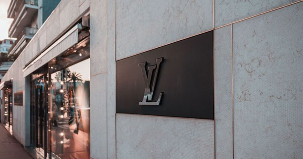
Luxury branding is all about subtle power. Imagine strolling down Manhattan’s Fifth Avenue, past gilded storefronts where a discreet LV or interlocking CC silently declares “high-end.” These logos don’t scream – they whisper prestige.
In today’s world of “quiet luxury,” where consumers favor subtlety over flash, your brand’s logo must speak with elegance.It’s the little black dress of your visual identity: simple, timeless, and utterly sophisticated.
In this guide I’ll walk you through 10 modern logo design tips that will make your brand feel like first-class all the way. We’ll blend creativity, proven strategy, and a bit of my own design storytelling to ensure your logo not only looks premium, but feels authentically high-end.
Luxurious logos often draw from timeless cues – clean stone facades, discrete serif lettering, and a restrained color palette. Think of your logo as a velvet rope at an exclusive club: it shouldn’t shout to get attention, but it must instantly convey that entry is limited to those “in the know.” Ready to make your mark? Let’s dive into the tips.
1. Research the Luxury Landscape
Before pencil meets paper, do your homework. Dive deep into your industry’s top brands – especially those vying in the luxury segment. What color palettes do they favor? (Spoiler: you’ll often see black, gold, navy, and white.) What typefaces set their tone? Luxury logos prioritize elegance and exclusivity, using minimal elements to hint at heritage and craftsmanship.
- Competitive audit: Compile logos of leading high-end and aspirational brands in your niche. Note common motifs: maybe everyone is using gilded lettering or bespoke wordmarks.
- Trend spotting: Check latest luxury logo trends (for 2026 think quiet luxury, balanced minimalism, subtle metallic accents). But don’t blindly chase fads – use trends for inspiration, not duplication.
- Questions to ask: What color schemes feel premium? What fonts exude trust and tradition? How do these logos balance simplicity with distinctive flair?
By understanding how top luxury names craft their image, you ensure your logo stands out. In fact, brands like Chanel, Rolex, and Patek Philippe have logos that look simple at a glance but carry layers of meaning. Your logo needs to fit this club – be instantly recognizable, yet hint at depth.
2. Seek Inspiration from Diverse Sources
Luxury isn’t just about competitor logos. Inspiration can come from art, architecture, or nature – anything that evokes refinement. Take a virtual stroll through a museum or historical landmark (think the proportion of the Parthenon or the Cartier crown emblem) to spark ideas of balance and regality.
A centuries-old fresco, a handcrafted gemstone, even a classic car’s grill can whisper design cues. For example, the precision of a vintage watch gear might inspire a crisp circular logo, or the symmetry of a Greek temple might inform a structured wordmark.
By broadening your visual diet, you’ll organically infuse elegance into your design. Legendary brands often borrow from fine art and craft traditions – they “steal like an artist,” so to speak, and remix it. As you gather sketches and clippings, ask yourself: Does this shape/color/font feel timeless? Could it sit on a couture label or a luxury gadget? The answers will guide you to ideas that feel both fresh and upscale.
3. Sketch and Iterate Freely
Sketching is where the identity starts to take shape. I’ve learned over time that the strongest luxury logos rarely appear in the first few attempts. They emerge after repetition, restraint, and patience. When you’re shaping a modern luxury logo design service, these early sketches do the heavy lifting. They allow you to explore wordmarks, monograms, emblems, and abstract forms without forcing an outcome.
Serif lettering, modern sans fonts, or understated calligraphic details all deserve a place on the page. Symmetry brings calm elegance. Subtle asymmetry adds character. Each iteration sharpens the brand until it feels deliberate, composed, and quietly premium.
Imagine each sketch as a mini experiment. How does a slanted letter “L” feel against a graceful flourish? Does a simple geometric shape like a circle or shield amplify the name? (Starbucks uses a circle to appear approachable yet exclusive.) Keep tweaking layouts and proportions – maybe stack the words, reverse them, or lock them into a badge shape.
When I’m designing, I often joke that at first my sketchbook looks like a toddler’s doodles – but buried in that chaos are sparks of genius. The goal is to uncover that remarkable logo through iteration. Eventually, one of those sketches will feel right: the elements click, and you can almost feel the brand’s personality. That’s your sign to move forward with refinement.
4. Embrace Minimalism and Negative Space
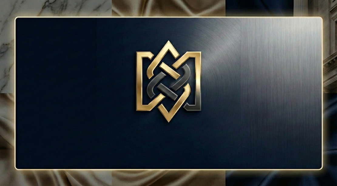
In luxury design, less is more. Consider classic logos like Hermès’s carriage or Chanel’s interlocking C’s – they say more by showing less. Stripping away clutter lets each element breathe and amplifies impact. A minimal logo scales beautifully (more on that later) and exudes confidence – it says, “We don’t need gimmicks.”
Designhill notes that luxury logos “do not carry many details. Most are simple monochrome graphics”. That simplicity looks elegant and ensures the logo can be printed, embroidered, or laser-etched without losing refinement. Think in terms of well-placed negative space: sometimes the space around the logo is as important as the logo itself.
For instance, FedEx’s famous arrow (not a luxury brand, but a great lesson) is formed by the white space between letters; in luxury logos, such clever use of space can hint at a secret meaning or just make the design feel airy.
Your logo should be like a tailored suit, not a novelty sweater. One bold, well-cut piece stands out more than a panel of slapdash patterns. Keep lines clean, curves smooth, and aim for an overall design that feels purposeful – not busy. A simple, iconic logo is more memorable and ooh la la than a literal picture.
5. Choose Sophisticated Typography
Fonts are your brand’s voice. For a luxury logo, choose words that talk softly but carry weight. In practice, this often means using a custom or high-end font. Serif typefaces (think Times or Bodoni-like styles) are perennial favorites for luxury brands – they feel classic and refined.
Brands like Dior, Gucci, and Tiffany rely on serif wordmarks that whisper tradition and quality. Alternatively, a lightweight sans-serif can look sleek and modern (like YSL’s bold sans or Apple’s minimalist approach). Script or calligraphic fonts can also add a handcrafted, exclusive vibe (Cartier’s logo mimics elegant handwriting, for example).
One golden rule: limit your font choices. Using more than two fonts can make a design feel noisy, not luxe. You might pair a bold serif for the brand name with a thin sans-serif tagline, but usually the brand name alone is enough. Consider customizing or merging letters in the name to create something unique (just like many luxury magazines and brands commission bespoke typefaces). As Mediaboom advises, steer clear of generic free fonts; pick or design a typeface that feels tailored to your brand.
6. Craft an Elegant Color Palette
Color in luxury logos is rarely loud – it’s refined and intentional. Black is the king of luxury: it’s simple, timeless, and bold. Many brands use black paired with metallic accents or a single bright hue (like turquoise, emerald, or gold) to convey exclusivity.
Gold, of course, instantly telegraphs prestige and wealth. You might add a pop of royal blue or deep red for a touch of vibrancy, but generally one dominant color with a complementary neutral works best.
Here are some premium palette cues:
- Black & White (Monochrome): The ultimate minimalist choice. It’s elegant and versatile, just like the Chanel or Prada logos.
- Black & Gold: Immediately regal. Gold foil on black cardstock feels ultra-premium. Rolex’s green and gold scheme is a perfect example of luxury color psychology.
- Deep Jewel Tones: Navy, emerald, burgundy – these saturated hues suggest richness (literally). A dark forest green can imply exclusivity and heritage.
- Ivory or Cream: For a softer, boutique vibe. Off-white backgrounds with black text can feel sophisticated and quiet.
Always ensure good contrast. A luxury logo often lives in black and white applications (embroidery, embossing), so test it in grayscale. If it works in B/W, it will pop in color too.
Remember, color psychology matters: purple hints at royalty, blue at trust, red at passion (though bright red is rare in luxury logos – think more of a burgundy). Tailor your palette to the emotion you want. As Mediaboom notes, “Colors evoke emotions and communicate your brand’s status”, and gold or black are luxury shorthand.
7. Craft a Unique, Memorable Symbol
Many high-end brands use a symbol or monogram to elevate their wordmark. Think of the interlocking “CC” of Chanel, the iconic “G” of Gucci, or the three-letter YSL monogram. These symbols are simple yet unmistakable. If your brand name lends itself to initials, play with monogram designs. They should be distinctive – avoid cliché clip art. For example, designing an entwined “AB” for “Arbella Boutique” could give it a personalized feel.
Don’t limit yourself to letters, though. A cleverly drawn icon can become your trademark. Maybe your initials form a hidden image, or a subtle abstract shape suggests your product. Use geometry thoughtfully: soft shapes (circles/ovals) tend to feel approachable and feminine (Starbucks’s circle motif is soft and inviting), while angular shapes (squares, triangles) communicate stability and professionalism. Even lines have meaning: horizontal lines can feel solid and grounded (as in the IBM logo), vertical lines height and aspiration.
One tip from mediaboom’s branding gurus: Create an icon that embodies your brand’s essence, not something generic. Imagine designing a crown for a jewelry line or a graceful leaf for a luxury spa. A strong icon “can spark instant recognition and leave a lasting impression”.
Check your symbol at all scales to make sure it’s clear, even tiny. It should complement your logotype – together, they tell your story. If you nail this, people will recognize the shape even without the name (like seeing Nike’s swoosh or Apple’s apple silhouette).
8. Balance and Harmony in Layout
A luxury logo exudes composure. Every element – text, icon, and empty space – should feel balanced, as if placed on a designer’s precision grid. Think of the logo as a scale: if one side looks heavier, it throws everything off. Centered or symmetrically-aligned designs often feel more formal and timeless, while a slight asymmetry can work if the overall composition feels deliberate (a bit like a custom-tailored pattern).
Pay attention to spacing. Ample “breathing room” around each part of the logo gives it a classy look. Cramped letters or crowded symbols will cheapen the effect. According to design experts, “visual equilibrium is essential” – each piece must be “meticulously positioned and proportioned to create harmony”. Even vertical/horizontal balance matters: a tall icon might need a bolder font, or extra tracking (letter-spacing) in the text to feel stable.
Put your logo in a box in your design software and see if it feels centered from all angles. Step back (or shrink it down) to judge if one part dominates too much. The goal is a logo that feels poised. An unbalanced logo is like a person slouching – it just doesn’t project confidence. A well-balanced logo, on the other hand, will look so polished that customers subconsciously trust it.
9. Ensure Scalability and Versatility
Luxury is modern, and modern means digital. Your logo must work seamlessly everywhere – from a 16px app icon on an iPhone to a giant billboard on Sunset Boulevard. That means designing with flexibility in mind.
- Scalable shapes: Avoid overly intricate details that disappear when shrunk. Fine filigree looks great in a magazine but vanishes on a phone screen. Keep strokes and lines bold enough to read at small sizes.
- Variations: Create alternate layouts. Maybe your primary logo is a horizontal wordmark + emblem, but also make a square or icon-only version. Also prepare a solid-color (one-color) variant for embossing or embroidery, and a reversed-color (light on dark) variant for dark backgrounds.
- Consistent identity: Use the same logo (or consistent variations) across all touchpoints – packaging, website, social media, signage. Mediaboom emphasizes that a versatile logo can be simplified or recolored without losing identity, keeping brand recognition strong.
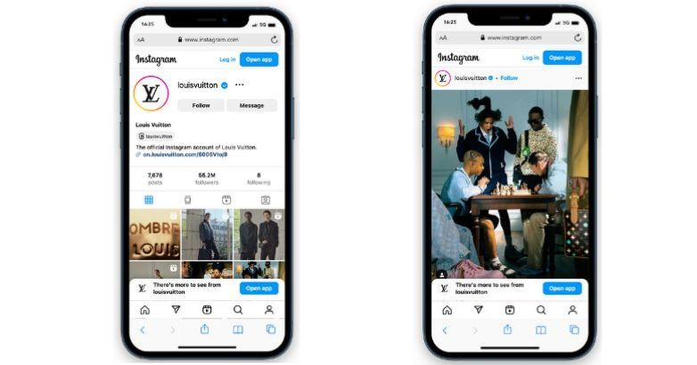
In a digital-first world, consider how the logo appears as a social avatar or app icon. For example, a tiny iOS app icon needs a clear focal point (think of how Apple uses its bitten-apple silhouette alone). As mediaboom notes, “design your logo with scalability in mind” so it retains impact at any size. By planning for every use case, your logo will always shine, whether it’s on a website favicon or an engraved piece of cufflink.
10. Gather Feedback and Refine
Finally, don’t go it alone. Show your top logo concepts to trusted friends, colleagues, or even potential customers. Fresh eyes can spot things you missed: maybe that elegant script is hard to read, or the spacing is off. Constructive feedback will only elevate your design – after all, even Chanel’s interlocked Cs went through iterations before the world recognized its perfection.
Don’t be precious with your first draft. Iteration is key. According to design experts, “fresh perspectives can help identify areas for improvement and ensure your logo resonates with your target audience”. Tweak weight, kerning, color contrasts – little adjustments often make a big difference in polish. Remember, a luxurious logo should feel effortless, but getting there usually requires many quiet nips and tucks behind the scenes. Embrace the process.
By refining and perfecting, you won’t be reinventing your logo – you’ll be elevating it. A logo may start as a simple sketch on paper, but through feedback and craftsmanship it becomes an emblem that stands for your brand’s prestige and quality.
Conclusion
Designing a luxury logo is like crafting a fine timepiece: every detail, from the tip of a letter to the choice of color, must scream quality and heritage. By researching top brands, drawing inspiration from art and architecture, and iterating toward elegant simplicity, you create a logo that not only looks exclusive but feels exclusive.
Remember to keep it minimal, choose fonts and colors with intention, and polish the layout to perfection. In the end, a high-end logo is more than just an image – it’s the jewel in your brand’s crown, promising your audience that your products or services are in a class of their own.
Now it’s your turn. Take these 10 modern luxury logo design tips and apply them to your brand’s identity. Whether you’re rebranding a heritage label or launching a new boutique, your logo can set the stage for an aspirational experience.
What are your favorite luxury logos and why? Share your thoughts below, or snap a photo of your logo sketch and tag us. Your feedback makes this community thrive – after all, even James Bond takes advice on his suit design now and then!
FAQs
Luxury logos focus on elegance and exclusivity. They use simpler, timeless elements—like restrained color palettes and high-quality fonts—to convey heritage and sophistication. In contrast, regular logos might use bolder colors or playful graphics aimed at mass appeal.
Not strictly, but it’s wise. A pro brings expertise in balancing artistry and strategy. They’ll help translate your brand’s vision into a polished logo that really resonates with a high-end audience. If the budget is tight, use online tools for brainstorming, but plan on refining or recreating the chosen concept with a skilled designer.
Online tools are great for inspiration, but luxury branding often demands more customization than template logos offer. Mediaboom points out that online makers “may not offer the refinement needed for a truly luxurious logo”. Think of them as a starting point—your final logo should be unique and bespoke, not a one-size-fits-many clipart.
Generally more than a standard logo. A custom luxury logo involves research, custom typography, and multiple revisions, so expect costs to reflect that expertise. Prices vary widely (from hundreds to tens of thousands of dollars), depending on the designer’s experience and how complex your logo needs to be. Remember: this is your brand’s signature, so it’s worth investing to get it right.
Avoid clichés and overdoing trends. Using generic fonts or clipart instantly cheapens a logo. Overloading with details or following a fleeting style can make a logo feel dated quickly. Experts warn: a luxury logo should be “timeless, sophisticated, and leave a lasting impression”. Keep it simple, distinctive, and true to your brand’s heritage to stay on the right track.


Comments
Update Comment