
Best Social Media Post Design Practices for Businesses
In today’s scroll-addicted world, the first thing you notice in your feed is visual. A vibrant image or clever graphic can make you pause your thumb-in-the-air and actually look. Your business’s social media posts need that “stop-the-scroll” magic.
I’ve found that even the smartest caption won’t rescue a blurry, cluttered image. Think of your social feed as a digital billboard – if the design is sloppy, people will literally walk by.
You’ve probably seen it: a beautifully styled post catches your eye while its dull neighbor just blends into the background. This isn’t an accident. Research shows posts with images get 2.3× more engagement than text-only posts, and visual content is 40× more likely to be shared.
In fact, Venngage found that visual content is 43% more persuasive than plain text. In other words, great social media post design isn’t a nice-to-have – it’s your ticket to grabbing eyeballs. The good news? You don’t need art school to make a splash, but you do need to play by a few design rules.
Even with the best ideas, design takes time and expertise. Not every team has a dedicated artist on payroll, and that’s okay. If you’re swamped, consider bringing in professional social media post design services to polish your look. These experts can translate your marketing goals into cohesive, branded graphics.
They’ll ensure consistent color palettes, typography, and layouts that fit your brand’s vibe. In short, outsourcing to pros can save headaches and keep your visuals sleek and on-brand.
Essential Design Elements for Engaging Posts
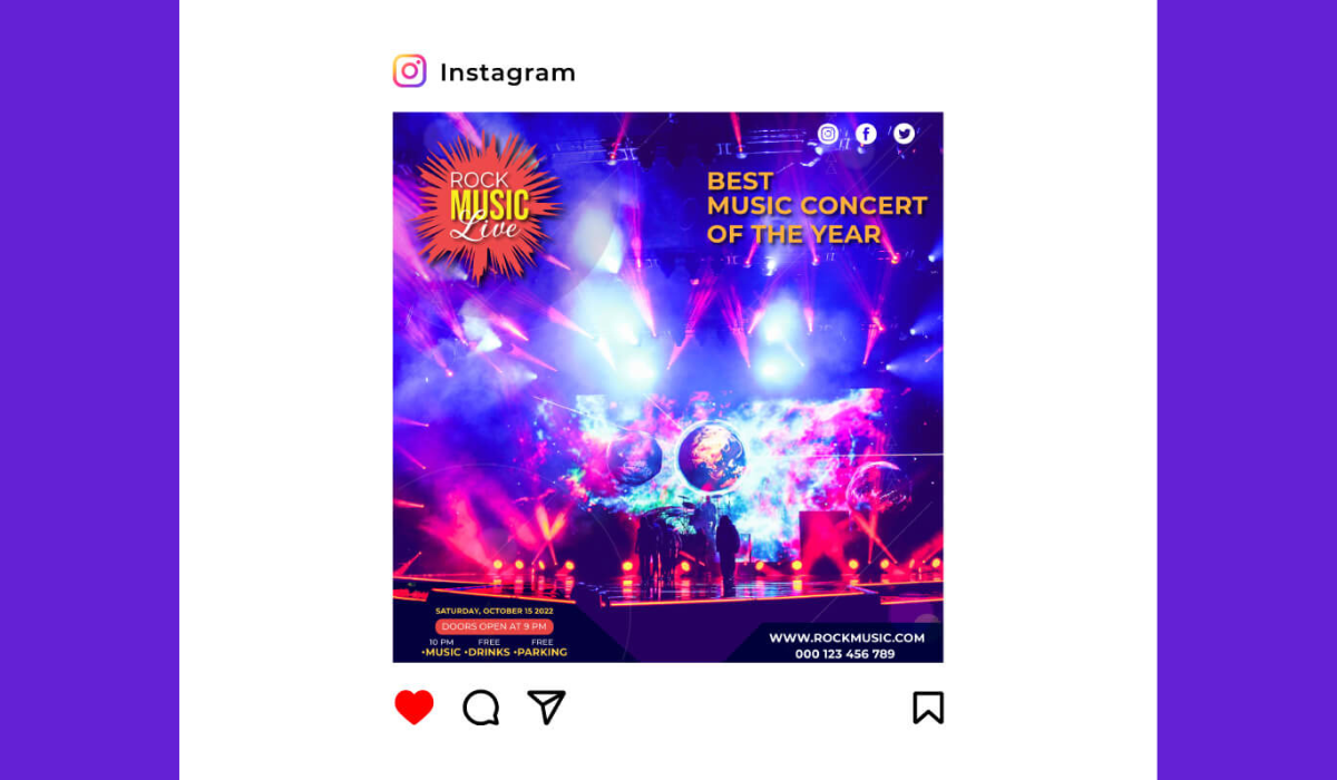
Now let’s break down what makes a post pop. First, focus on a single subject or message. Busy, confusing images make people scroll past – instead, have a clear focal point (like a product shot or eye-catching headline).
Hootsuite advises using one clear subject and the rule of thirds to compose images that naturally draw the eye. Think of the frame like a tic-tac-toe board: align important elements along those lines or intersections for balance.
- Clear focal point: Don’t cram ten things into one picture. Highlight one key element (your product, logo, or headline) front and center.
- Color and contrast: Use your brand’s color palette consistently. High contrast between text and background is a must – it makes your words legible on tiny phone screens. Hootsuite notes that good contrast is “easier to read, works better in black-and-white, and is more accessible”. And color isn’t just decoration: studies show consistent brand colors can improve recognition by 80%. (Imagine if Coca-Cola suddenly swapped out red for lime green – you’d do a double-take, right?)
- Typography: Pick fonts that match your brand personality but prioritize readability. A bold sans-serif for headlines and a clean font for body text usually works. Keep text overlays brief – people skim. If you do overlay a caption on the image (which some brands use to hook “skimmers”), make sure it’s big enough to read on mobile. In fact, Gains notes that adding key words or CTAs directly on the image can snag readers who wouldn’t read a long caption. (Tip: Use a subtle text shadow or translucent banner behind text to keep it legible.)
- Whitespace and simplicity: Clutter is the enemy of clarity. Leave some breathing room around your elements. If an image feels too “busy,” simplify it or split information across multiple posts or a carousel. Hootsuite’s advice? “Keep it simple” – your audience should get the message at a single glance.
- Consistency: Every post should feel like part of the same family. Always use the same logo placement, color scheme, and general style. A unified visual language builds trust – Hootsuite confirms that a cohesive visual identity “helps you stand out from the competition and increase engagement” while building trust and loyalty. Think of it as dressing your team in a uniform; even if you change the play, the audience immediately knows who you are.
Branding and Consistency: Your Secret Weapon
Consistency across your social channels is non-negotiable. If your Instagram is neon-cool and your Facebook is beige-bland, your audience gets confused. Use a social media style guide or branded templates (like custom Canva templates) so every post — whether it’s a quote graphic or a product photo — follows the same rules. That means the same logos, color tones, and filters.
Trust me, it pays off: companies with consistent visuals report about 23% higher revenue. It’s not magic – it’s just smart branding. Your design should scream “us” without yelling in the viewer’s face.
Voice matters too. If your brand is quirky and playful, maybe hand-drawn doodles fit. If you’re all about professional polish, stick to sleek minimalism. A consistent tone (even in the style of illustrations or photography you use) makes your feed feel curated. For example, if your brand voice is friendly and personal, photos of real people or behind-the-scenes moments work great.
On the other hand, if you’re a finance firm, clean graphics and charts might be more on point. As one Reddit designer quipped: “Reuse the same template and color scheme like you would your favorite font — it just looks better that way.”
Finally, remember mobile. About 98% of social media use is on smartphones, so always preview designs on a phone screen. Tiny text or fiddly details get lost on small screens. Make buttons or CTAs tappable (no one wants to zoom in to find your link). If it doesn’t look great on a phone, back to the drawing board.
Platform-Specific Guidelines and Image Sizes
Every network has its quirks. For example, Instagram now favors vertical images: posts around a 4:5 aspect ratio (1080×1350 px) fill more of the feed than old 1:1 squares. Stories and Reels need 9:16 (1080×1920 px) to take up the full screen. Facebook, meanwhile, works well with square (1080×1080 px) or slightly vertical (1080×1350 px) post images.
Twitter (X) can be forgiving, but its best bet is a horizontal image (about 1600×900 px) for full-width impact. For LinkedIn, use high-resolution images and the recommended sizes if you post link previews (1200×627 px) or status images (around 1200×1200 px is a safe square).
|
Platform |
Post Type |
Recommended Size (px) |
|---|---|---|
|
|
Square image post |
1080 × 1080 |
|
|
Vertical image post |
1080 × 1350 |
|
|
Square feed post |
1080 × 1080 |
|
|
Vertical feed post |
1080 × 1350 |
|
X (Twitter) |
Horizontal post |
1600 × 900 |
|
|
Link preview image |
1200 × 627 |
Buffer recommends 1080×1080 px for square posts and up to 1080×1350 px for vertical posts (most feeds accept that). X/Twitter’s ideal is 1600×900 px for a wide view. LinkedIn link thumbnails should be 1200×627 px for sharp previews.
Keep text minimal for platforms like Twitter/X or LinkedIn where shorter posts get more attention. On Instagram and Facebook, you can be a bit more visual – think carousel posts or infographics. But even those should follow good design: clear headings, consistent fonts, and easy-to-read charts or icons.
For example, if you share a tip list as a carousel, use the same background and typography on each slide, just changing the content.
Trending Visual Content & Tips
Social media design trends evolve, but some principles stick. Video and animation are king: short videos (Reels, TikToks) get huge reach now. If you use video snippets or GIFs, make sure the first frame (thumbnail) is compelling — almost like designing a poster for your clip. 80% of social feeds are video-formatted these days, so even if you primarily do images, test out animated posts (like slideshows or cinemagraphs).
Think in mobile-first terms. For instance, vertical video (9:16) has soared because it fills the phone. Infuse some motion if you can: even a subtle zoom or parallax effect on your image can catch the eye as people scroll.
User-generated content (UGC) is also huge: photos of real customers or staff feel more “authentic” and get more trust. According to Marketing LTB, 48% of consumers trust UGC more than brand photos, so don’t hesitate to repost that happy customer snap (with their permission, of course).
Need inspiration? Hootsuite’s blog lays out solid design tips. For example, it emphasizes keeping visuals clean and focused — one clear subject, lots of contrast, and no over-editing. (They even caution: “Resist the temptation to press all the buttons” – too many filters and stickers will just look amateur.)
Tools, Templates, and Resources
You don’t have to start from scratch each time. I swear by tools like Canva, Adobe Express, or Visme for whipping up quick, polished posts. They come with built-in templates sized for each network. Even Instagram and Facebook themselves offer story templates and font options if you’re on a budget.
Consider creating a template library for your brand. For example, a “quote card” template, a “promo banner” template, or a “announcement graphic” template that anyone on your team can use. This keeps styles consistent and saves loads of time. Remember to save editable source files (like Photoshop or Illustrator files) so you (or any hired designer) can tweak future posts without rebuilding everything.
One more tip: always add alt text to your images when posting. It’s good for SEO and accessibility. Describe the key visual (e.g. “Blue and white logo on tablet screen, bold text reads ‘Sale: 50% off!’”) to help people who use screen readers. This tiny step also slightly boosts discoverability on some platforms.
Common Design Pitfalls to Avoid
Don’t overlook the basics. Here are traps I see often:
- Tiny text: If viewers have to pinch-zoom to read a caption on your image, you’ve lost them. Keep text large and legible.
- Inconsistency: Randomly switching your color palette or fonts post-by-post confuses followers. Stick to your brand kit.
- Over-branding: Yes, include your logo, but don’t plaster it over the whole image. Make sure it’s present but not distracting (e.g. in a corner).
- Low-quality images: Grainy or pixelated photos look unprofessional. Always use high-resolution images (at least 1080 px wide for feed posts).
- Neglecting engagement elements: Even a great design needs a call-to-action (like “Shop now” or “Learn more”) if the goal is clicks. Make that CTA button or text visually distinct.
- Ignoring analytics: Keep an eye on which designs perform best. Maybe your audience loves candid photos over product shots, or heavy text graphics flop. Learn from your insights and iterate.
By steering clear of these mistakes, you ensure your time and money invested in design pay off in engagement and trust.
Conclusion
Designing stellar social media posts is both an art and a science. You’ve now got the rules of the road: clear focal points, on-brand colors, mobile-friendly layouts, and smart sizes for each platform. Remember, social media post design is not a one-and-done deal. Keep experimenting with new visuals and learn from feedback.
Engage your audience with eye-catching posts, and they’ll reward you with likes, shares, and conversions. Ready to level up your visuals? Start applying these best practices today, and don’t be afraid to get creative – your brand will thank you for it.
Want to see your posts thrive? Put these tips into practice and watch your feed transform from forgettable to fabulous.
Frequently Asked Questions
It depends on the platform. As a rule of thumb: Instagram/Facebook square posts ~1080×1080 px, vertical posts ~1080×1350 px. For Twitter (X), about 1600×900 px works well for horizontal images. LinkedIn link previews prefer 1200×627 px. You can always refer to Buffer’s or Hootsuite’s up-to-date cheat sheets for each platform.
Focus on strong visuals: use one bold focal point, brand colors, and clear text. Add contrasting colors or a bit of animation to catch the eye. Also experiment with formats like carousels, stories, or short videos. Engaging content often ties together a compelling image and a snappy caption/CTA. Think of each post as a mini poster advertising your message.
If your budget allows, professional designers or agencies can ensure polished, on-brand posts (and they’ll know current design trends). However, many tools (like Canva or Adobe Express) offer easy templates if you want to DIY. The key is consistency: whether in-house or outsourced, make sure everyone follows your brand’s style guide.
Popular options include Canva, Adobe Express, Photoshop, and Illustrator for detailed work. Mobile apps like Over (now GoDaddy Studio) or Snapseed can edit images on the go. Even free tools like Google Slides or PowerPoint can be used to create quick graphics if you export them as images.
Track engagement metrics: likes, comments, shares, and click-through rates. Most platforms offer insights that break down which posts got the most attention. If a certain style of graphic consistently wins, lean into that. A/B test variations (e.g. color changes or layout tweaks) and keep refining based on real data.


Comments
Update Comment