
Why YouTube Thumbnails Design Matters More Than Your Title
.jpeg)
You’ve just filmed an amazing video, poured hours into editing it, and agonized over that perfect title. But here’s the million-dollar question: will anyone click? In today’s fast-paced digital world – especially here in the U.S. where we scroll through content with lightning speed – your thumbnail often does the heavy lifting.
It’s the first impression your video makes, and it needs to stop the scroll in its tracks. A funky celebrity gossip headline might turn heads in a magazine, but on YouTube it’s the visual billboard – your thumbnail – that grabs attention.
Think about your own habits on YouTube or TikTok: you scan thumbnails like they’re magazine covers on a New York City subway stand. A catchy title is great, but if the thumbnail looks dull or confusing, viewers will breeze right past it.
In fact, Nielsen Norman Group research confirms the picture-superiority effect: people process and remember images far more easily than text. Our brains recognize a thumbnail nearly instantly (within milliseconds), long before we even read your title.
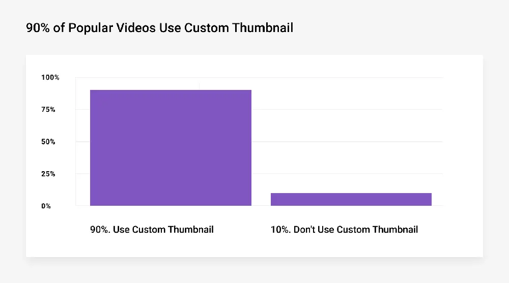
Colorful, high-contrast images with expressive faces or bold text will make viewers pause. It’s no exaggeration, as Backlinko notes: “90% of top-performing YouTube videos use a custom thumbnail”, and “your thumbnail can make or break your entire video.” Essentially, a killer thumbnail is like an irresistible ad poster for your video – without it, even the wittiest title can fall flat.
The Science of Visual Hooks
Our brains are wired to react to visuals long before processing words. Studies show that people remember only 10% of information they hear or read, but that retention skyrockets to 65% when an image accompanies the information.
In practical terms, this means a striking thumbnail can communicate the gist of your video in the blink of an eye. A relevant thumbnail image is stored in memory twice (as an image and as a descriptive word) while a title is just another sentence.
Consider this: a thumbnail can be processed by the human eye in as little as 13 milliseconds. That’s practically an eyeblink. Contrast that with the few seconds it takes a viewer to decode and absorb a line of text. In today’s attention economy, every split second counts.
One chart from YouTube research illustrates this point: 90% of the top videos on YouTube use a custom thumbnail, underscoring that channel growth often hinges on that very first glance. When viewers are scrolling through dozens of video choices, the thumbnail is often their first and only cue.
Tables and research aside, the takeaway is clear: A well-designed YouTube thumbnail communicates faster and more memorably than the cleverest title. This is why so many top creators invest in compelling visuals – a tiny thumbnail with big impact can dramatically boost click-through rates. If you’re struggling to find the right look, even quick solutions can help.
Using a High CTR YouTube Thumbnails Design Maker gives you professionally crafted visuals that are engineered to grab attention and drive clicks perfectly when you want standout results without wrestling with design tools.
Thumbnail vs. Title
Let’s break it down with a quick comparison. Think of your thumbnail and title as tag-team partners in securing that click. The thumbnail is the visual bait – colorful graphics, dramatic facial expressions, or bold text – while the title is the verbal hook that teases why they should care.
In practice, viewers see the thumbnail first and then read the title. If the thumbnail doesn’t seize their attention (say, with contrast and emotion), they may never glance at your brilliant title at all.
|
Aspect |
Thumbnail |
Title |
|---|---|---|
|
First Impression |
Immediate and visual – often the first thing viewers notice. |
Text-based; engaged only after viewer’s curiosity is piqued. |
|
Emotional Impact |
High: use faces, colors, graphics to trigger instant reaction. |
Lower: depends on the wording, which viewers process more slowly. |
|
Click-Through Rate |
Major driver: custom thumbnails boost CTR by 60–70% on average. |
Important: optimized titles (with keywords) also raise CTR, but often less dramatically. |
|
SEO & Discovery |
Less direct impact: not searchable text. |
Crucial for search ranking, keyword relevance, and algorithmic surfacing. |
|
Design Freedom |
Creative: can overlay text, use unique colors or icons. |
Limited by platform: must fit character limits and still make sense out of context. |
|
Branding |
Builds visual consistency and brand pattern. |
Can convey brand voice in word choice but less visual continuity. |
From this table, it’s easy to see why many channel experts argue that thumbnails often matter more than titles when it comes to raw clicks. YouTube’s own metrics back this up. For example, A/B tests by growth marketers have shown that swapping out an old thumbnail for a redesigned one can jump CTR by as much as 50% or more.
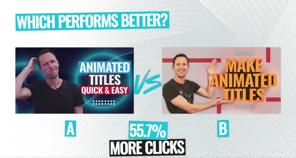
In one case study on Primal Video’s own channel, one thumbnail design yielded 55.7% more clicks than its competitor. This isn’t a fluke – it’s evidence that the look of your thumbnail can profoundly influence engagement.
That’s not to say titles don’t matter. A well-crafted title with strong keywords will improve your search visibility and can bump CTR by double digits through optimization. But remember: if nobody clicks, views won’t pick up no matter how clever the title is.
Thumbnails catch the eye; titles (and video quality) keep the viewer watching. In practice, a winning strategy is to use both: hook them with an arresting image first, and then reinforce it with a concise, intriguing title.
Thumbnail Design Best Practices
Designing an effective thumbnail is part art, part science. Drawing on top YouTube creators and UX experts, here are some key tips to make your thumbnails click-worthy:
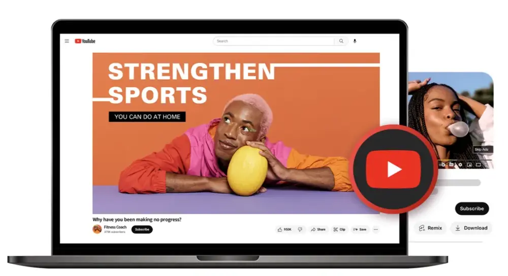
- High Contrast: Use bold, contrasting colors so that the elements (text, faces, icons) stand out sharply against the background. Bright yellows, greens, or blues often outperform backgrounds that blend in with YouTube’s red/white interface. High-contrast images grab attention in a feed.
- Expressive Faces: Close-up shots of people showing clear emotions (surprise, joy, shock) can lift CTR by 20–30%. We naturally react to facial expressions. If it fits your content, include a human face with eye contact or a dynamic pose – it adds relatability and curiosity.
- Brevity and Bold Text: If you add text to your thumbnail (a short phrase or number), keep it big and readable. Think of it like a billboard: use a large sans-serif font and only a few words (e.g. “$500 Per Day” or “Don’t Click!”). Text shouldn’t be smaller than ~48px at 720px width, because thumbnails appear small on mobile. A useful rule: 20 characters or less so it’s legible at a glance.
- Clear Message: Your thumbnail should summarize the video content at a glance. Avoid generic stock photos. Instead, show an element from the video, or a graphic symbol (like a YouTube icon, product image, or arrow) that tells the story. For example, if your video is about “Top 5 Pizza Recipes”, show a cheesy slice and “5” big in yellow, rather than a plain kitchen scene. This way, even without reading the title, viewers get the idea.
- Consistent Branding: Develop a visual style (color scheme, layout, logo placement) that recurs on all thumbnails. Viewers browsing a channel should immediately recognize your brand vibe. Consistent elements (like a corner logo or similar font style) help loyal subscribers spot your videos, and even reinforce credibility for new viewers.
- Plan Ahead: Whenever possible, shoot or prepare images specifically for your thumbnail. Don’t just grab a random video still. For example, many vloggers snap extra high-res photos during filming with dramatic poses or staged expressions. That way you have crisp, intentional visuals to choose from.
- Test and Refine: Use tools like YouTube’s own A/B testing (currently in Beta) or TubeBuddy/vidIQ to experiment with different thumbnails. Look at your analytics: if a video has low CTR, try swapping its thumbnail. Data-driven testing can uncover what your audience really likes (bright backgrounds? certain faces? etc.). In one split test, Primal Video discovered one design got 45.2% more clicks than another. The only way to know for sure is to test.
The Role of Thumbnails in YouTube’s Algorithm
YouTube’s recommendation system heavily favors watch-through and click-through rates. In other words, if people click your video and actually watch it (or at least watch for a significant time), YouTube will show it to more people. Thumbnails play a starring role in that initial click-through rate (CTR). No matter how SEO-optimized your title is, the thumbnail is often what earns you that first viewer.
For example, YouTube’s leaked test-and-compare tool shows that AB testing thumbnails can transform performance. TubeBuddy reports creators seeing 37%–110% improvements in CTR after tweaking titles or thumbnails, and some even report gains over 300%.
Critically, one case study highlighted by TubeBuddy found that switching out a thumbnail propelled a video’s views from 300,000 to 1.1 million – just by changing the image, not the title.
Meanwhile, changing the title (with the same thumbnail) produced a more modest 30% CTR lift in tests. These anecdotes suggest thumbnails often have a more immediate, dramatic impact on clicks, though both elements matter.
In practical terms, if you find your video has a low impression click-through rate in YouTube Studio, often the quickest fix is a new thumbnail. Even a single redesign (with brighter colors or a clearer photo) can turn a stagnant video around.
The key is to think like your audience: what would make you stop scrolling? Maybe it’s a bold question in the image, a reaction shot, or vivid on-screen numbers. These small design decisions leverage powerful cognitive biases – the same ones advertising has used for decades.
Finally, don’t forget mobile. Most Americans watch YouTube on phones, where thumbnails are tiny. Always preview your design in a mobile mockup. Make sure the key elements are still readable when shrunk. YouTube’s interface is busy (with text and icons all around), so a unique pop of color or clear subject will differentiate yours in a small thumbnail.
A Case Study
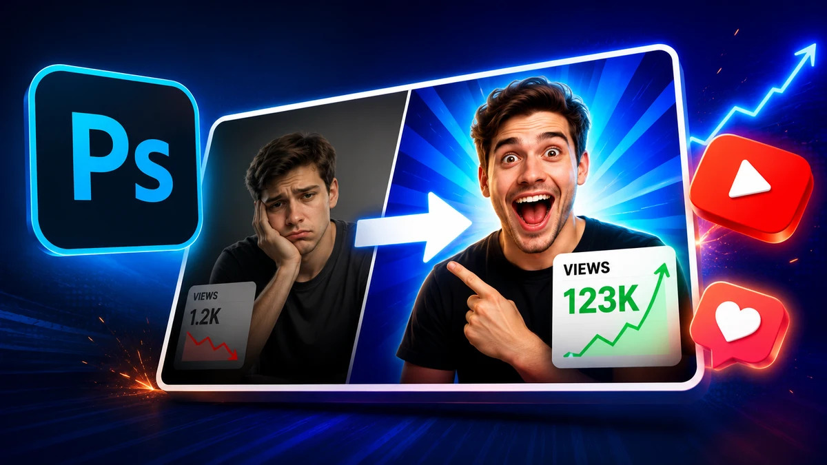
To illustrate all this, let’s look at a real-life example (adapted for privacy). A finance education channel found one of their tutorials performing poorly – and suspected the thumbnail. The original image was a generic pie chart with a vague title. They redesigned it: bold green numbers, a thumbs-up graphic, and a close-up of a confident face.
After swapping in the new thumbnail, the video’s CTR shot up by over 50%, doubling its daily views. In another case, lifestyle YouTuber Ali saw one of his videos jump from about 300,000 views to 1.1 million simply by changing a boring stock-photo thumbnail to a lively shot of himself reacting to the video’s content.
These stories are not unique to one niche – whether it’s tech, cooking, fitness, or marketing, channel owners have seen similar effects. The principle “image first, title second” holds across industries.
As one social media blog puts it, on crowded feeds every video “starts to blur together — unless something stops you,” and that something is usually the thumbnail. So, the next time you upload, imagine your thumbnail as the neon billboard of your video in a world of black-and-white alternatives.
Conclusion
In the battle for eyeballs, your thumbnail is your secret weapon. It’s the first handshake you have with a potential viewer. Nail that handshake with a vibrant, intriguing image and the viewer will stick around to read your title (and then watch the video). On the flip side, a bland thumbnail might mean your carefully crafted title never even gets a glance.
In sum: prioritize thumbnail design. Amp up the colors, add expressive faces, overlay a hooky phrase, and stay on brand. Test different versions until you find what resonates – tools like A/B testing or even our in-house design (see 3rd para) can guide you.
Ready to boost your channel’s click-through rate? Update the thumbnail on your next upload using these tips and watch how your view count climbs. Your title might make them curious, but your thumbnail will make them click.
FAQs
Thumbnails and titles work together, but in most cases yes, thumbnails take priority for grabbing attention. Viewers scroll through feeds quickly, and a compelling image will make them stop long enough to read the title. Studies (and YouTube’s own data) show that custom thumbnails give videos 60–70% higher CTR on average, meaning the thumbnail’s role as the “click-decider” is very real. That said, titles still matter for SEO and context, so don’t neglect them. Think: thumbnail attracts the eye, title seals the deal.
Good thumbnails often share these elements: bright, high-contrast colors; big, easy-to-read text (if any); a clear subject (often a face or object); and some emotion or intrigue. Use close-up facial expressions or action shots, and add concise text (like “$100 Challenge” or “Epic Fail!”) to hint at your content. The Backlinko and Sendible guides recommend limiting text and maximizing color contrast. Also make sure the thumbnail accurately reflects the video – misleading “clickbait” can harm your reputation.
A/B testing is the answer. YouTube’s built-in “Test and Compare” lets some creators test up to three thumbnail versions (though full CTR data is still limited). Alternatively, use third-party tools like TubeBuddy or vidIQ which offer more detailed A/B testing. The idea is simple: upload one thumbnail, collect data (CTR, impressions) for a few days, then swap to the second version and compare. Even swapping thumbnails manually and comparing metrics can work. Keep testing visual elements – we saw one example where swapping a thumbnail design led to a 55.7% jump in clicks.
Yes, if possible. YouTube’s creators say it bluntly: 90% of top videos have custom thumbnails. Using the auto-generated freeze-frame is a missed opportunity. Even a simple design edit (brightening an image, adding your channel logo, or overlaying text) can distinguish you from the competition. Since thumbnails are the gateway to your content, investing a bit of time to create a custom one can pay dividends in views.

Comments
Update Comment